Understand First
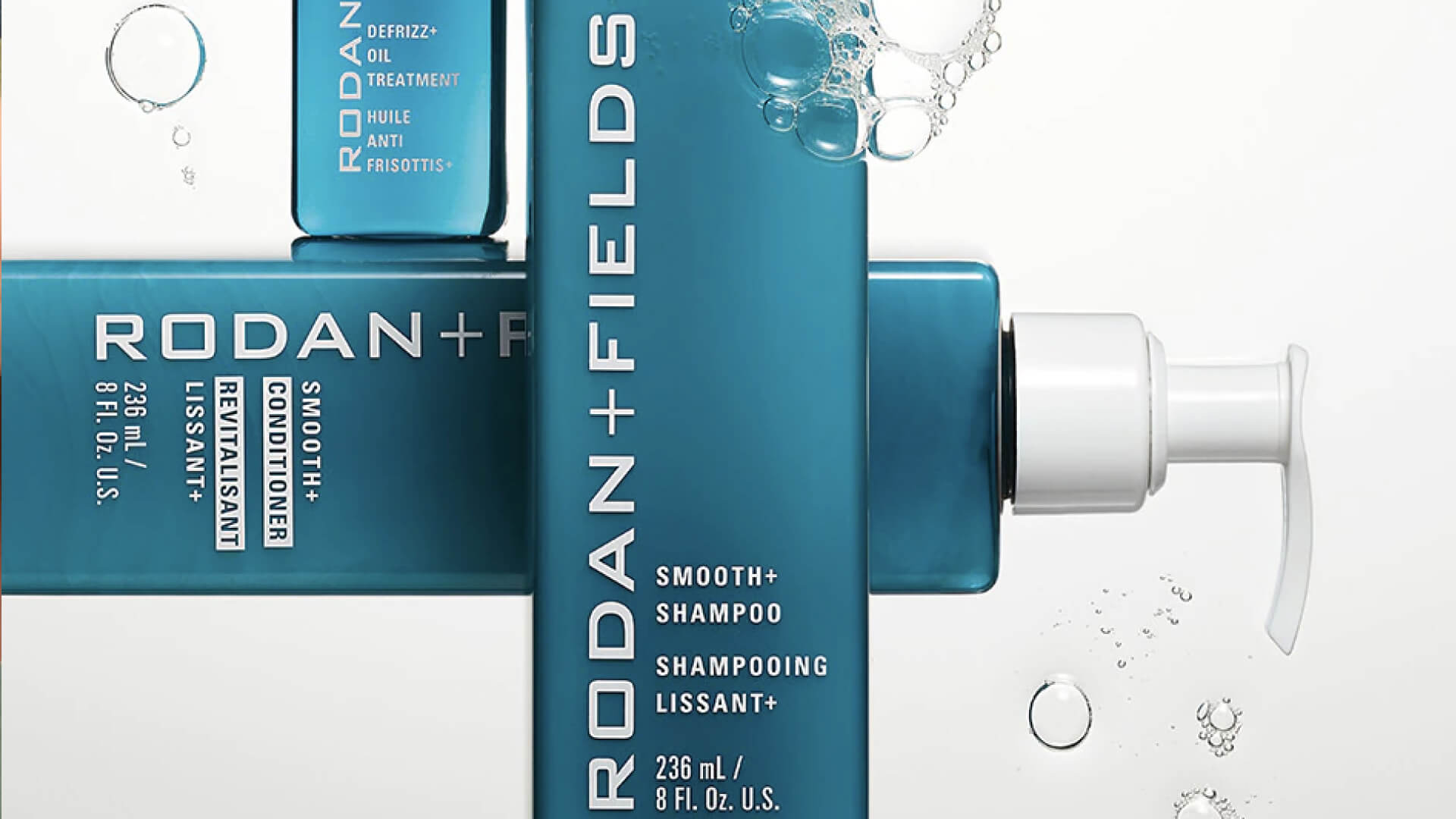
Hugely successful, science led skincare brand, Rodan + Fields, sought our support in expanding on the identity for the brand, to inject a ‘must have’ prestige look and feel that would sit beautifully in the bathroom.
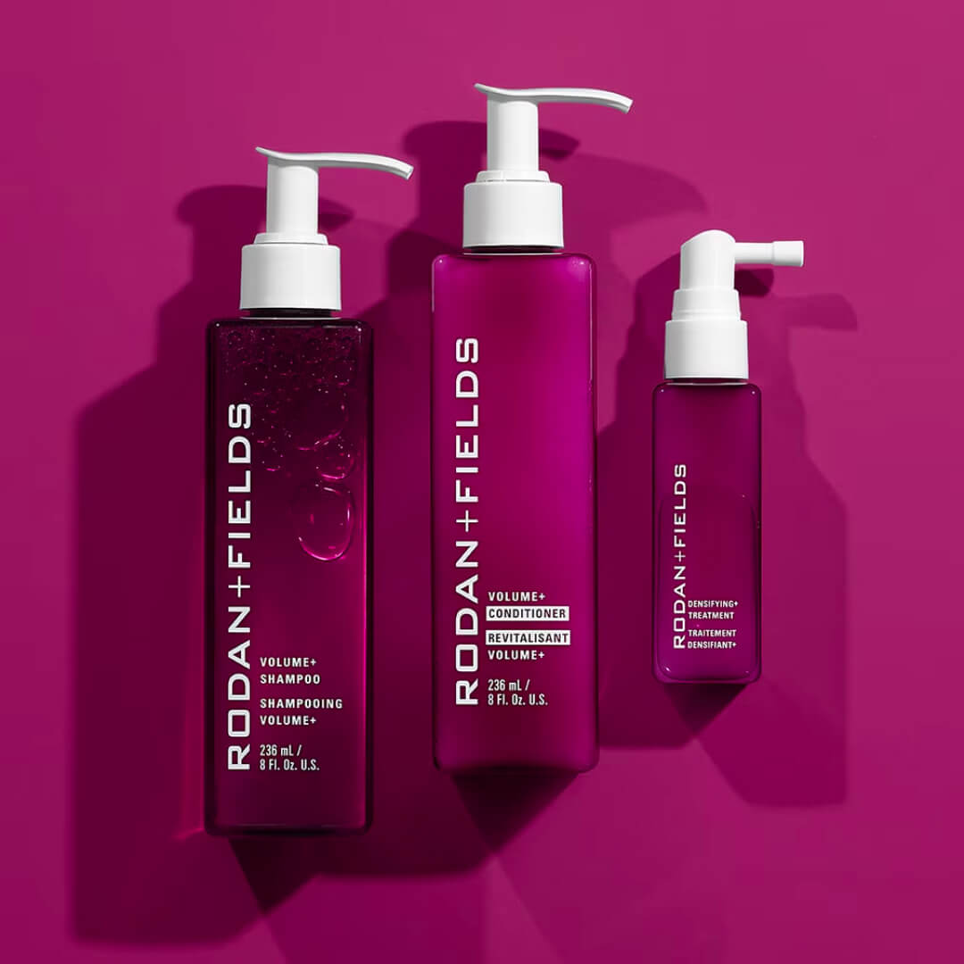
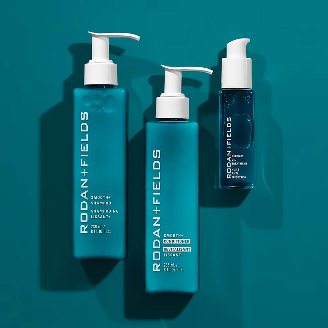
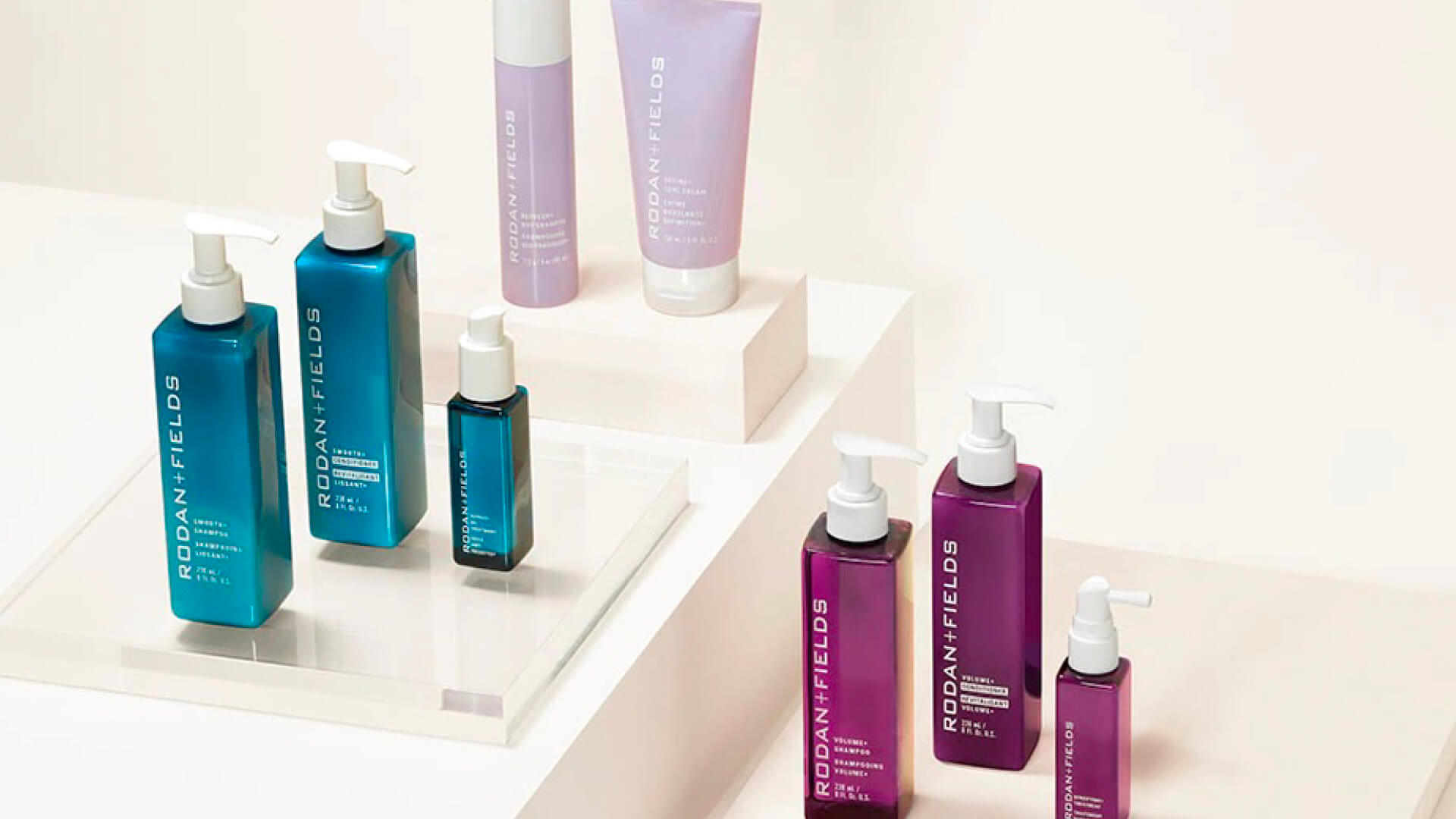

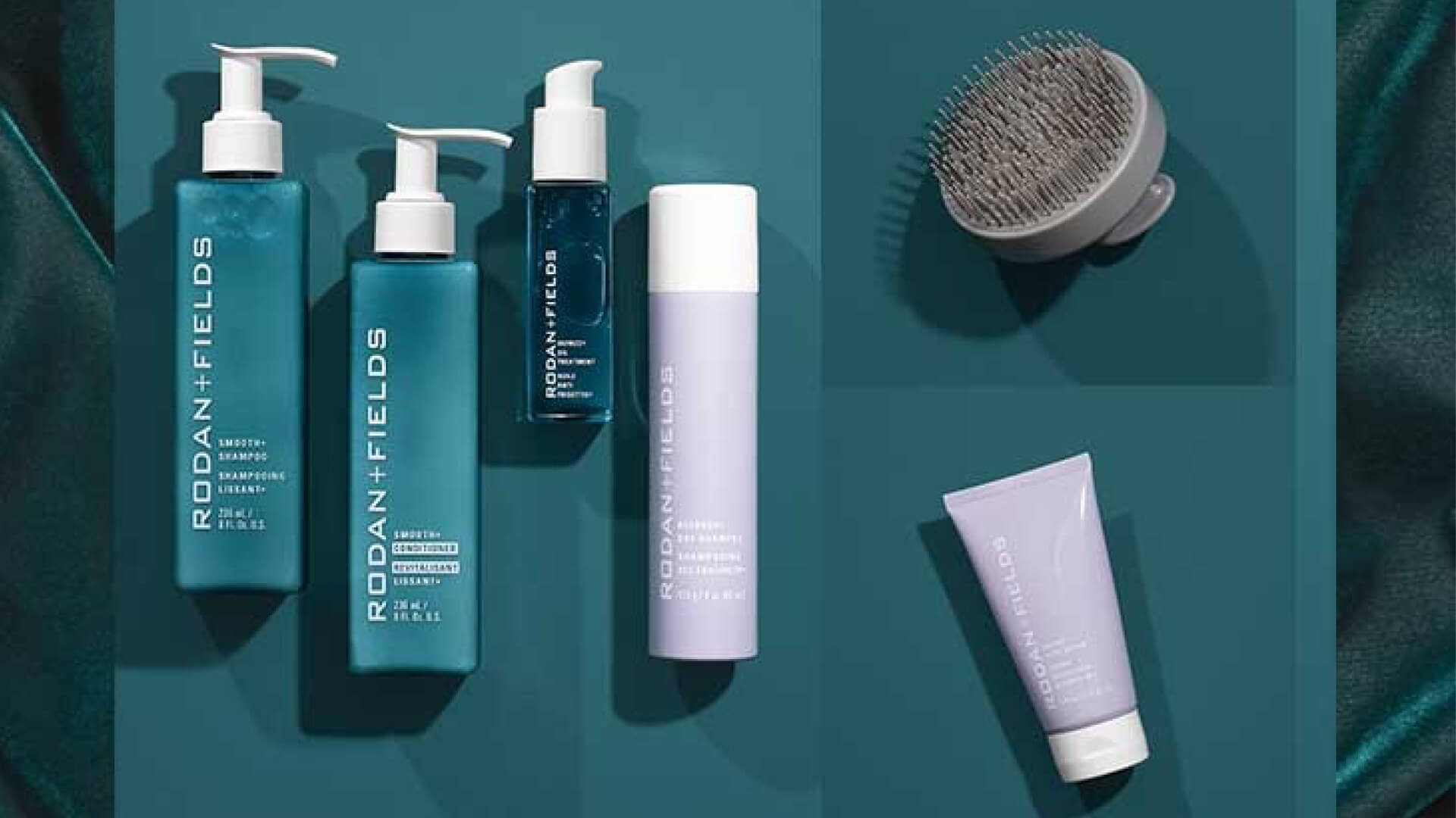
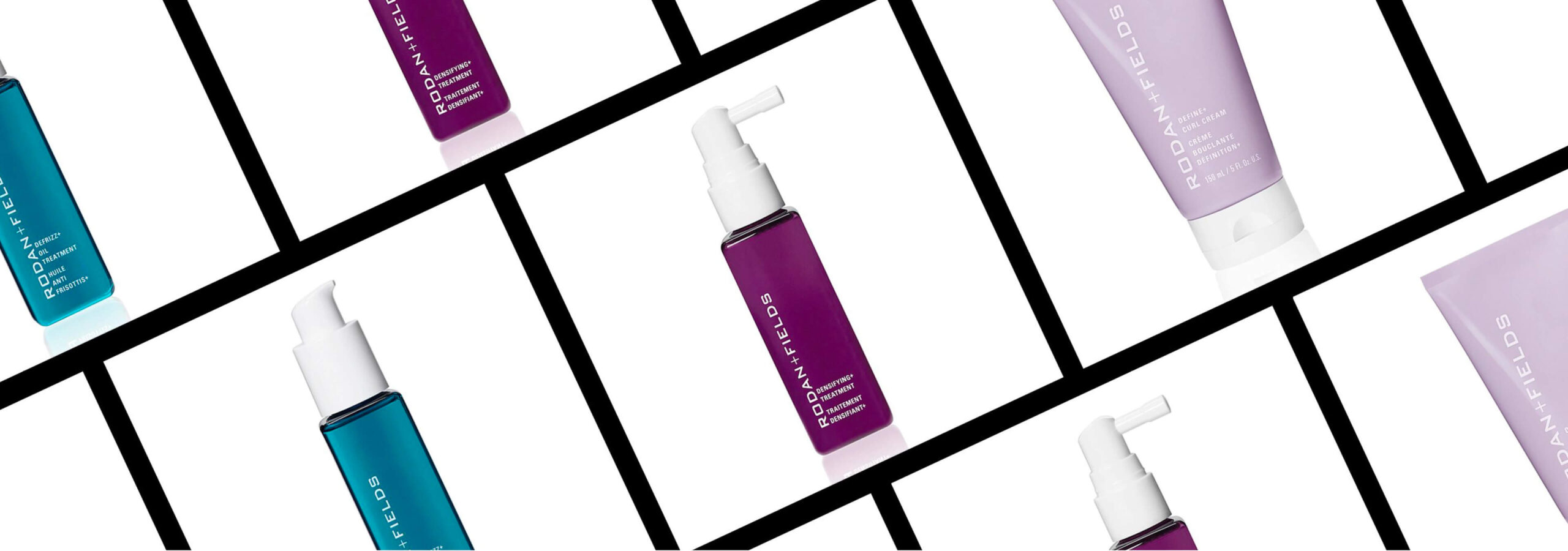
Refreshed packaging identity required a look and feel that was suitably rich and nourishing, whilst retaining a visually scientific feel that would reflect the level of rigour and consideration the formulations had been subject to. We therefore played with levels of opacity and translucency of the substrates to add interest, depth and ease of recognition to the packaging, as well as proposing a structural silhouette that is as much elegant and empowering as it is recognisably Rodan + Fields. Navigation across the range was carefully defined, allowing space for any future additions to the range.

