Understand First
As cell experts in the supplements category, Richelet sought the status of no.1 global beauty supplements brand. They wanted our support in building a visual identity to help propel them towards this ambition in a saturated market.

This major revitalisation created a distinctive visual identity that was contemporary, powerful and capable of uniting all brand assets, including broadcast media. Our goal was to communicate a compelling message that would resonate with customers.
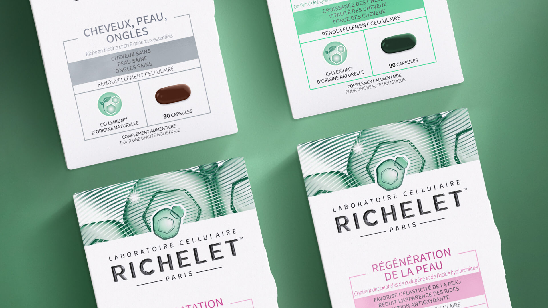
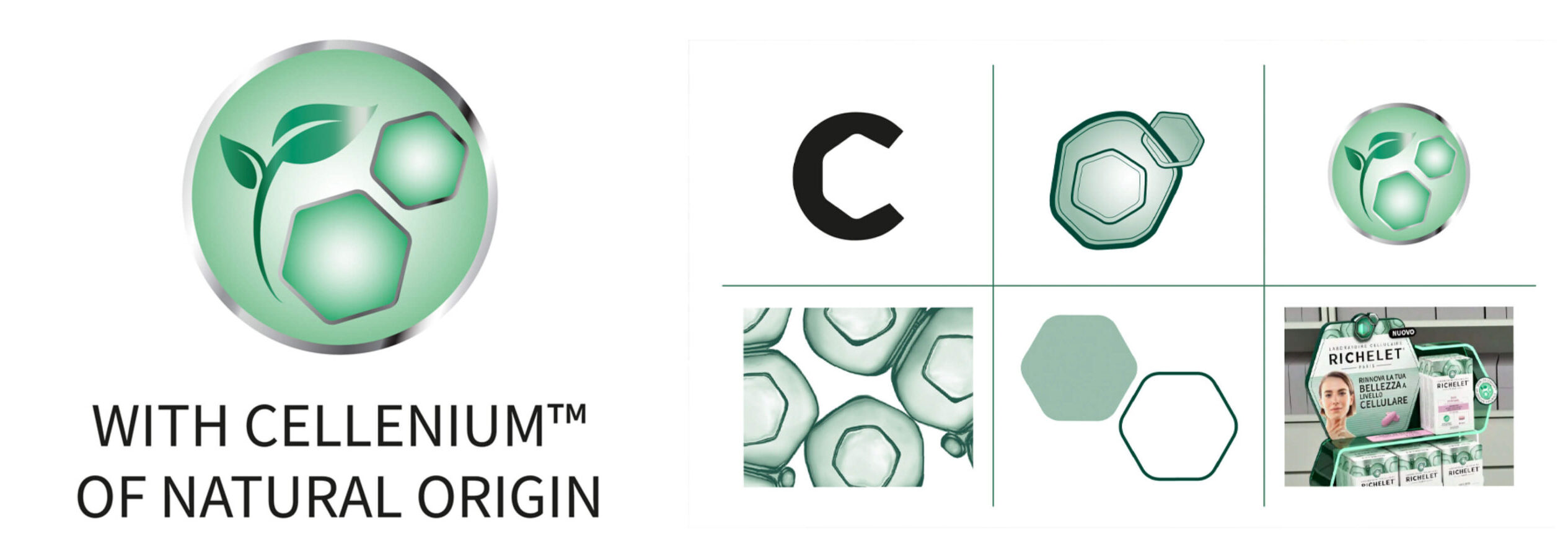
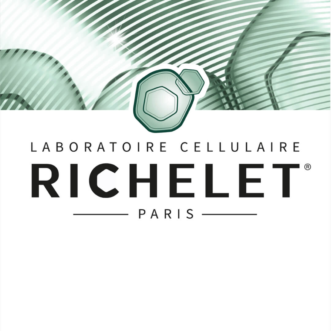
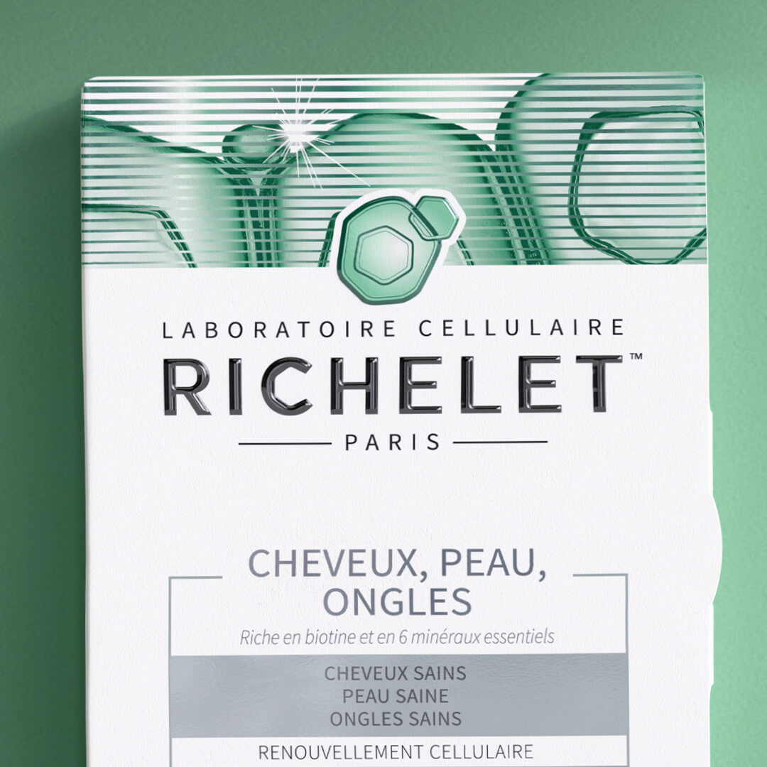
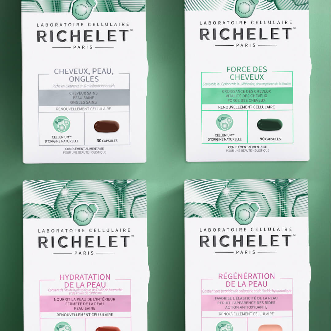
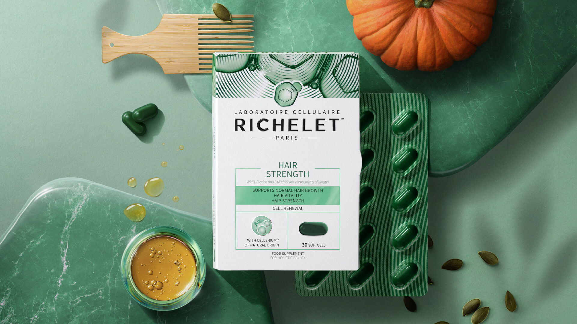
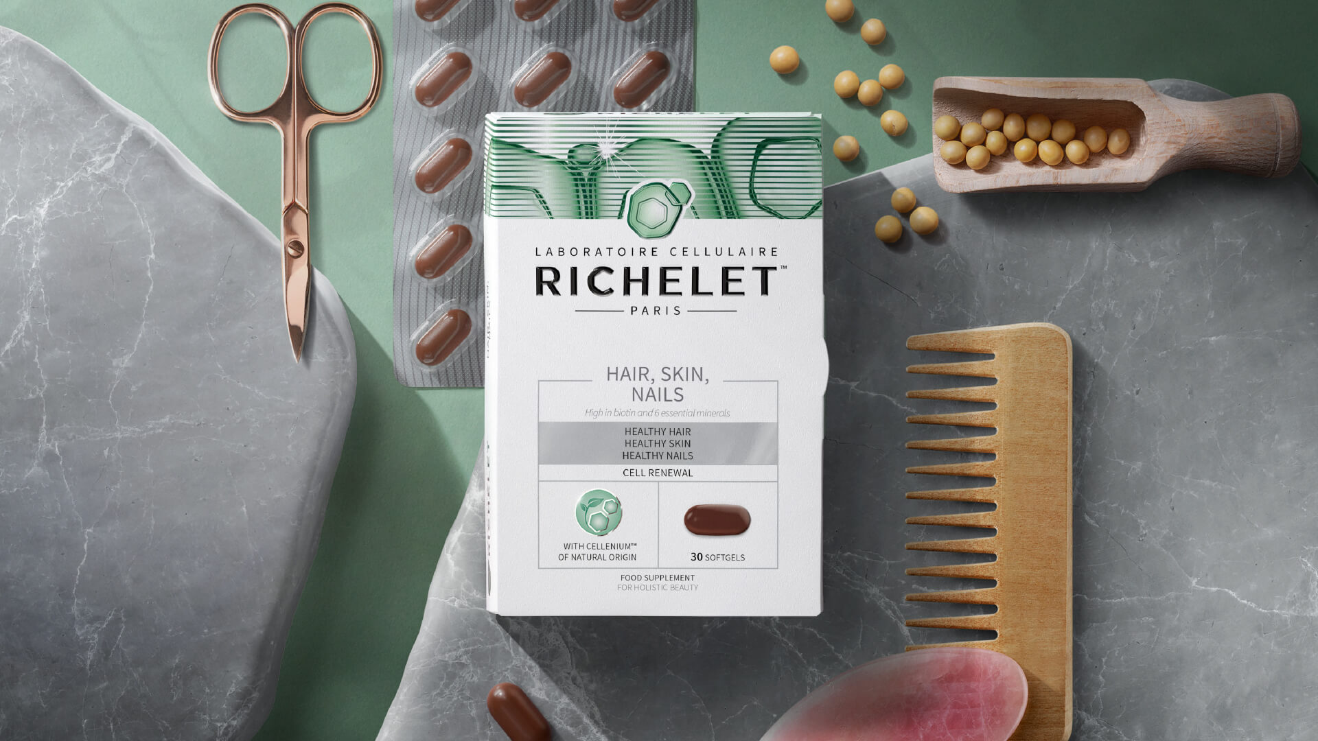
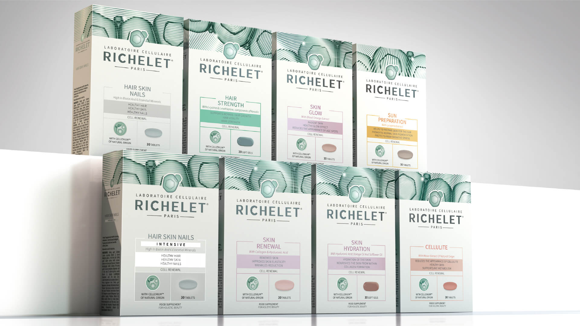
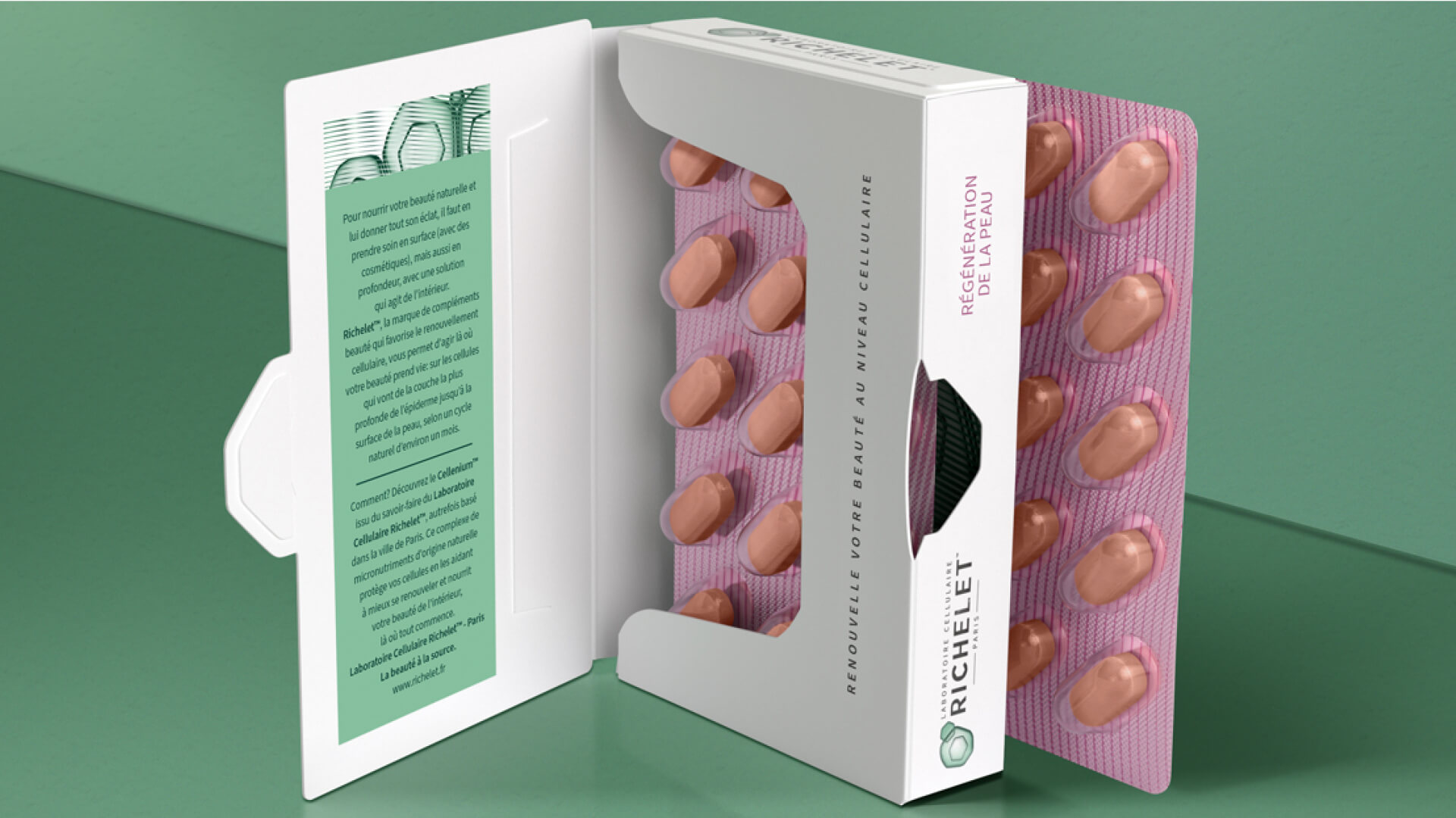
Refinement of the brand marque incorporated and emphasised the cellular element, and was framed within the Laboratoire Cellulaire, Paris setting, to add power of provenance for the French-born brand. The unique icon was inspired by Cellenium, the brand’s central ingredient. Packaging design balancing white, green, and foil elements reflects the brand’s laboratory heritage, while allowing it to remain competitive in the beauty category.
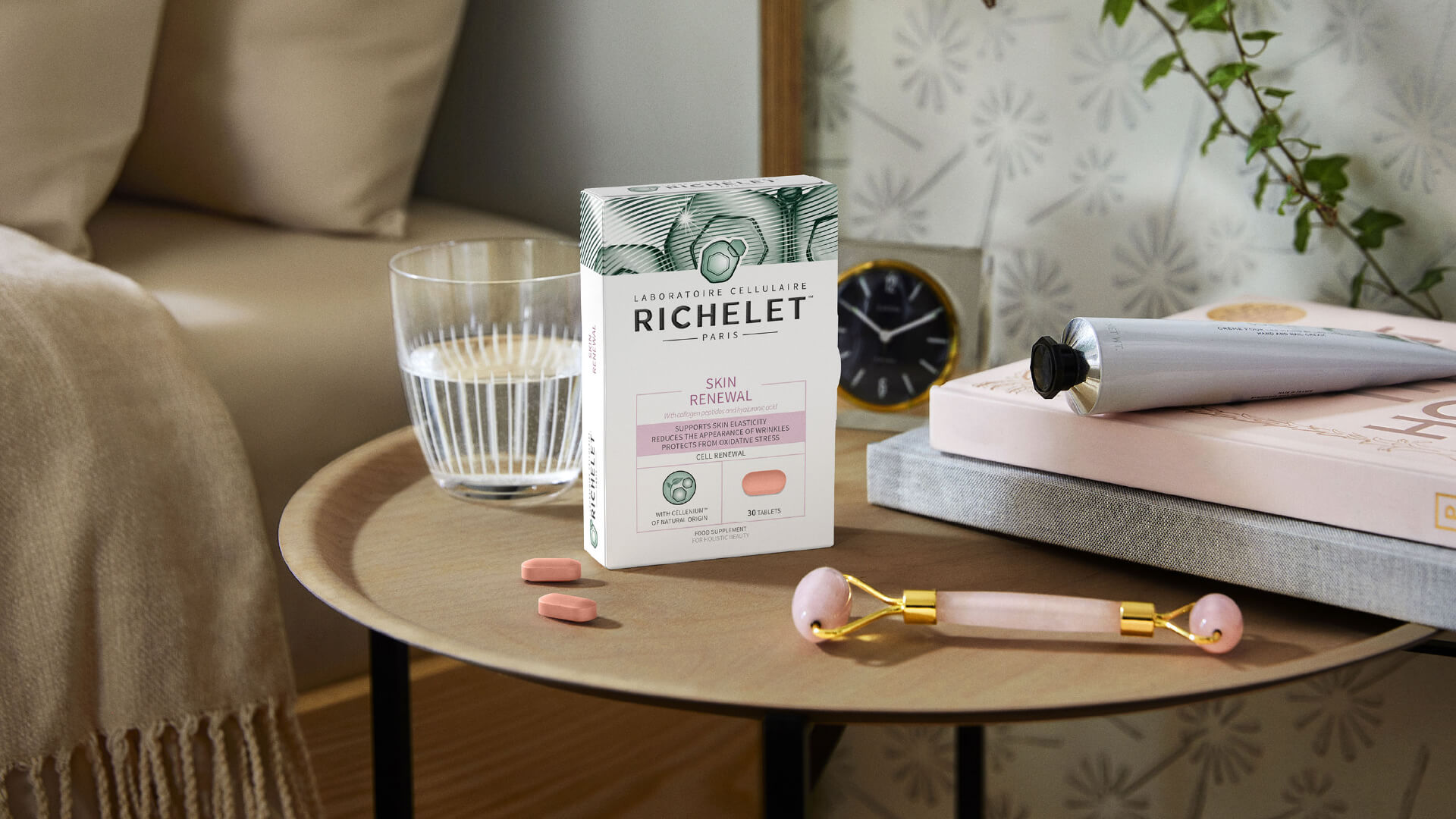
A distinctive representation of cell renewal was created which was used across the top of pack to hold the range together with a consistent motif. The all-important Cellenium technology was given its own very individual icon to highlight the differentiating element. And the whole re-imagining was tinted with tones of the green brand colour for consistency. Four products – Skin Renewal, Skin Hydration, Hair, Skin & Nails and Hair Strength – have been launched in French pharmacies in March 2023 promoted by a synergistic TVC.
