Understand First
Understand first
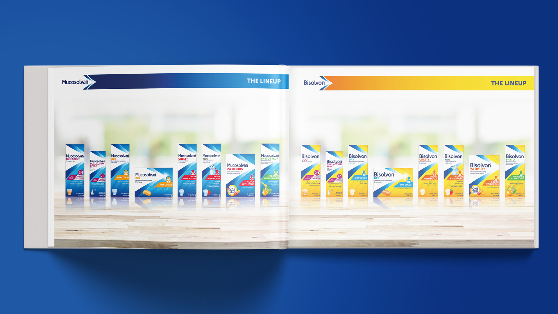
Despite owning market-leading cough and cold treatments, Mucosolvan and Bisolvon packaging design no longer communicated Sanofi’s brand purpose or true efficacy. This led to much needed global portfolio harmonisation, and improved emotional connection with consumers.

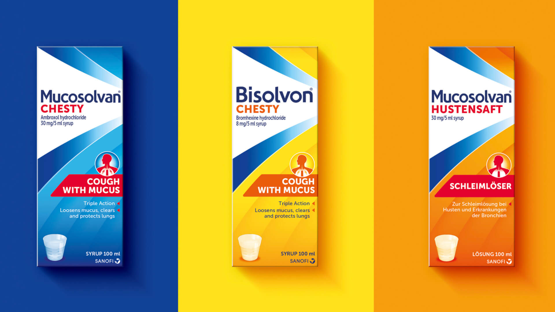
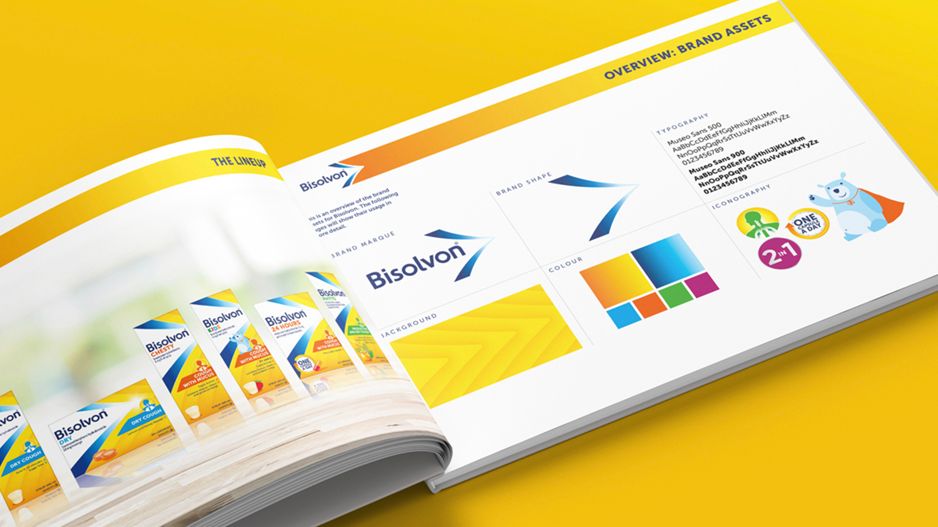
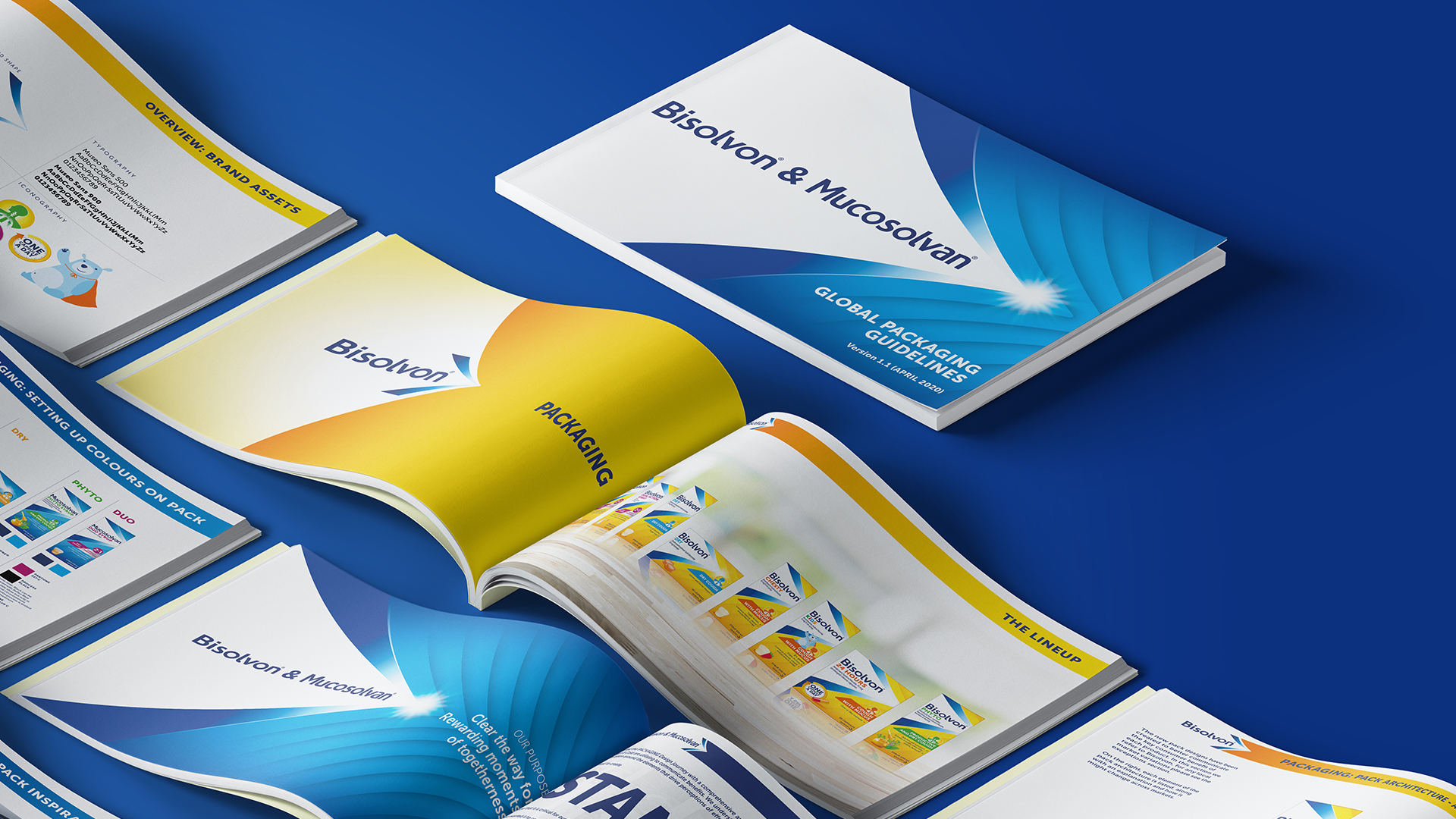
To ensure cut through in a competitive healthcare market, we tapped into Sanofi’s heritage as healers, unifying the brand under a new tagline – “clearing the way for moments of togetherness”. The new branding, typography, iconography, and improved colour palette aligned the full portfolio under a consistent communications umbrella.
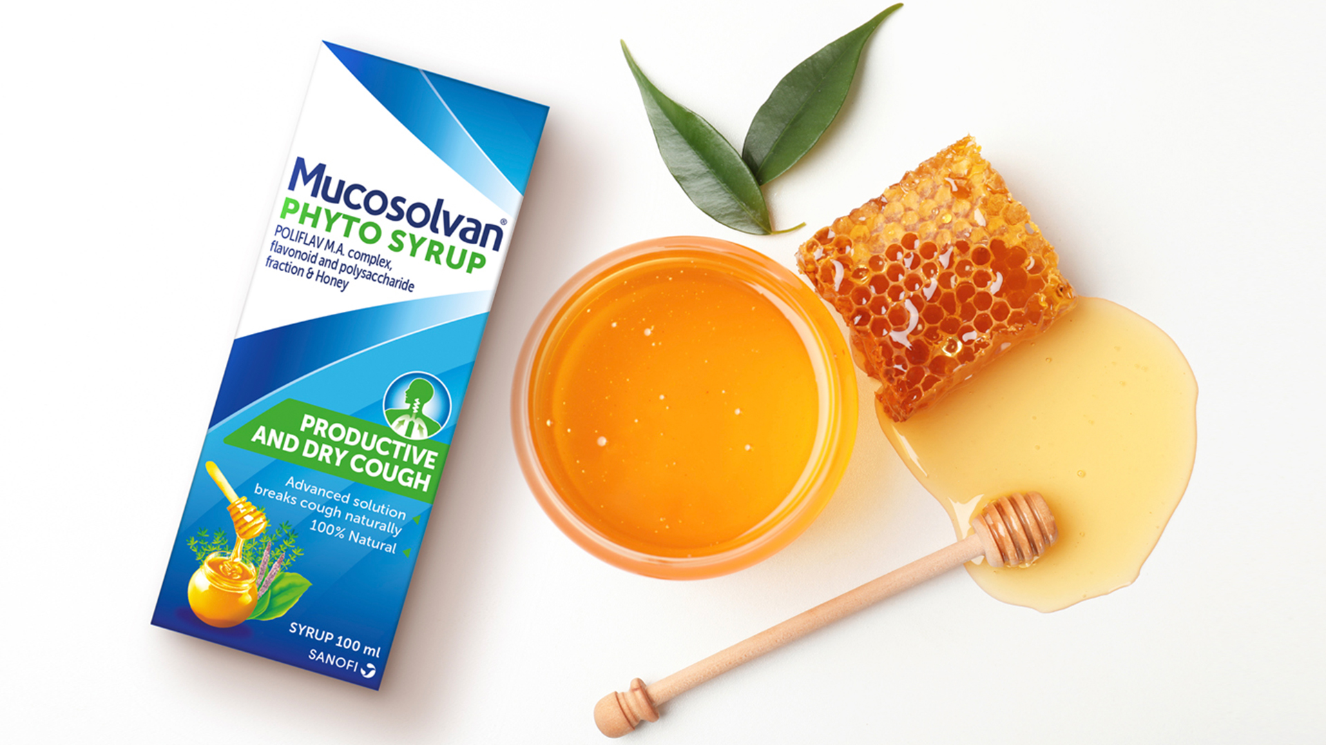
Creating one clear brand position included the use of a single typography style, to ensure consistent brand recognition in different regions. Packaging design also made clear the scientific aspects of the range, showcasing accessibility to proven clinical effectiveness.
“Free The Birds successfully provided the brand unification and stand out we were looking for. The new design also does a fantastic job of showcasing our products’ efficacy, and highlighting our expertise and heritage of trust across all our markets.”
