Understand First
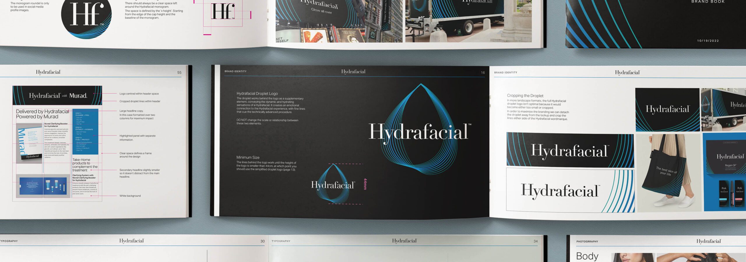
This global category-creating brand is at the intersection of beauty and aesthetics, crossing B2B and B2C touch points across estheticians, consumers and partners. Our work supported explosive global growth by refreshing Hydrafacial’s visual identity and brand architecture.
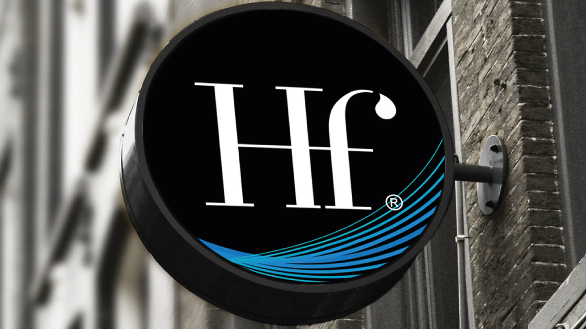
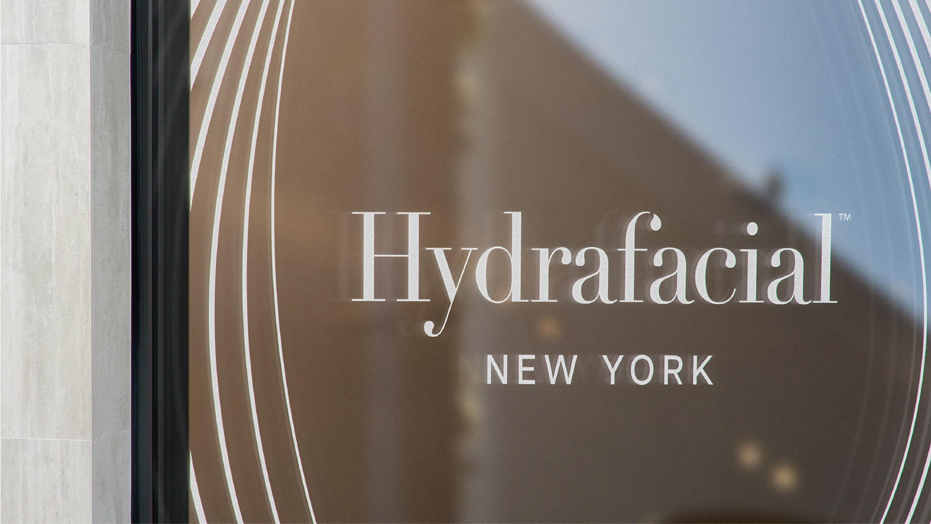
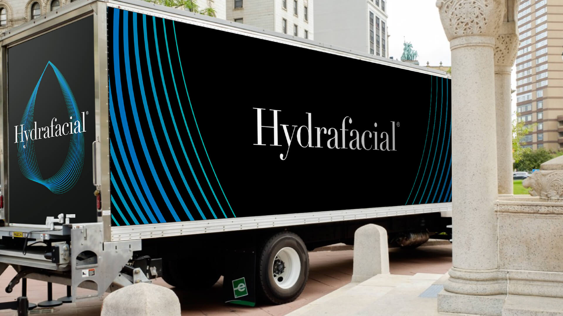
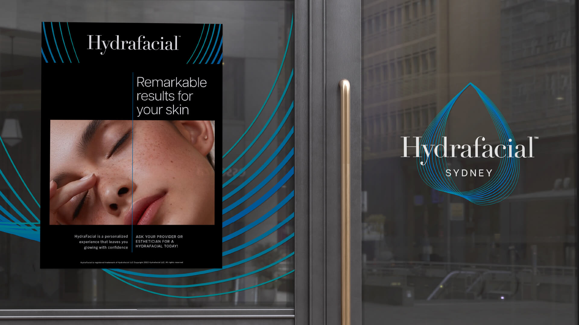
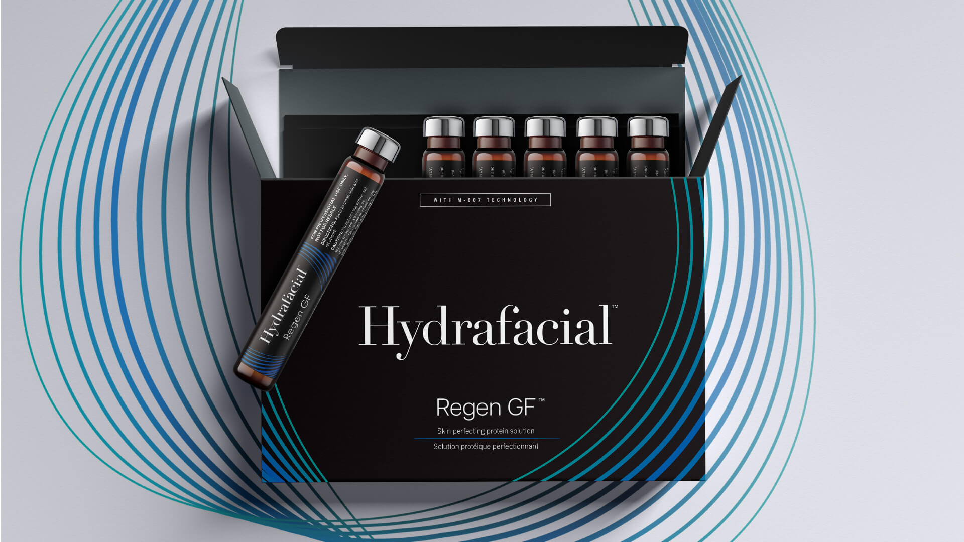
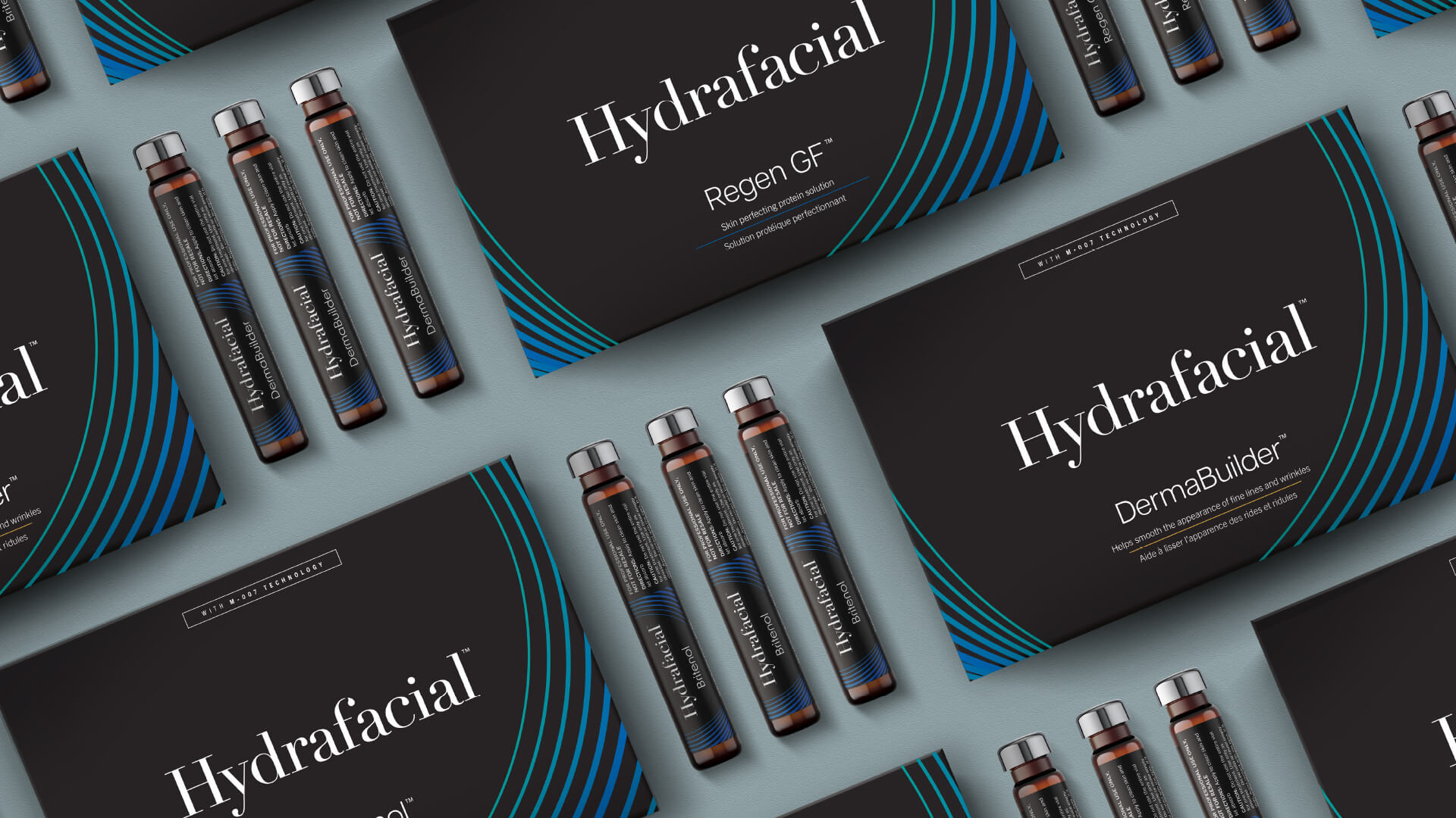
We elevated Hydrafacial’s logotype by tweaking the positioning of the water droplet found in the upside down “i” of the original, to slip it into the curvature of the “f’ in the new logotype. Our team also introduced a hero visual – the pulsating droplet – that descends in a cascade of blue hues to bring depth to each brand touchpoint; from packaging to Hydrafacial’s immersive brand experiences and events.
“Free The Birds has provided a refresh that evokes the highly effective, personalised treatment we offer and promises to unify the Hydrafacial brand experience across the 90 countries where we operate.”
Former BeautyHealth President and Chief Executive Officer, Andrew Steinleick
