Elimax: Balancing authority and ease in brand identity
Reassuring design language brings clarity and calm to the category. A confident refresh built on protection, trust and ease.

Understand First

Elimax, a pharmacy-exclusive brand offering insecticide-free lice protection, partnered with Free The Birds to evolve its identity and packaging. Preparing for future growth, the brand needed a design solution that felt modern and distinctive, while retaining the familiarity and reassurance valued by consumers and healthcare professionals. The brief: bring renewed confidence and clarity to the range without losing sight of what makes Elimax trusted.

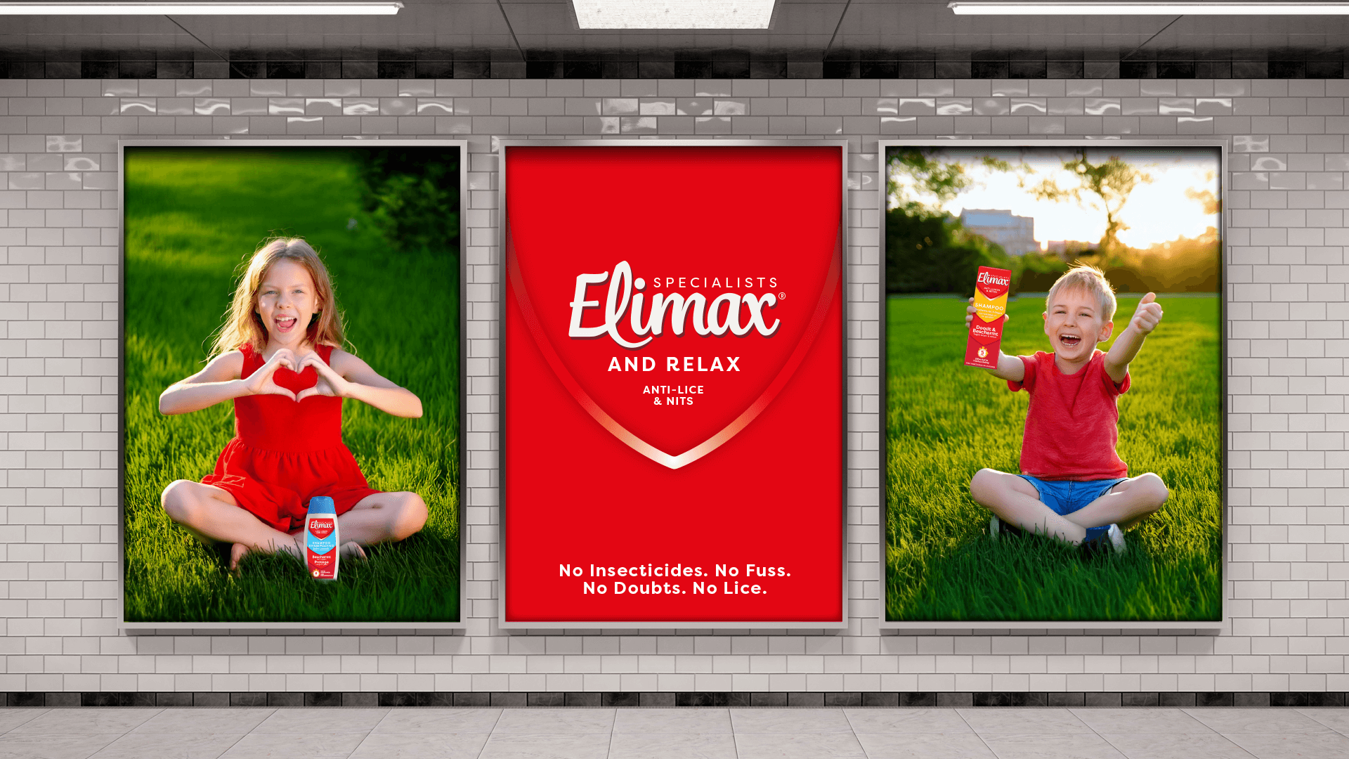
Free The Birds developed a focused strategy built around a simple but powerful brand idea: Elimax. And relax. This platform reframed headlice treatment as a stress-free experience — positioning Elimax as the calm, confident expert that helps families get on with their lives.

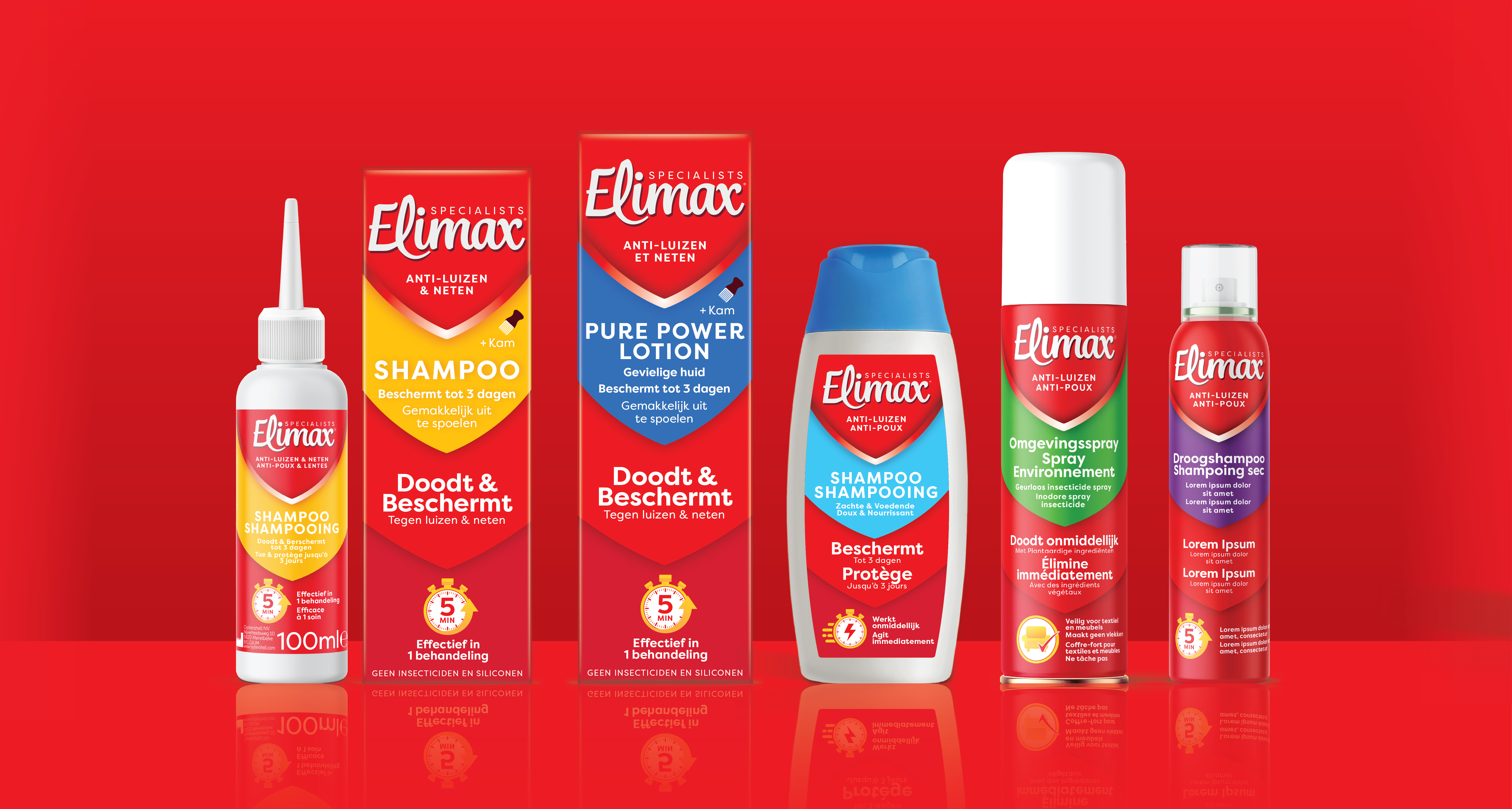
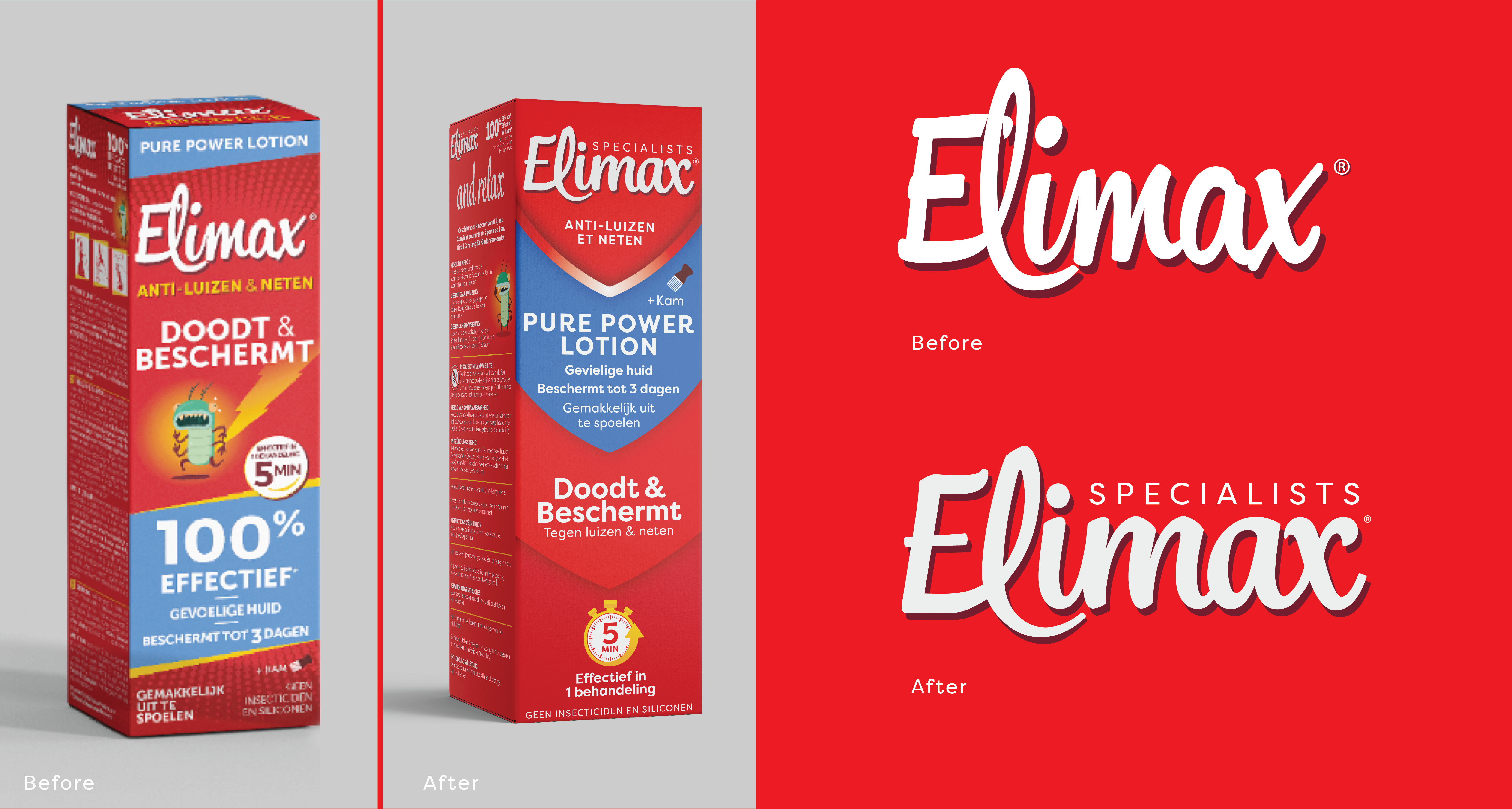
The refreshed identity introduced a clearer, more legible wordmark, now housed within a protective shield icon to reinforce cues of speed and safety. Elimax’s distinctive red remains central, supported by a burgundy secondary tone and a colour-coded system for easy product navigation across the range. Tone of voice, messaging and visuals were crafted to balance efficacy with empathy — providing essential information while making the brand feel calm, credible and ready for what’s next.


Role:
Brand Strategy, Identity, Packaging, Guidelines

Similar Projects

FTB Free The Birds
Sign up for our monthly news and views