Understand First
The territory of ‘a mother’s love for her baby’ was the property of Johnson & Johnson. Dove (as the established brand for women’s self-esteem and for moisturising care) was in prime position to challenge this position.
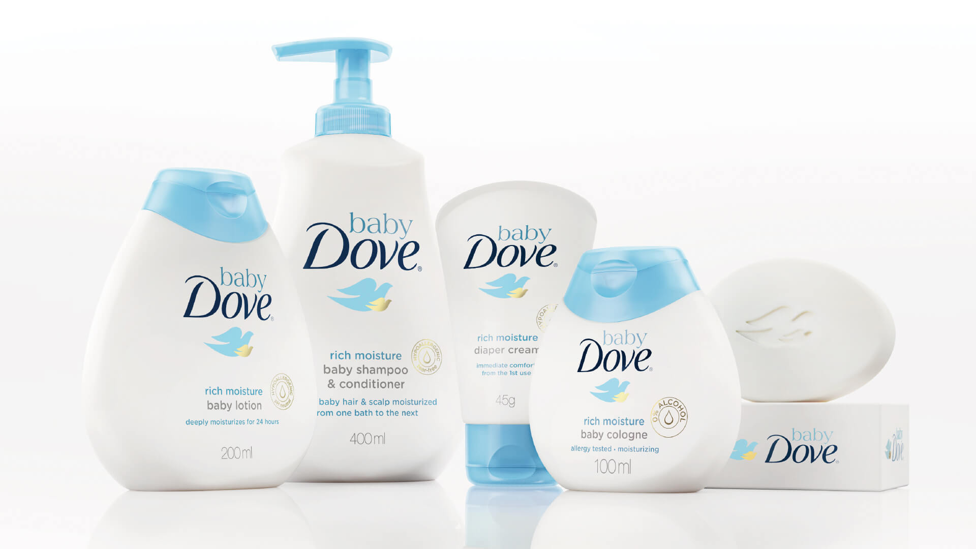
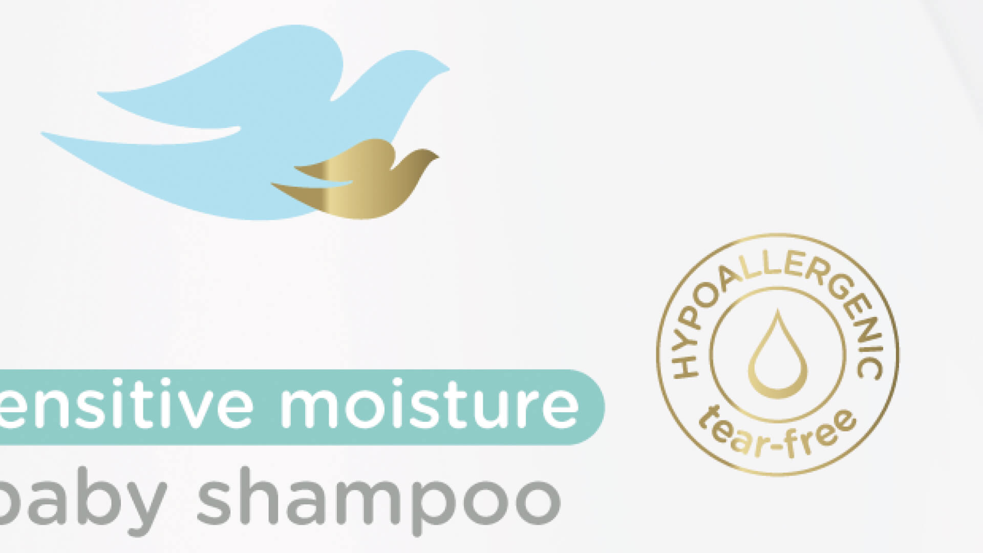
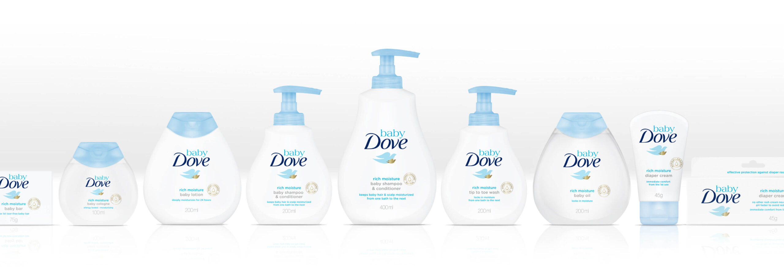
Presented with the challenge of introducing a sub-range whilst retaining the creative principles of Dove, we introduced the ‘gold baby dove’, representing a mother’s love for their child and the protection they will give it. There were two variants within the range (Sensitive and Normal) so we needed to differentiate between the two as well as propose a design framework that would allow space for new formats to enter the portfolio. We worked in close partnership with the structural design team to ensure we maximised the graphics space, given the unique silhouette of the packaging.
Following a successful launch in Brazil which exceeded all expectations, Baby Dove has now launched across the globe.
