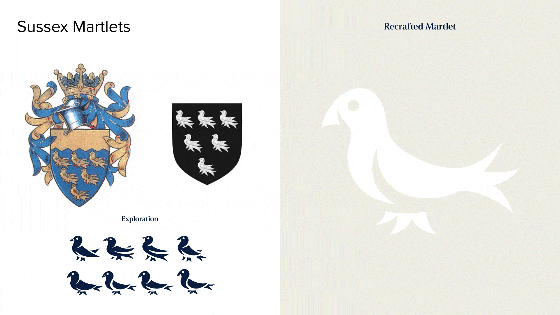
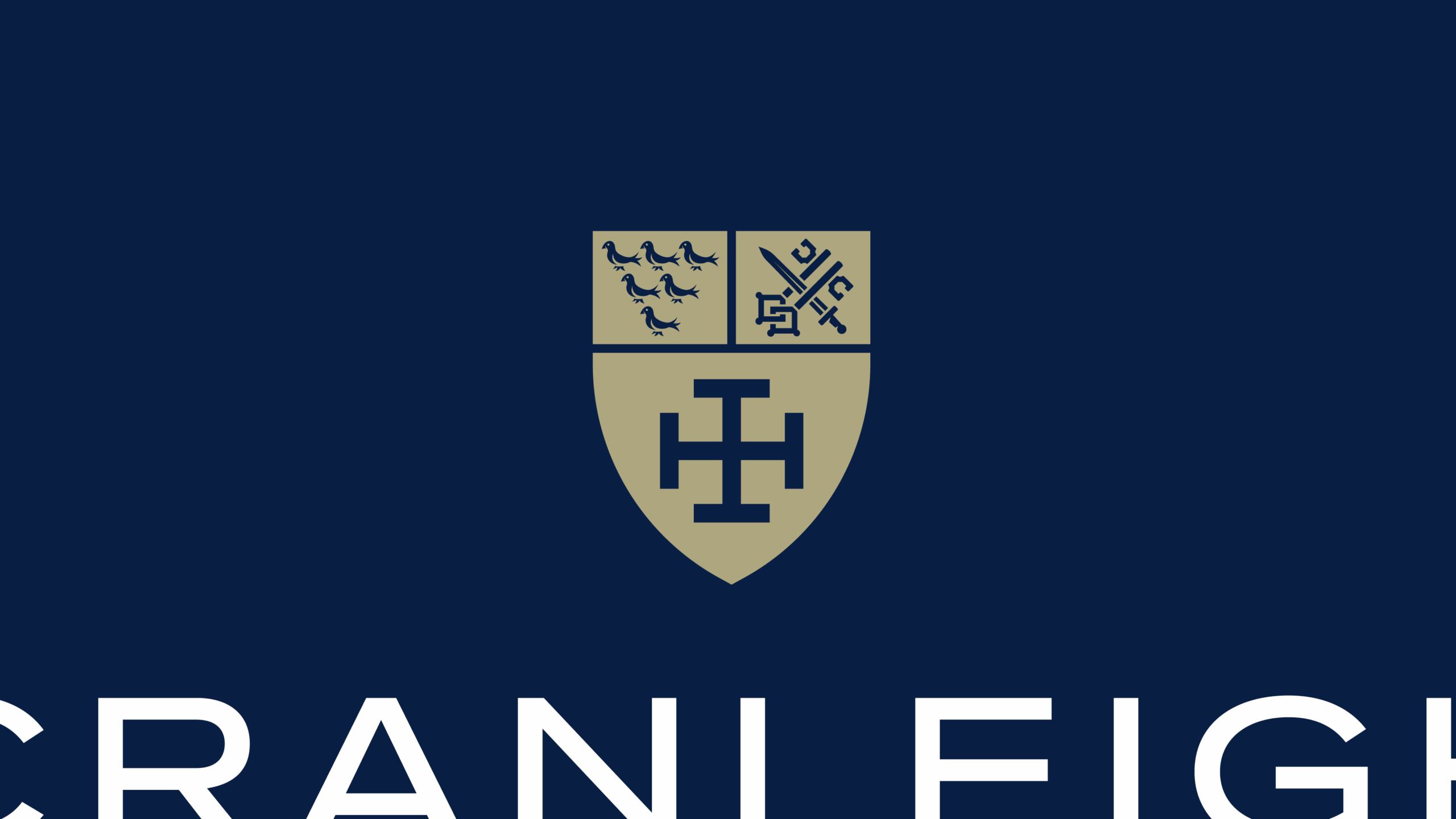
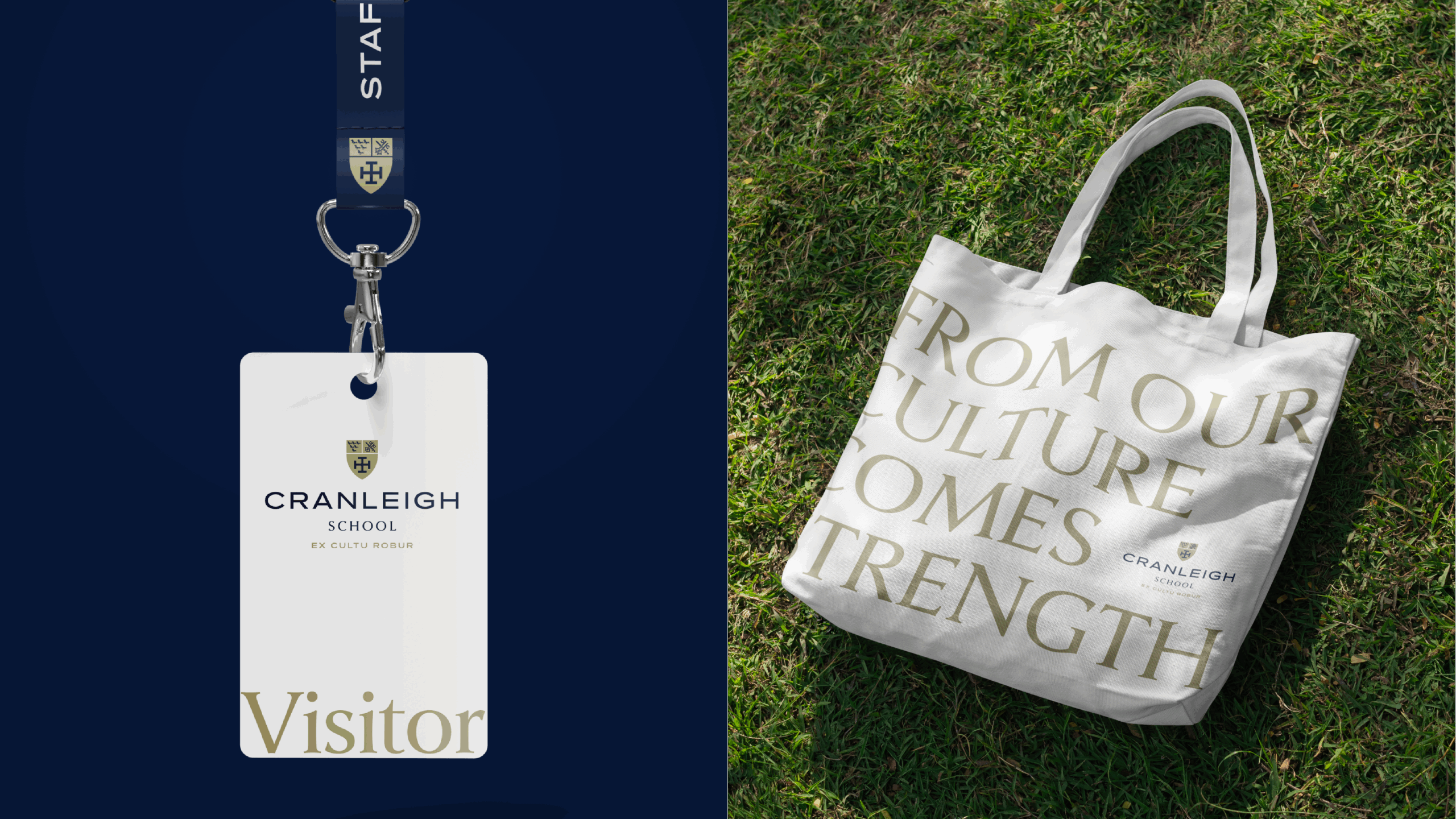
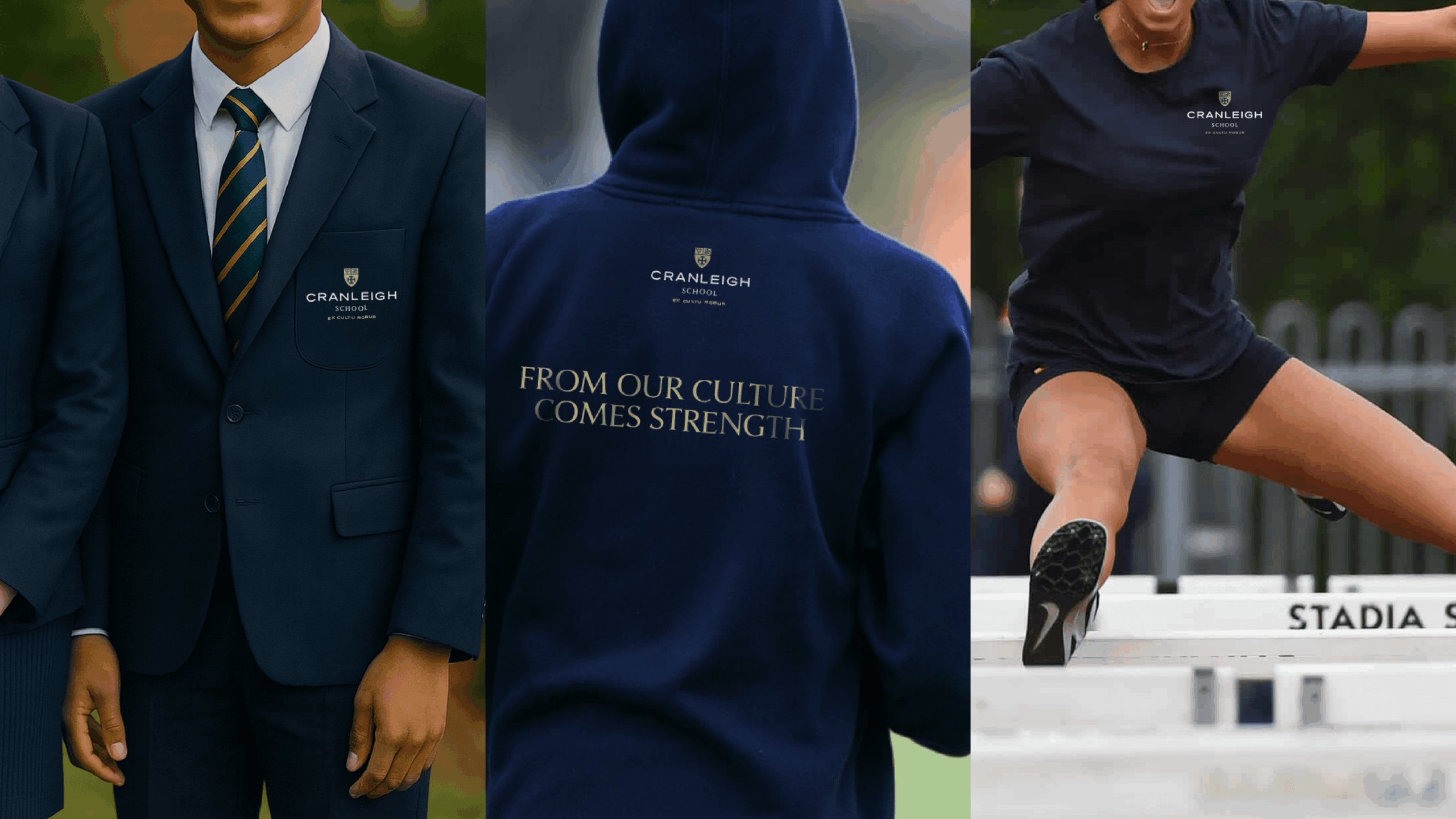
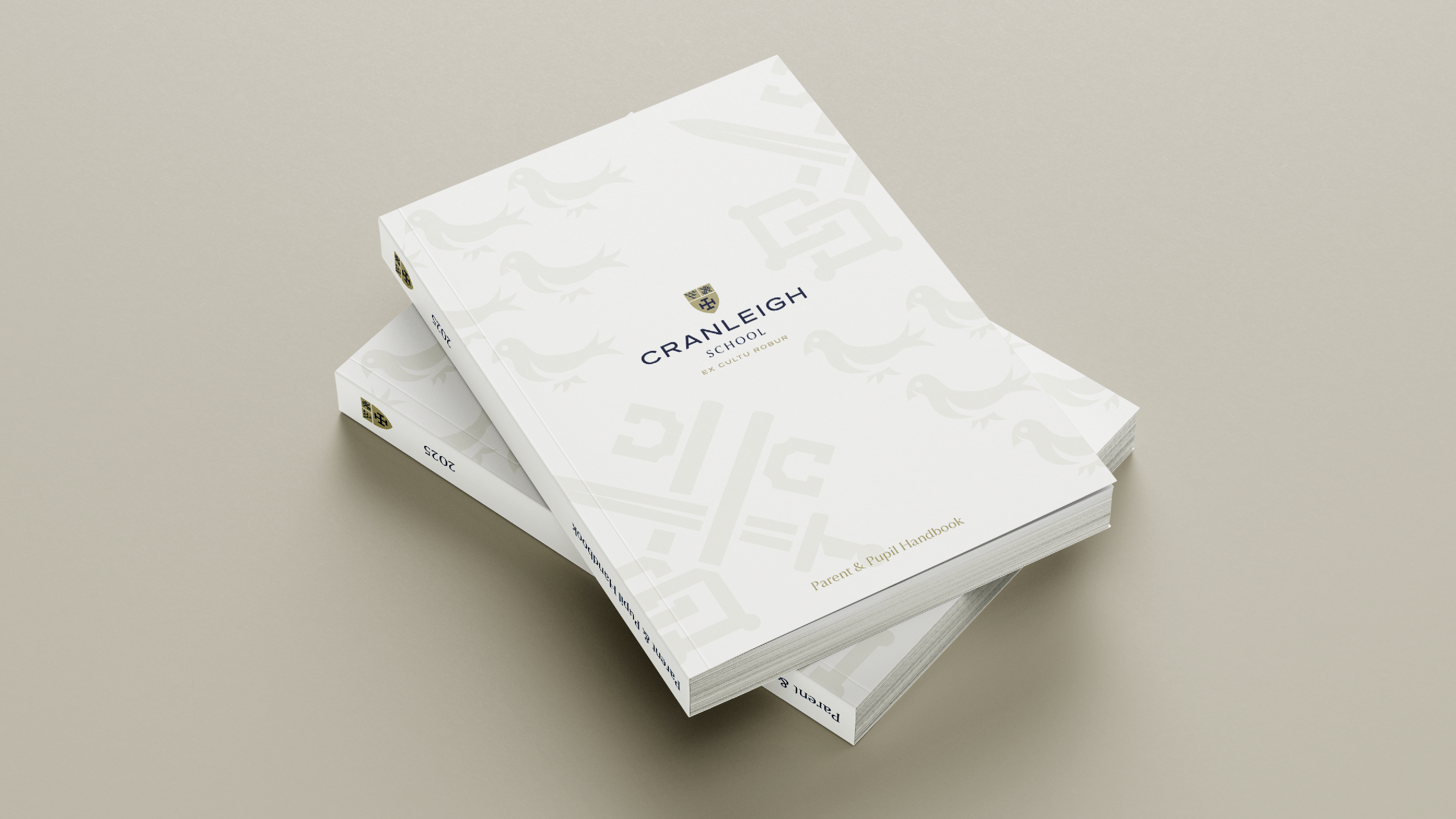
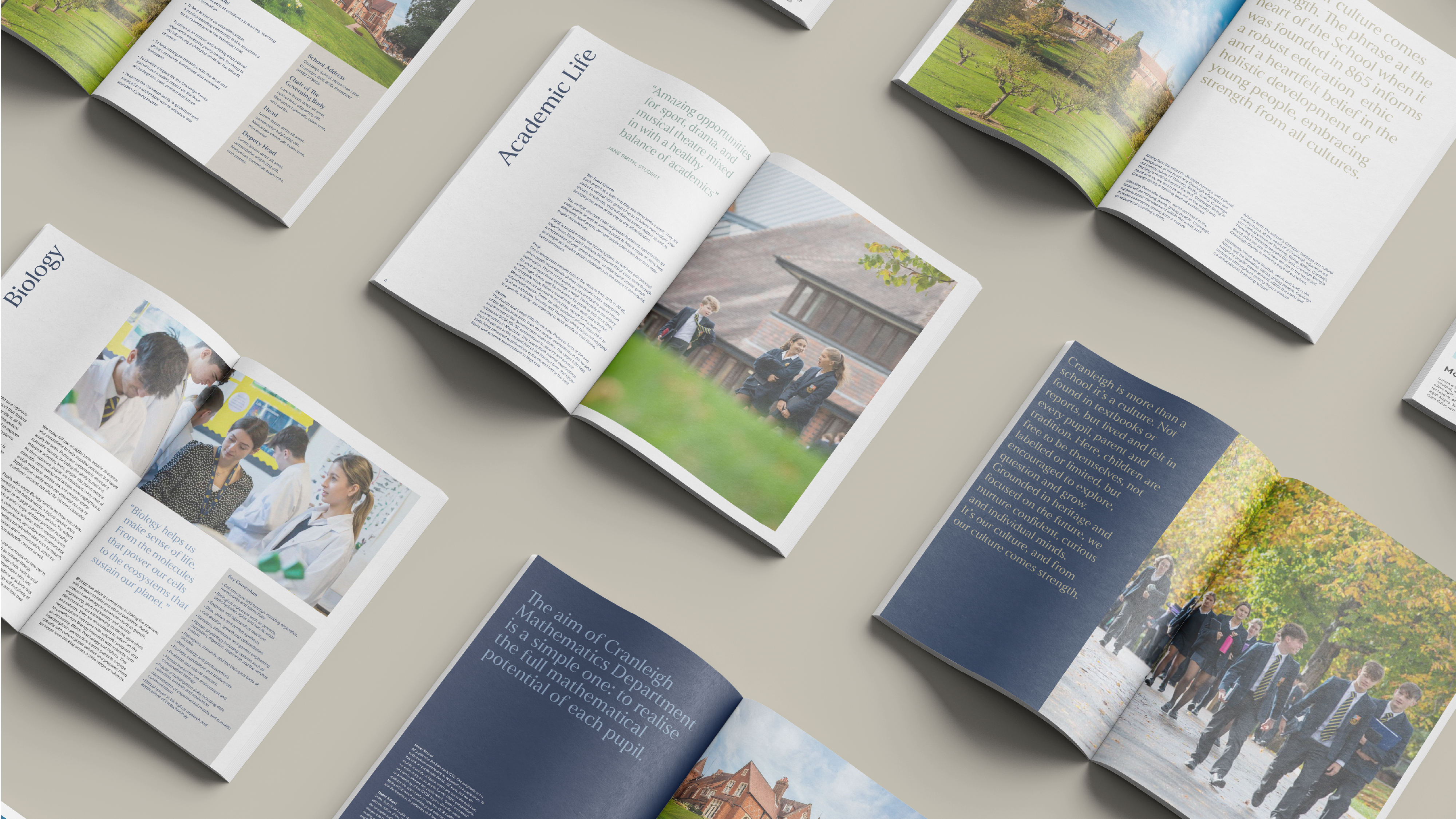
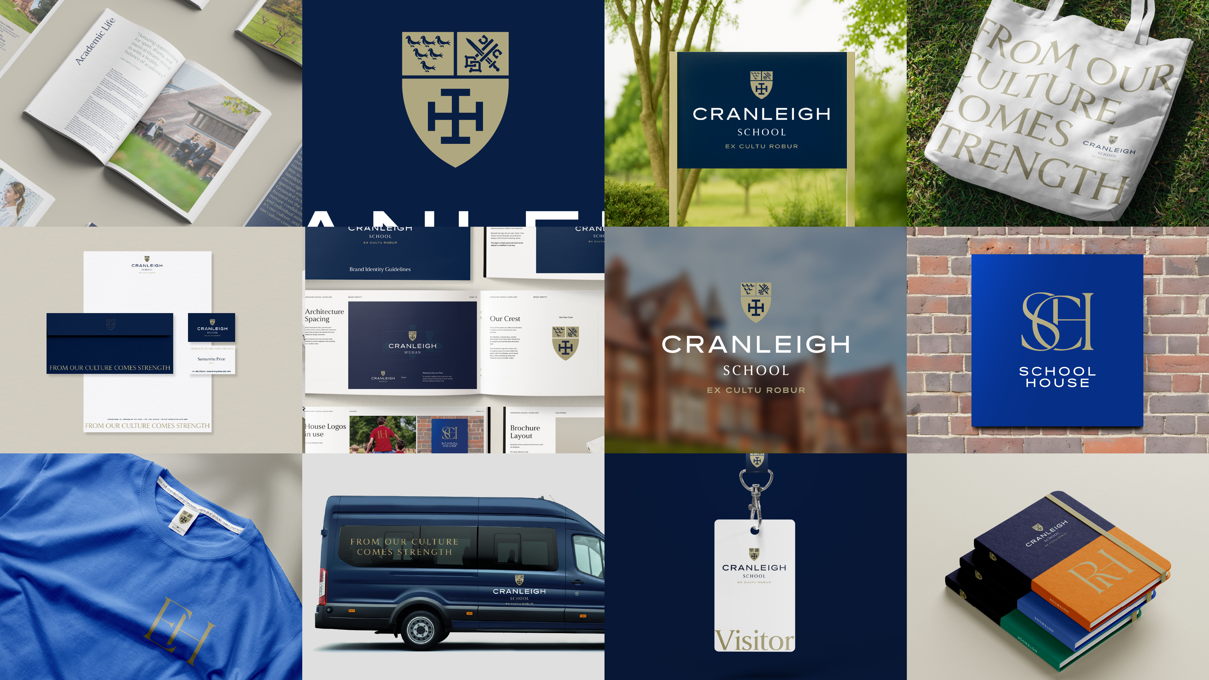
Free The Birds set out to craft an identity that distilled Cranleigh’s character into a system both timeless and future-facing. At the heart of this evolution was the school crest – a treasured emblem featuring the crossed keys, martlet bird and Winchester cross. While rich in symbolism, the complexity of the previous design made it difficult to scale across applications, with heavy outlines collapsing and details becoming illegible. Our response was to refine and simplify. By employing negative space to create subtle shadow and depth, the crest now retains clarity at every size, ensuring it can be applied with confidence across signage, uniforms, marketing and digital platforms.
This modernised crest was paired with an evolved interpretation of the school’s motto, Ex Cultu Robur. By shifting the translation from “From culture comes strength” to “From our culture comes strength”, the phrase becomes anchored in the lived experiences of Cranleigh’s students, teachers and wider community – making a historic motto feel owned and relevant today.
To further unite Cranleigh’s identity, we designed bespoke monogram logos for each of the eight school houses. This family of marks celebrates individuality while reinforcing collective belonging, giving every student a symbol to rally behind. The updated brand system also extends to guidelines, marketing templates and communications assets – creating a cohesive suite that unites tradition and innovation, and sets a strong foundation for Cranleigh’s next chapter.