Understand First
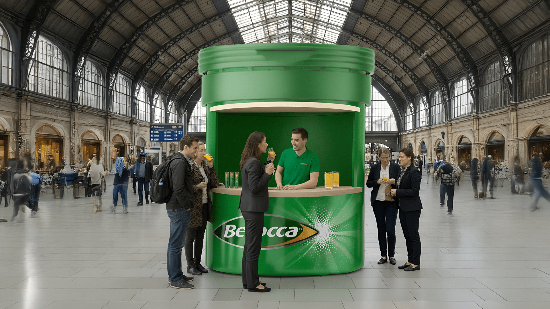
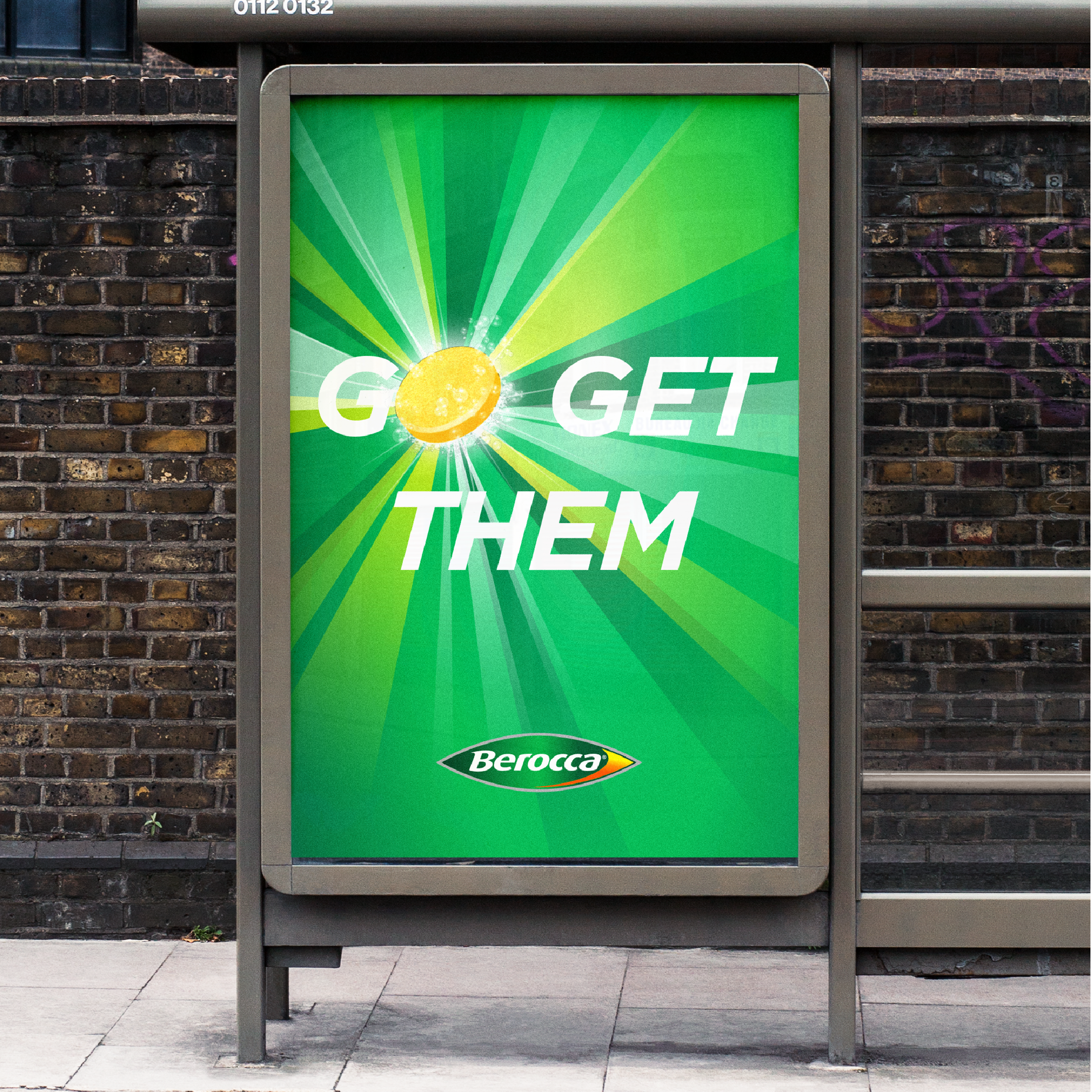
Berocca came to us at a time when the brand was losing its competitive edge. In need of a dose of its own medicine, our team recognised the significant potential to make the brand fizz.
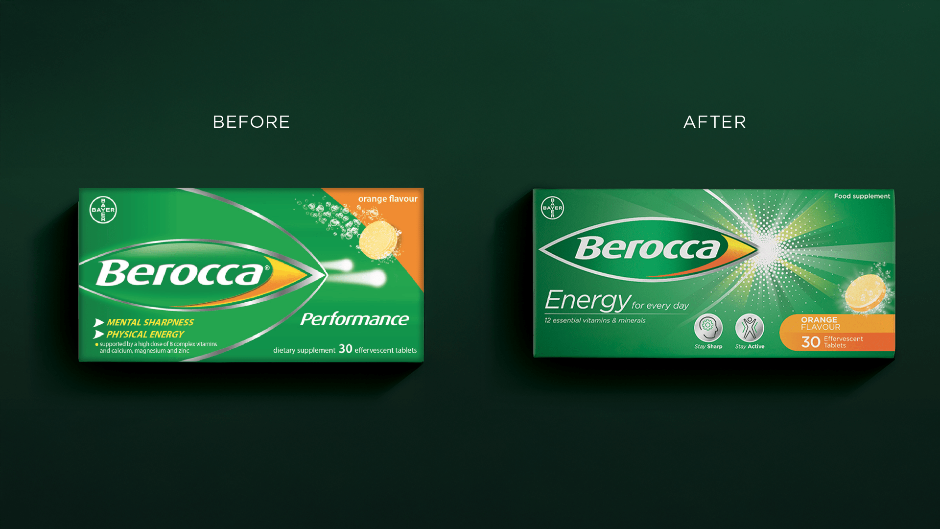
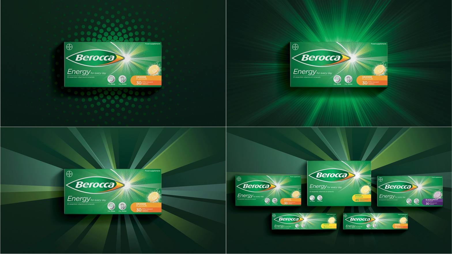
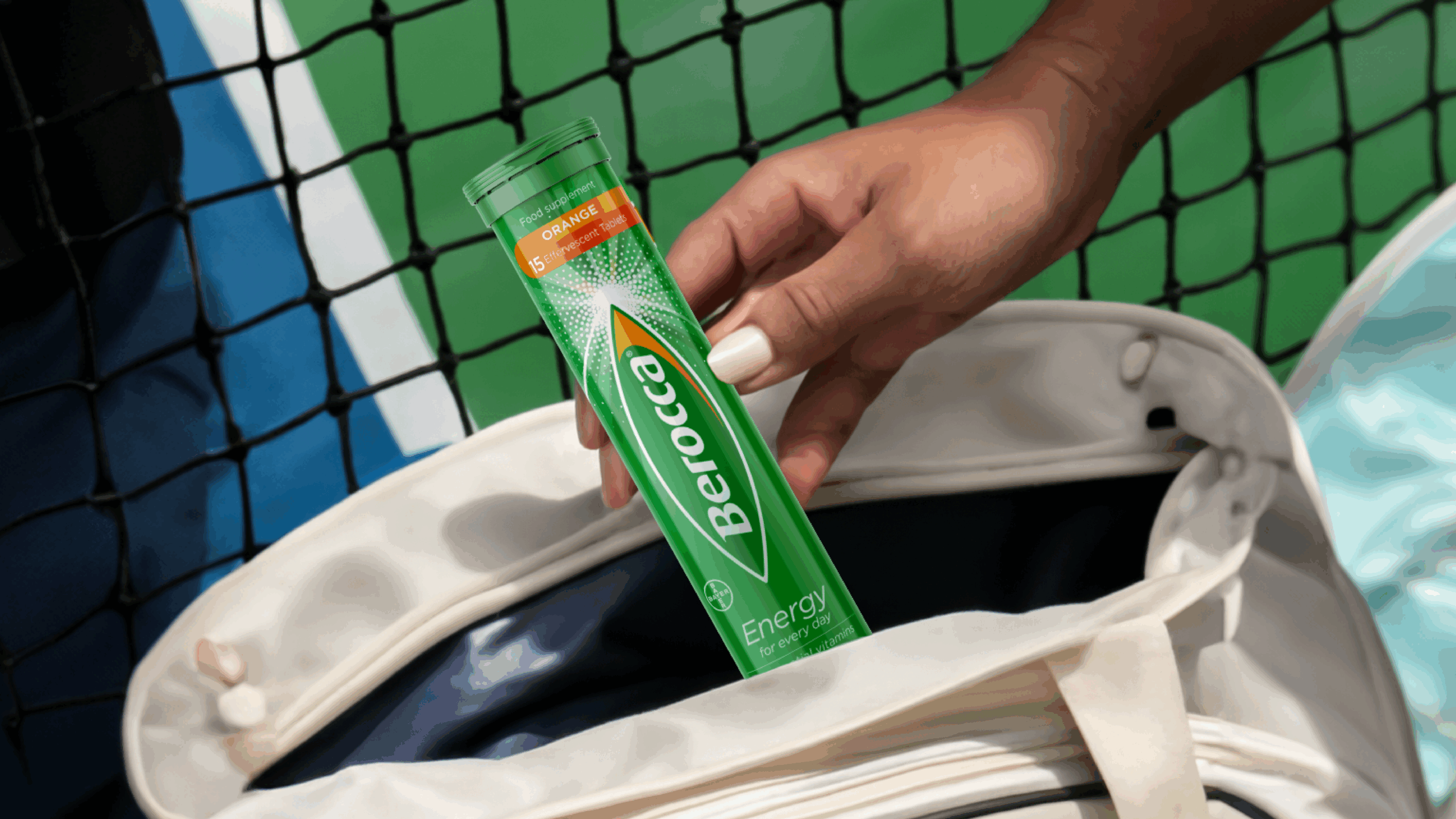
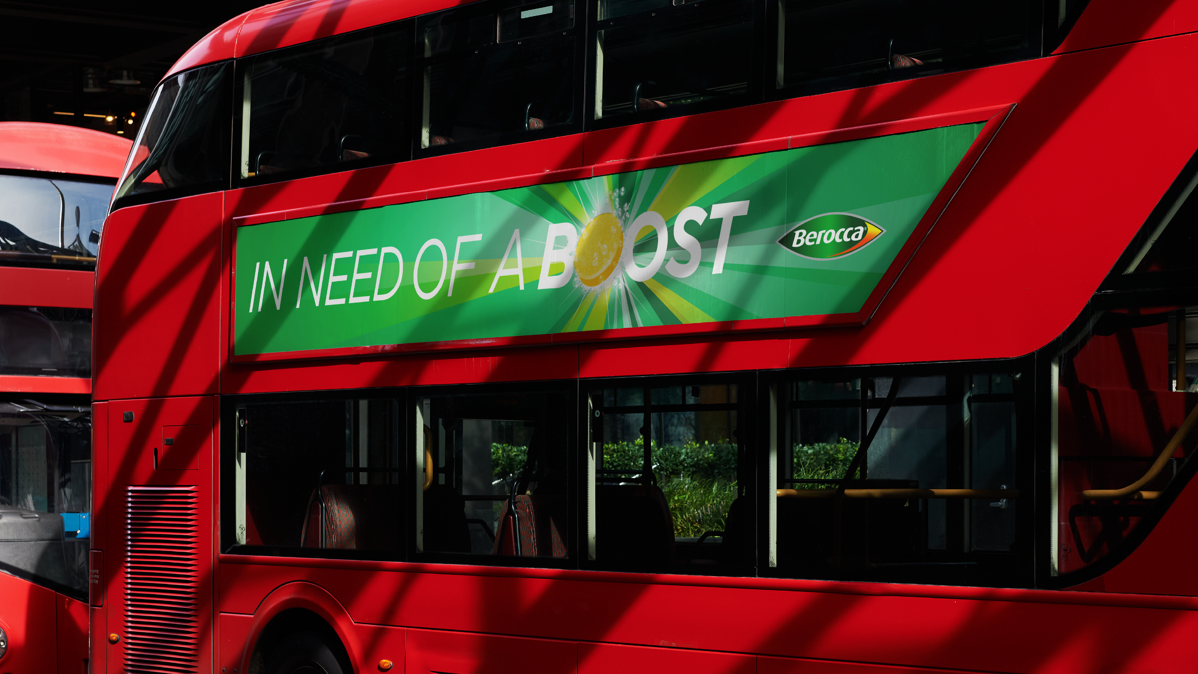
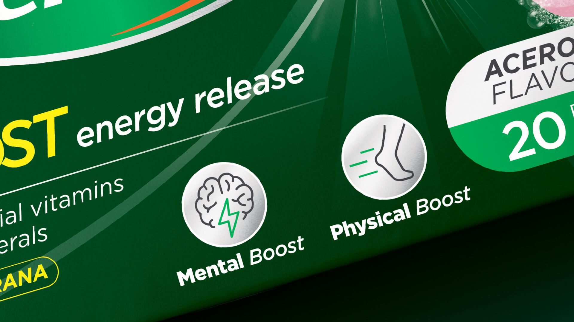
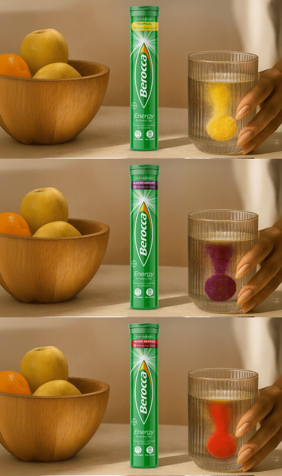
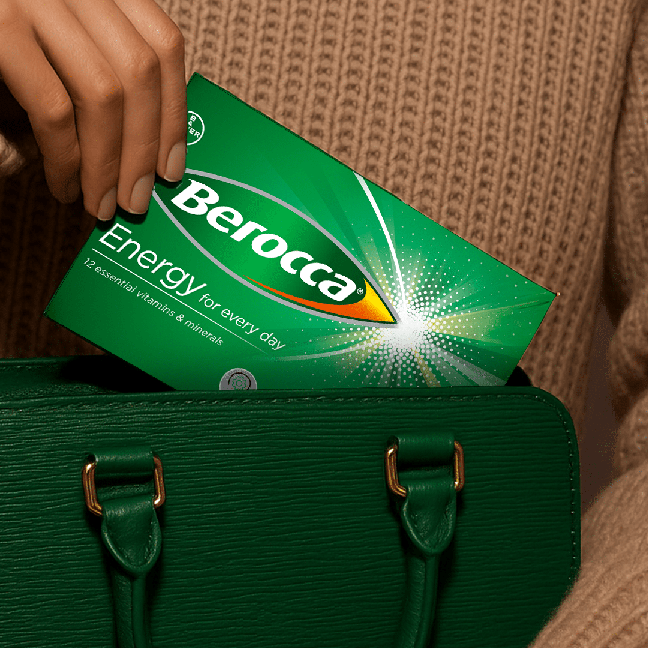
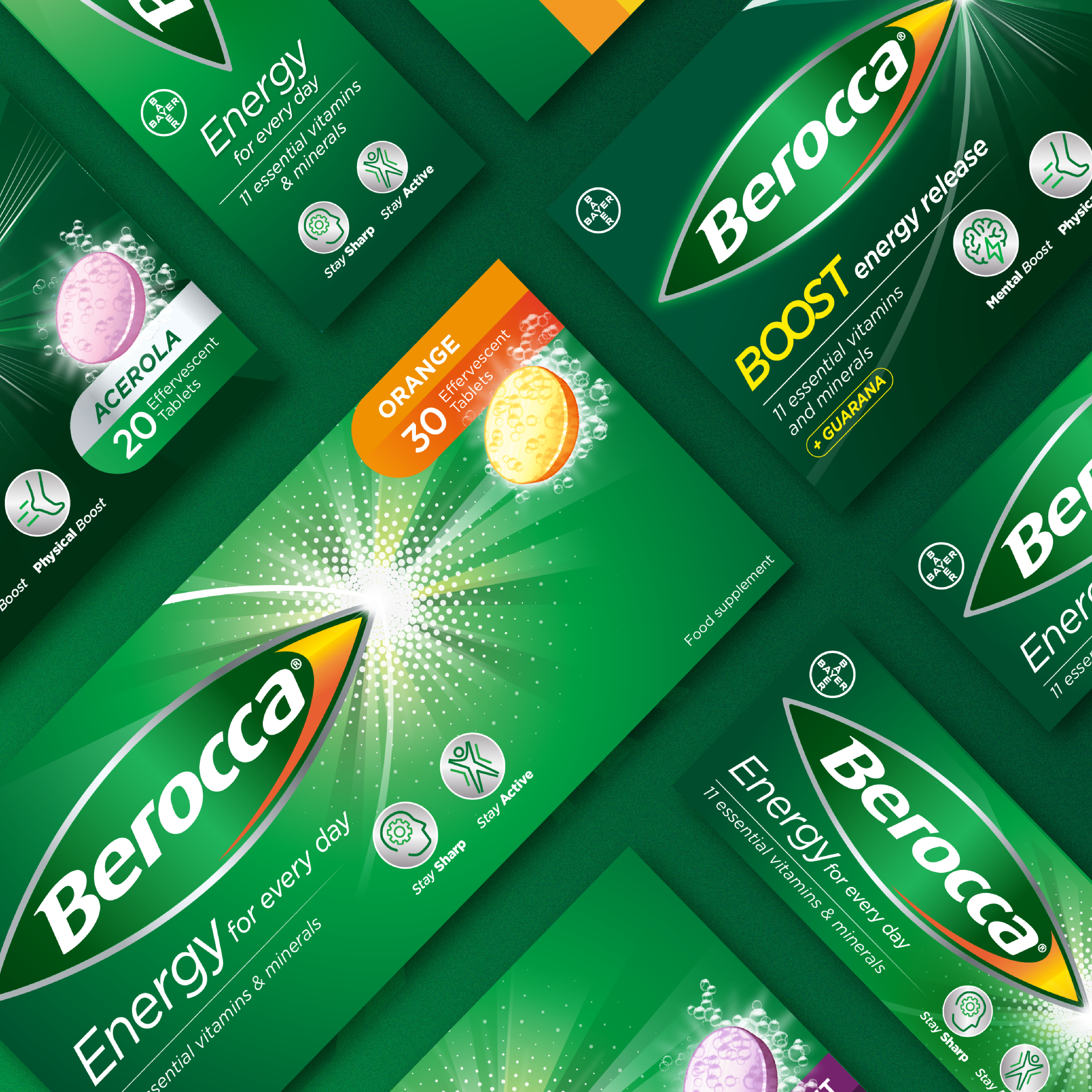
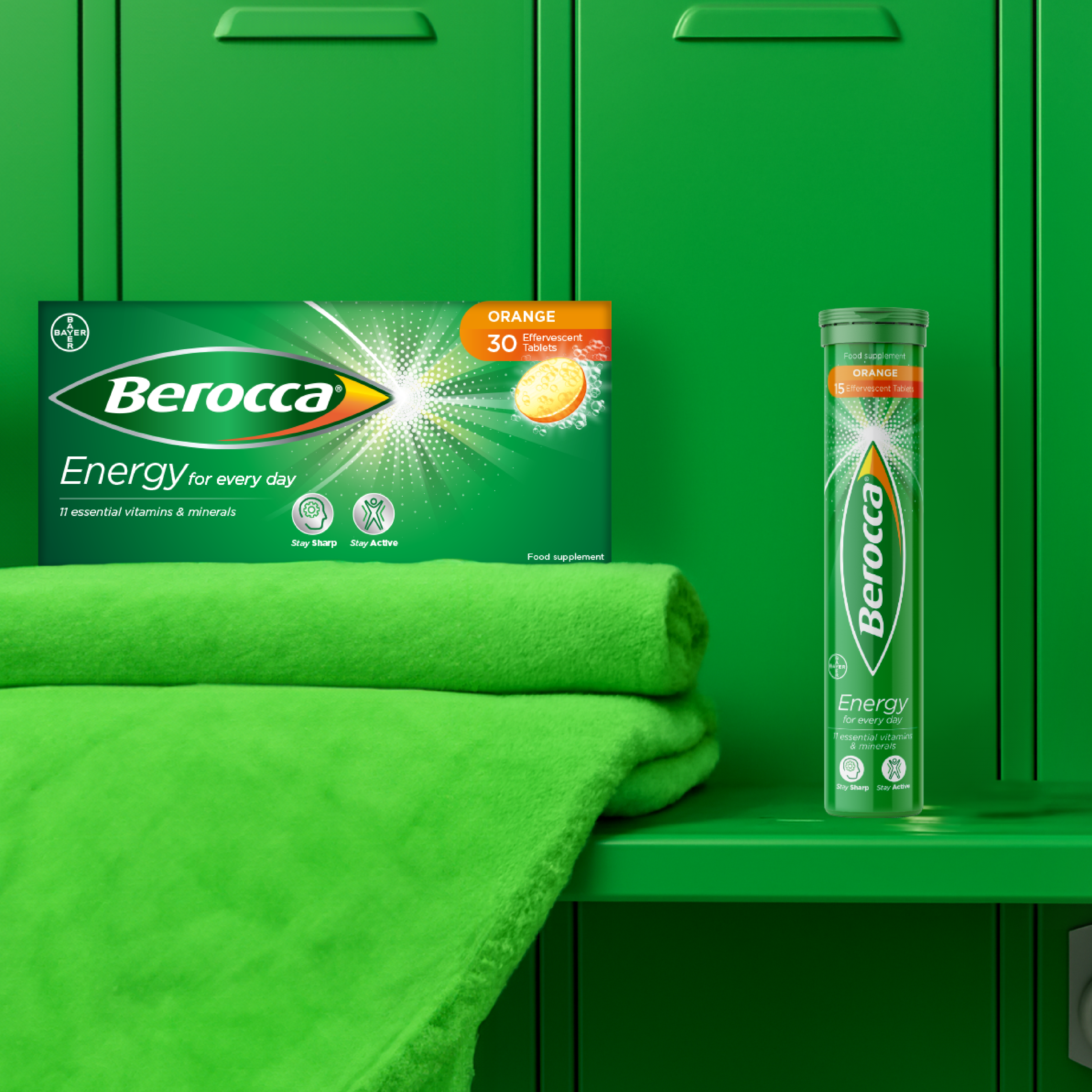
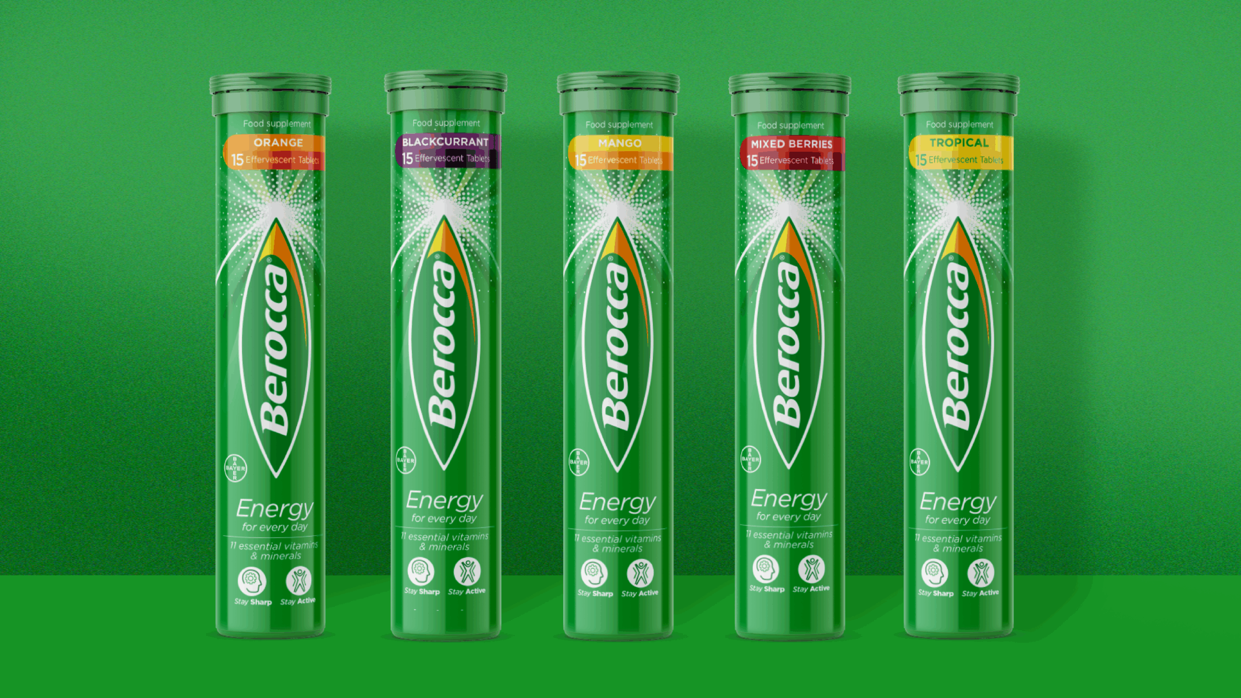
The new packaging design was created to reflect Berocca’s renewed ambition “to unleash positivity” for consumers. The renowned bullet logo evolved into a modern, confident identity that conveyed stronger authority.
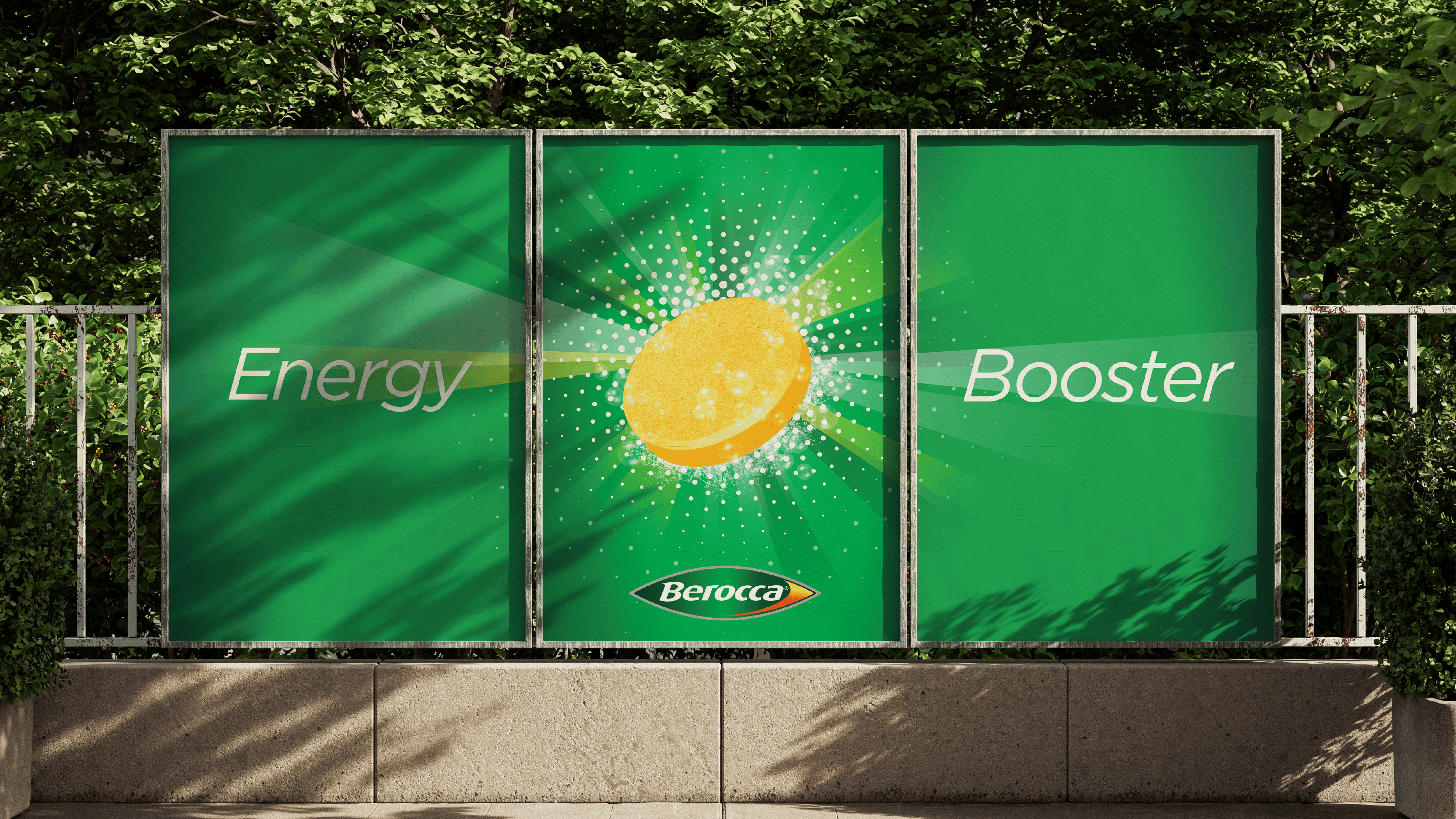
Importantly, the brand refresh ensures ease of customer navigation on shelves and differentiation between core products with distinct purposes; those that deliver “energy” through the day, and those that offer an instant hit “boost”.
The scientific properties are conveyed with greater authority, redesigning the back of each pack in an inviting layout which outlines product benefits alongside clinical evidence.
“Our brand needed a refresh in order to further engage the consumers, who are putting self-care and wellbeing at the forefront of their shopping experience. Free The Birds has been an excellent partner to our brand journey and has reinforced our product benefits on pack, whilst remaining consistent with our legacy.”
