Understand First
Bepanthen Global saw an opportunity for the brand to compete in the Medicated Skincare category. We identified the ability to leverage the brand’s heritage and the trusted efficacy built over decades amongst consumers and healthcare professionals.
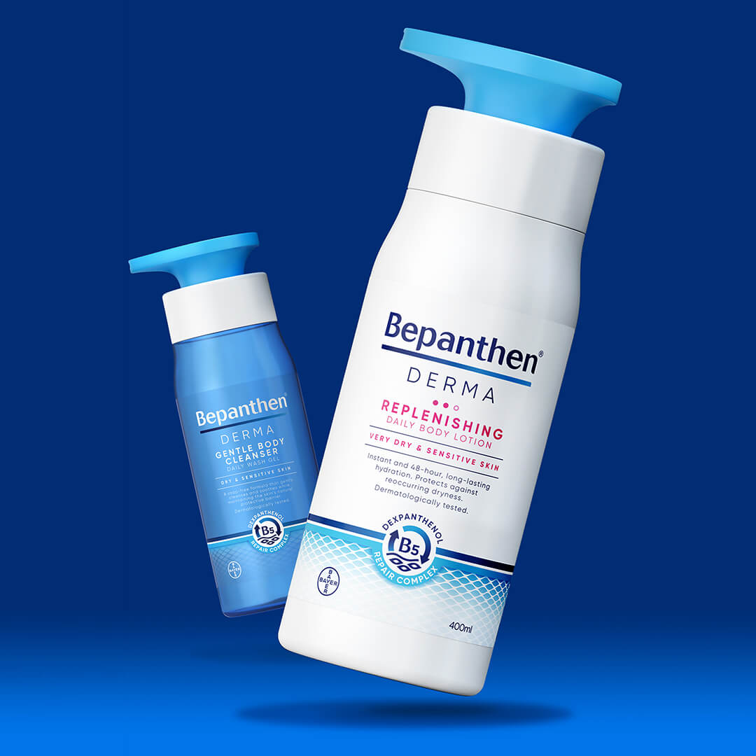
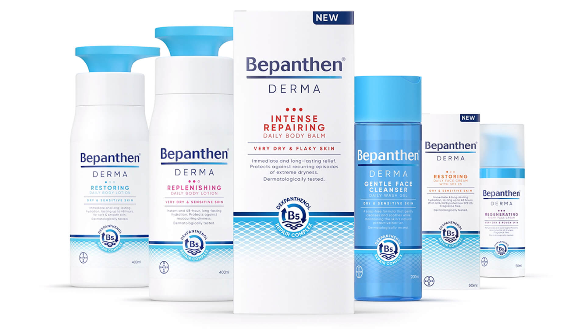
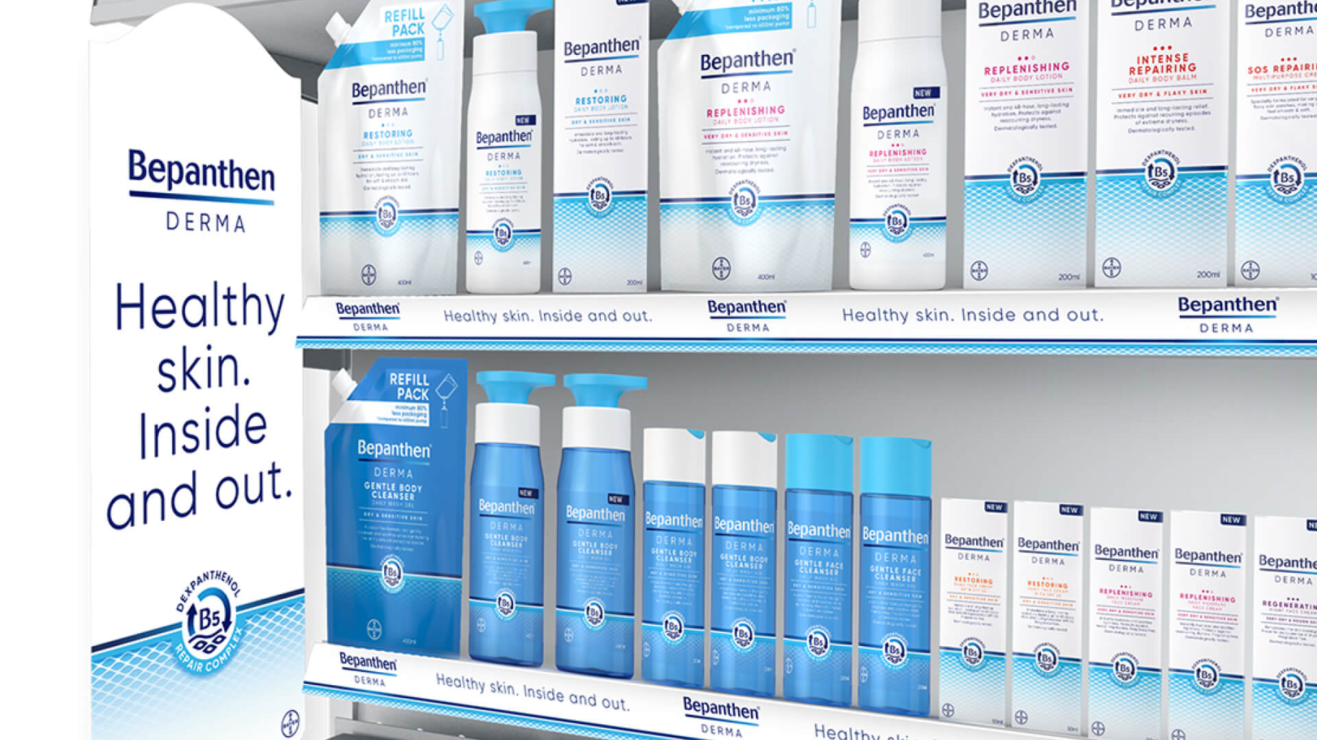
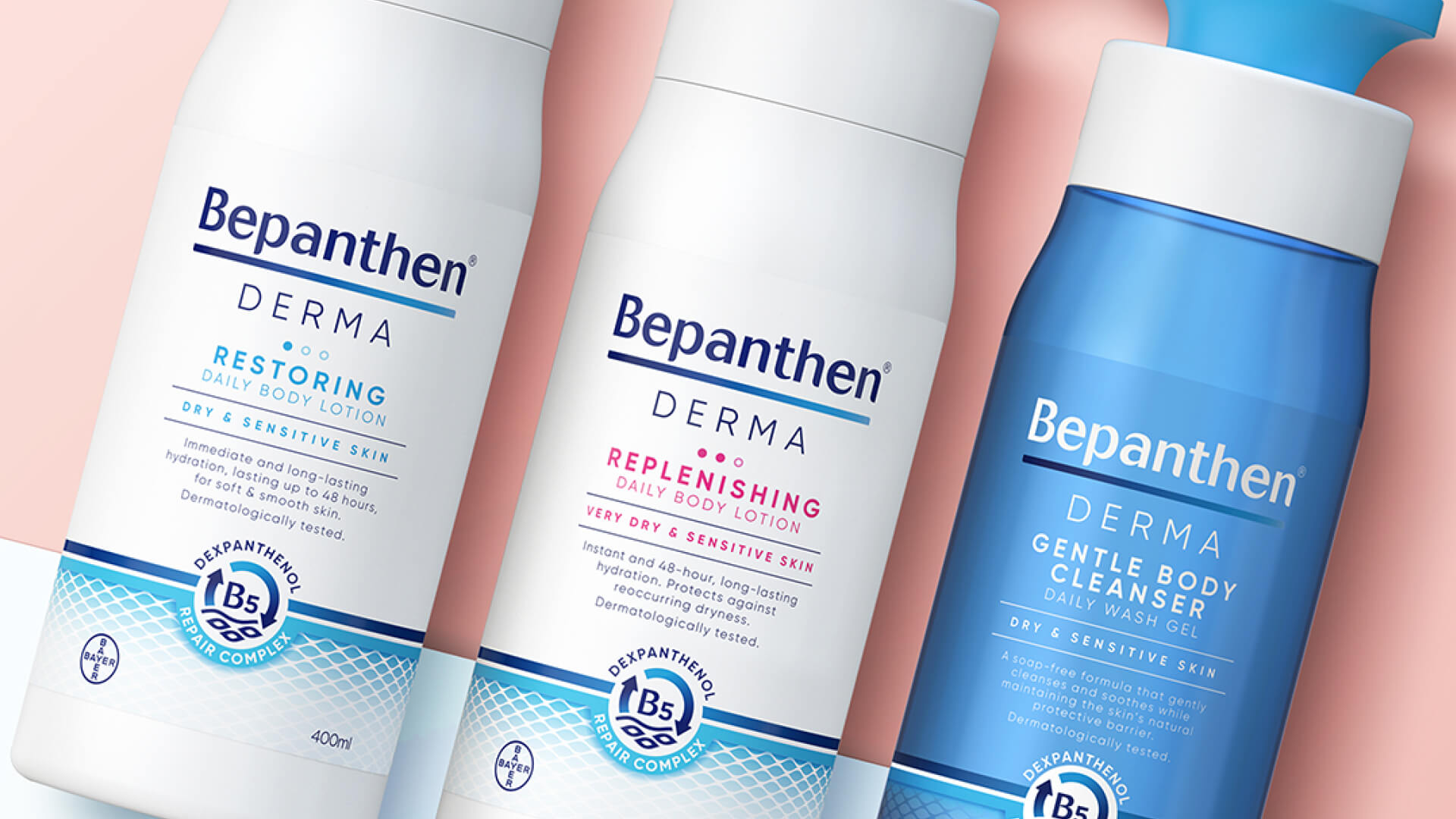
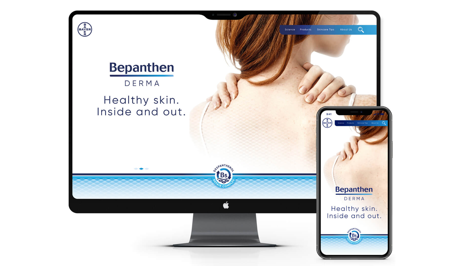
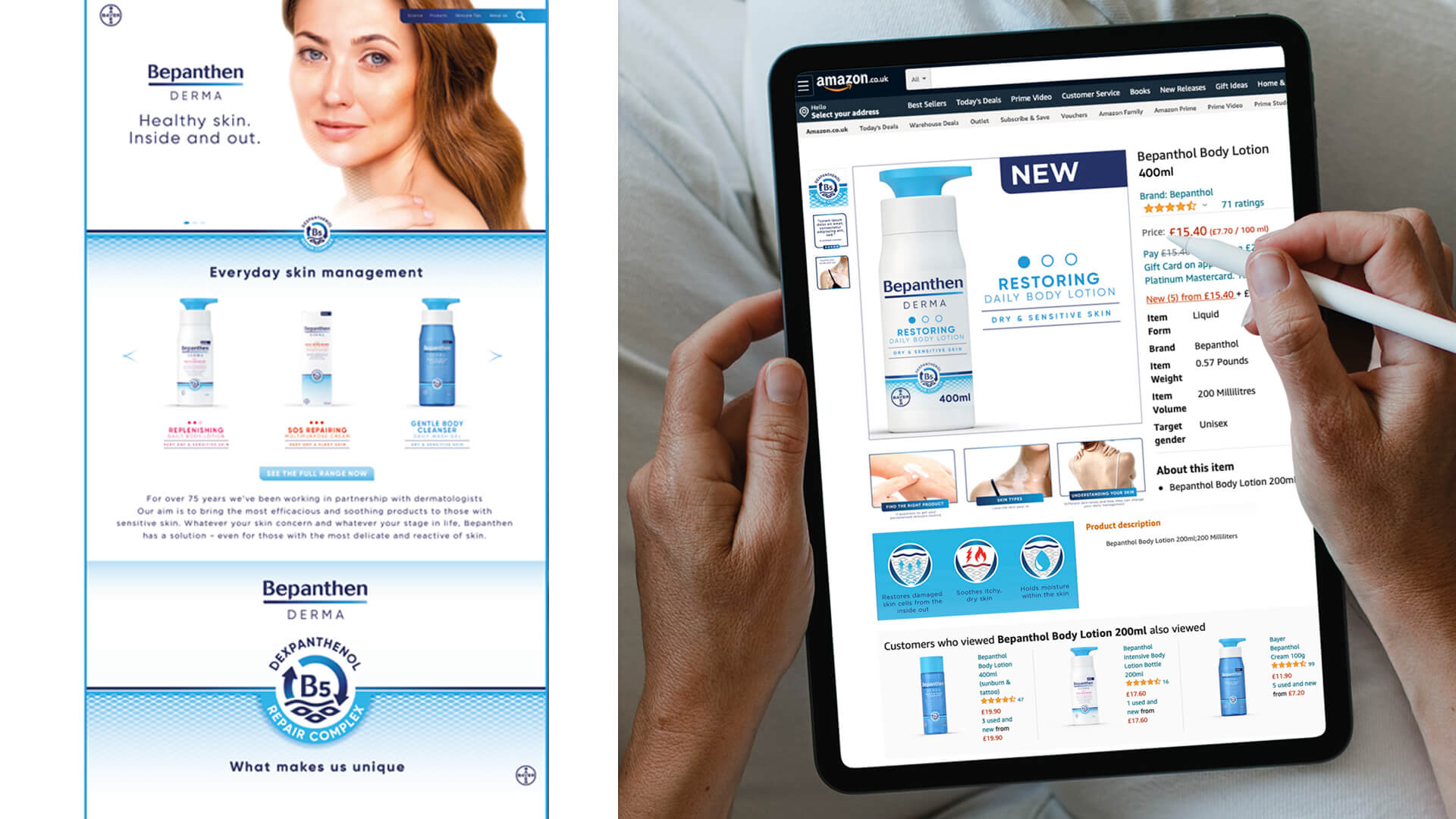
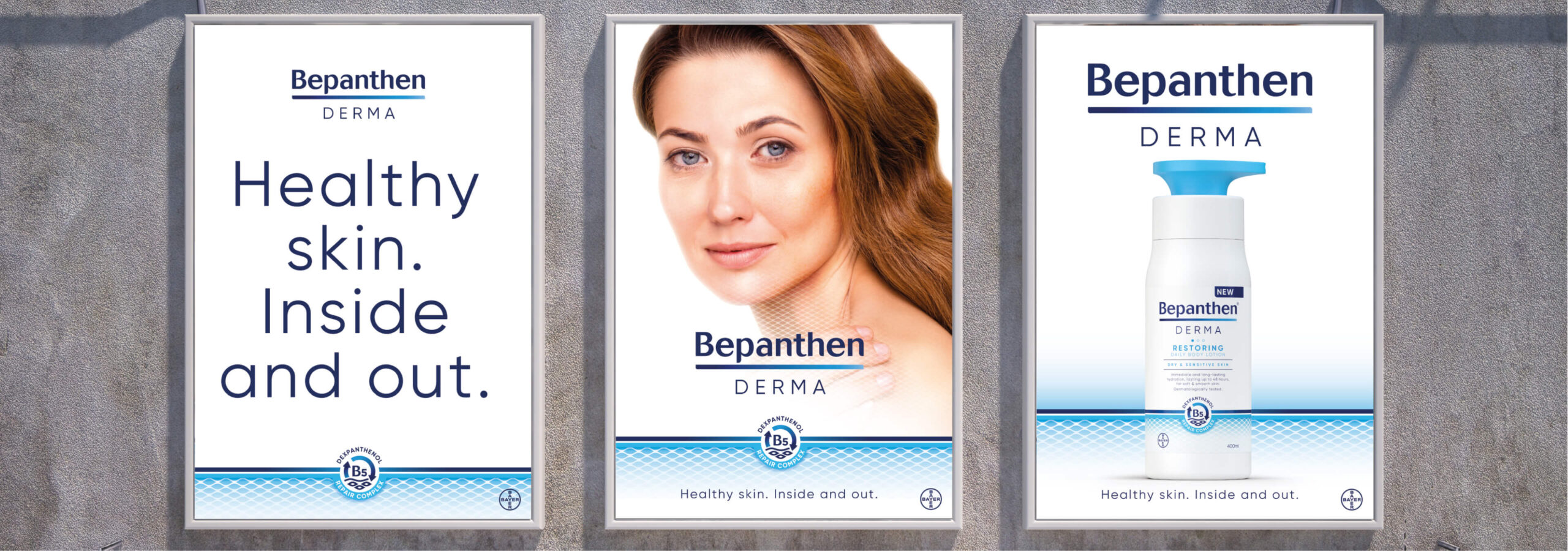
The new packaging design beautifully translated the science of Bepanthen Derma’s unique mode of action. The design depicted the skin’s surface and cell layers over a gentle gradient, communicating a clear sense of action in skin barrier repair.
The graphic is paired on-pack with a ‘B5 icon’, signposting the signature ingredient and the efficacy that Bepanthen Derma brings to daily skin management. The confident new logo lock-up conveys a sense of trust, heritage and expertise, with the inclusion of the blue gradient in the underline providing another nod to the healing process.
“We are very excited about launching the new Bepanthen Derma branding and bringing the products to a wider audience of consumers seeking a proven solution for the daily management of dry skin. Free The Birds have been invaluable partners to work with throughout this process and we are delighted with how they have evolved the brand whilst maintaining a strong connection to the heritage and scientific efficacy that we are so proud of.”
