Alleyn’s: Championing rich heritage in refreshed identity
Modern retelling of historical elements. A celebration of core values. Consistent communication across all touchpoints.

Understand First

One of the UK’s most highly regarded independent schools, Alleyn’s sought a refreshed identity with new, modern positioning. At the same time, the identity was to remain loyal to the values established by founder Edward Alleyn in 1619.

Beautiful Thinking

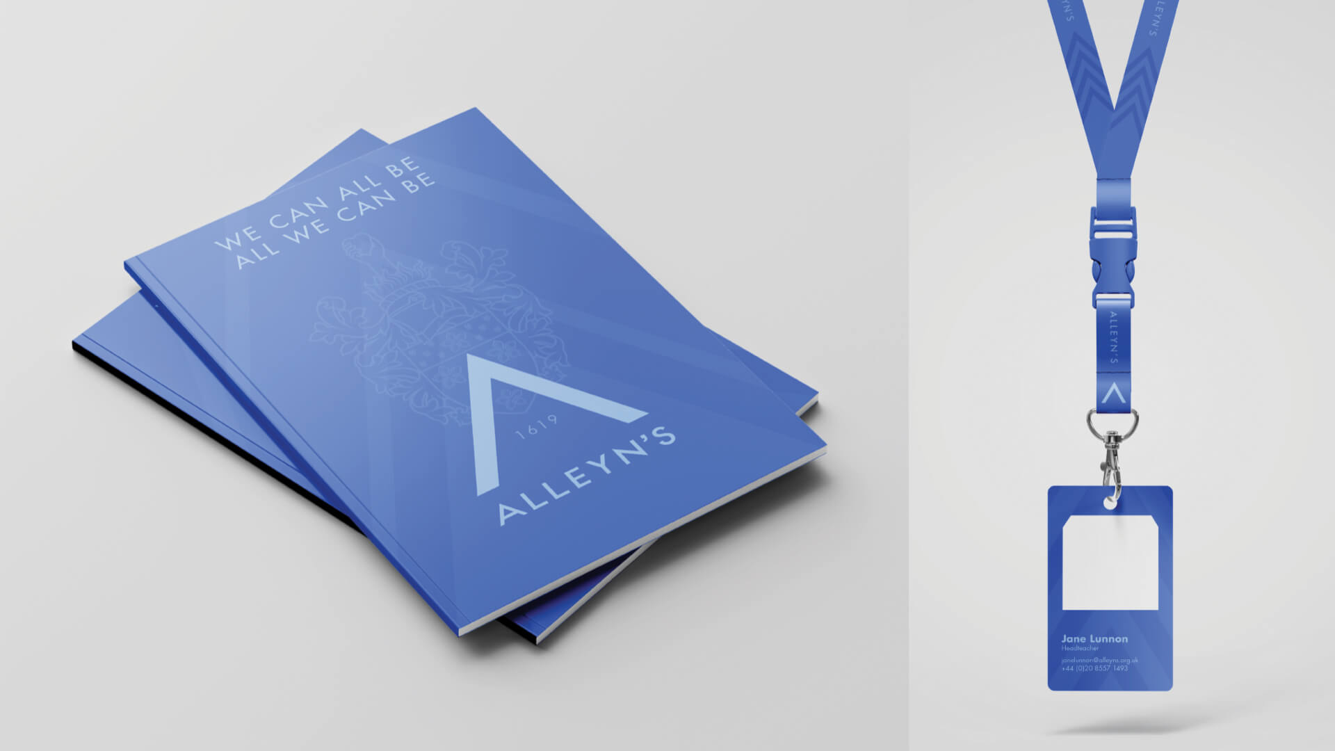
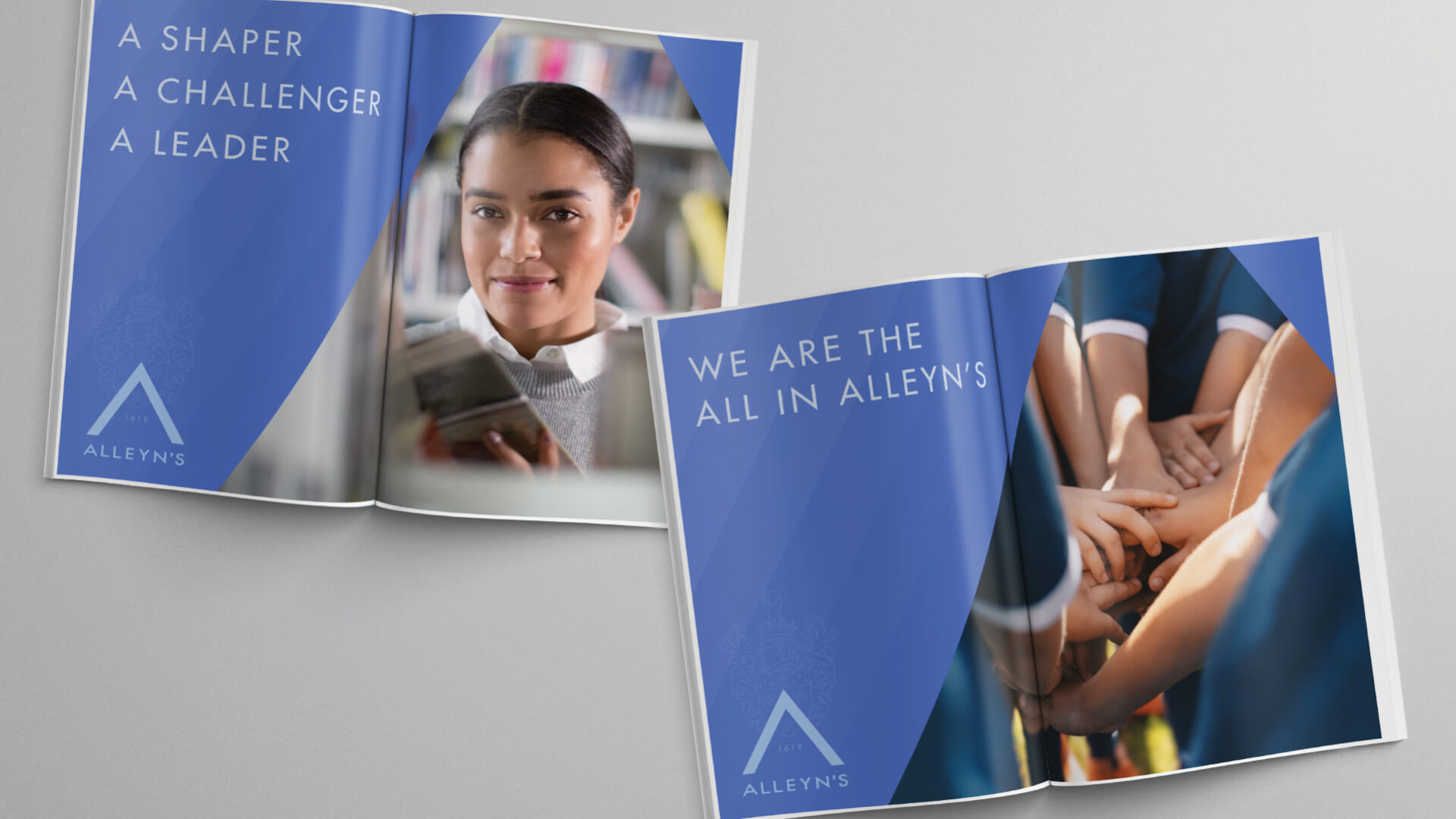
Whilst honouring important historical elements of the school, the brand identity ensured that Alleyn’s is consistent across numerous marketing touch points as well as potential future subsidiaries. The project introduced a new manifesto and tone of voice, as well as a Brand Bible outlining how the new distinctive assets can be deployed. 

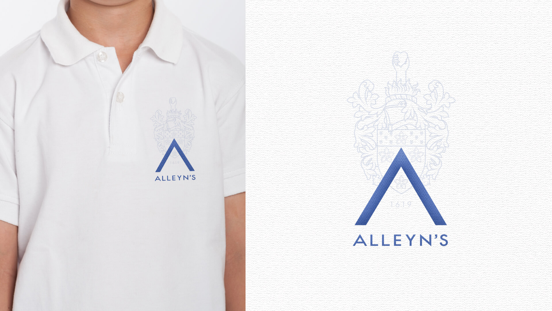
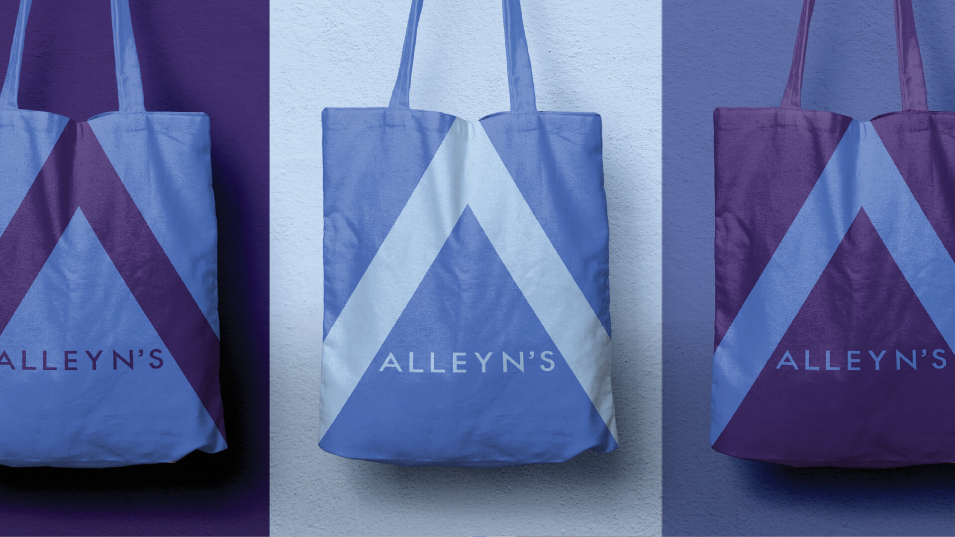
The logo, a key historical consideration treated with great care, features a simplified illustration to retain the original crest identity, with key modern additions. The cornflower blue becomes the principal colour, based on Alleyn’s favourite flower and which represents hopeful optimism for the future. 


Jane Lunnon, The Head of Alleyn’s

“It is very important to us at Alleyn’s that we celebrate the character, essence and success of our school over the last 400 years as well as ensuring that it endures. The heart of our legacy and our dreams for the future find expression in our visual personality: a dynamic and vibrant force that resonates with pupils, staff and parents past present and future. Free The Birds’ artistry has brought this to life. This revitalised identity blends across all aspects of our self-expression in a contemporary and clean way, weaving intricacies that pay homage to our founder and storied history. We are very grateful for this transformative journey.”

Role:
Brand Strategy, Brand Identity, Copywriting, Artwork, Brand World, Brand Guidelines

Similar Projects

FTB Free The Birds
Sign up for our monthly news and views