Beautiful Thinking.
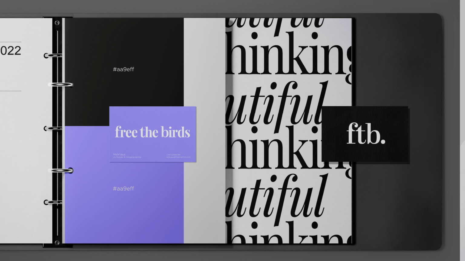
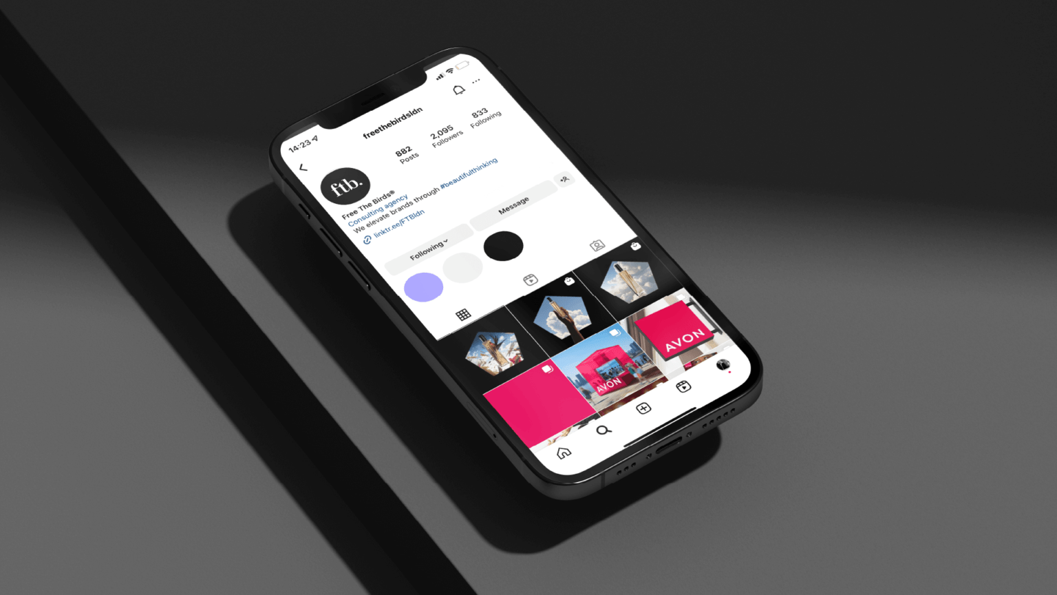


The first since our launch as Free the Birds back in 2018. As an independent brand elevation agency, we specialise in Beauty, Health, Homecare, and more. We deliver design, communications, content and strategy for major brands around the world, all powered by what sets us apart – Beautiful Thinking. Our refreshed design is a testament to the growing recognition of the award-winning, memorable and meaningful work we deliver to our clients.
Our new look and feel also celebrates our core value of Beautiful Thinking; our desire to elevate our clients’ businesses above the everyday, injecting soul into every element of a brand’s identity in order to help them create stronger connections with their customers.
This rebrand also aims to elevate the story behind our name, which our partners, Managing Partner Nick Vaus and Creative Strategy Director Paul Domenet, uphold upon every introduction to the business.
When famed artist Leonardo da Vinci would see a caged bird for sale in the Florentine markets, he would purchase them simply for the pleasure of liberating them. Half a millennium on, it is this – as well as the compassion which this story inspires – which influences the ideas and the work we produce for our clients every day.
This new identity follows a year which included a global rebrand of renowned heritage beauty brand, Avon, as well as the launch of our own award-winning product, Beautiful Thinking. This functional room fragrance, designed to work on a mental and olfactory level to enhance imagination and focus, donating all sales to Create, a charity that empowers young people via the creative arts.
The refreshed visual identity comes at a pivotal time not just for us, but for creative industries as a whole. With developments such as AI on the minds of every agency across the globe, our team welcomes the potential of this new era with a clear focus on how our capabilities and the deliverables of the agency have grown. It marks an exciting period for us, as we champion the opportunity to boost our capabilities, and expedite the time in which we deliver work for our clients, both current and new.
The use of AI allows our team to explore new creative territories and visualise our client’s products and services in global locations with a fraction of the carbon footprint. However, what Paul and Nick feel passionately about is what the team can do that AI cannot – deliver fresh, unique ideas.
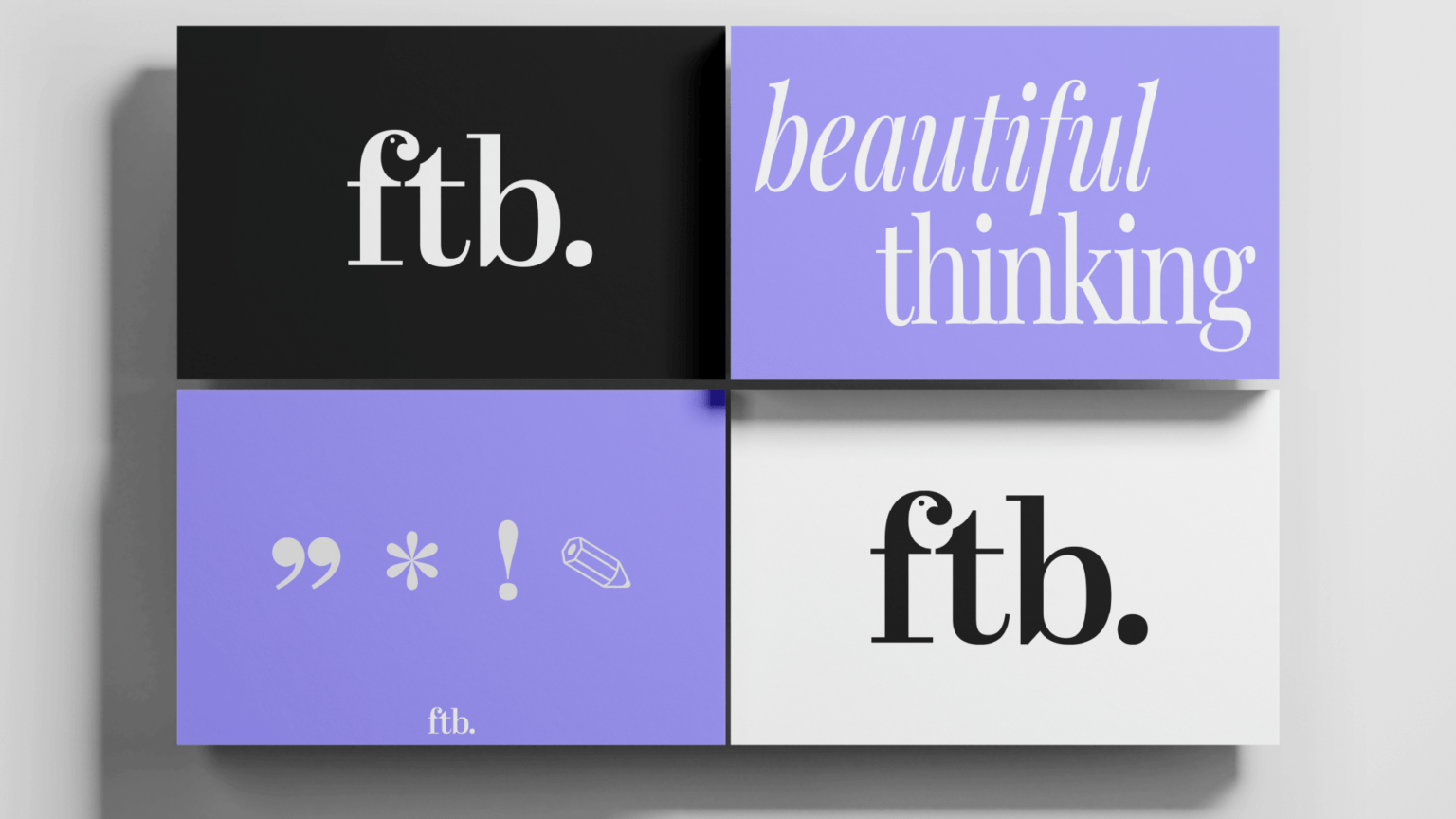
Free The Birds’ identity has ideas at its core, a testament to our pursuit of ensuring every element of our work is fuelled by an idea, a beautiful thought. These refreshed visuals representing this identity include a new logo, which introduces a visual shorthand for our identity; a natural progression for the agency as it passes half a decade since it was born.
The shorthand logo, rather than replacing the business’ full name which continues on, is designed to speak to the confidence, authority and boldness with which the agency moves forward. The full stop adds further weighting to this, alongside the illustration of the bird eponymous to our identity.
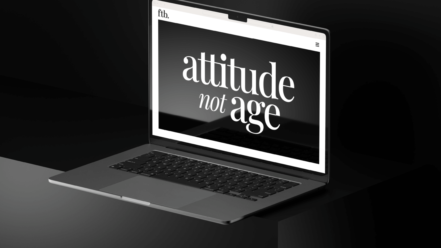
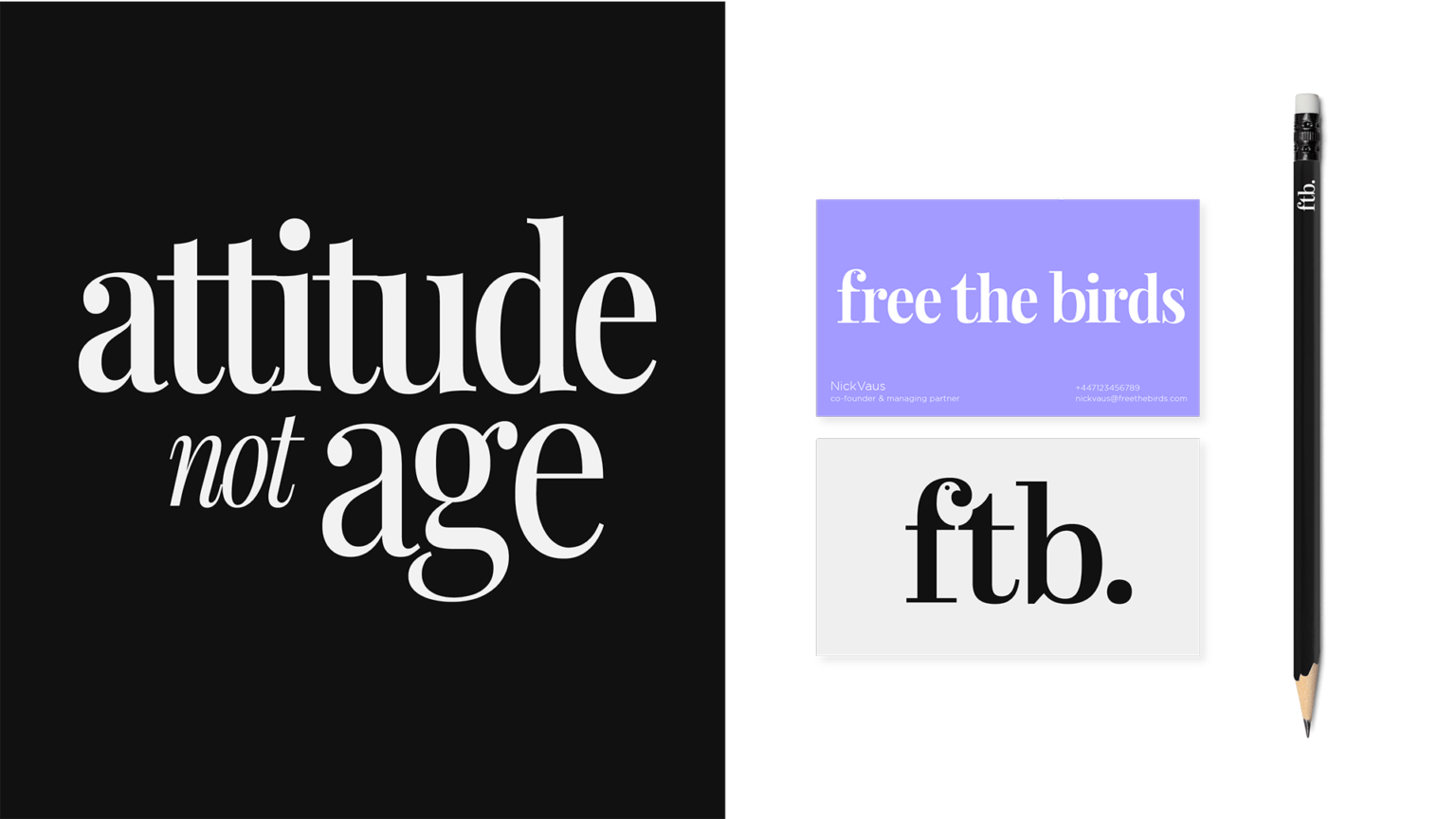


Our motto – attitude not age – also plays an important role in the new visuals. The bold type speaks to our confidence, but also our desire to make this attitude beautiful. To bring a smile to the mind. We have aimed to create something that feels conversational, informed – without arrogance. It is a conversation which you want to be a part of. It might be a bold sans serif, but it is softened to ensure it is approachable.
