“Simplicity in structure” the graphic design principles of Josef Müller-Brockmann
“I came across Josef Müller-Brockmann while researching for a project at university, I always liked the Swiss style of typography. The simplicity and structure that his work is built upon is what I find really inspiring.”
Earlier this month, we met with our Senior Designer Matt Taylor to speak about his beautiful thinker and how he is inspired by the Swiss Graphic Designer and the power he finds in simplicity:
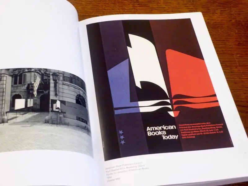
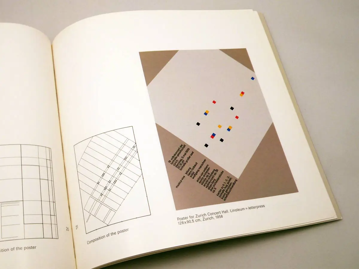
“His collection of posters Musica Viva is really beautiful, the contrast between the creative composition of colours and shapes he uses to express the feeling of a symphony and the structured typographic layout, is very inspiring. They go down to the core idea of musical arrangement and gives you that emotional connection to something as simple as four circles on a page – It’s a stunning collection.”
“My greatest take away from Grid Systems in graphic design is about starting from the ground up and laying a strong foundation first. A keen eye for the structure of a design allows the creative idea to be communicated in its simplest form. When we are working on projects, packaging in particular, this experience is key to envisioning it across 10 or 15 products and maintaining that consistency”
Matt told us how his Beautiful Thinker’s simplicity in structure has influenced his practice, including working on projects at Free The Birds.
“This has been hugely beneficial for our recent work with wilko, where the design had to work across thousands of products. Our job was to create a visual system that would work across all products and ranges and have the flexibility to work in many different sectors from cleaning, to DIY, garden or pets.
Establishing strong design principles through the guidelines was crucial to create a consistent and recognisable brand house, whilst allowing the design to flex int different specific category codes.”