Olympic pictograms and Swiss typography – the less is more approach is our own Mike’s method of Beautiful Thinking
A country known for precision engineering since the beginning of the 20th century – from two seaters to trunks – the magnifying lens was on Germany as the world gazed to witness the rebrand of a conflicted post-war country.
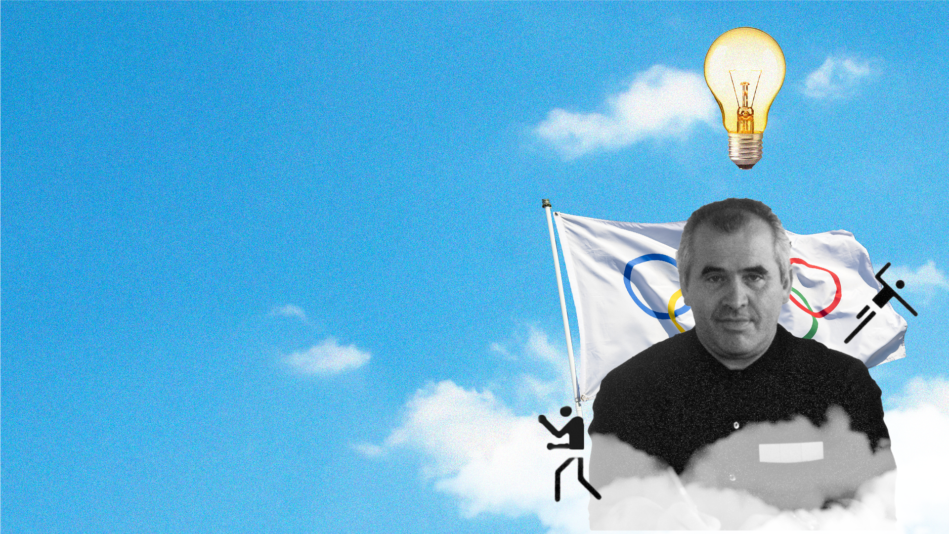
Hopeful for harmony, the 1972 Olympics in Munich was an opportunity to show the world how far they have come. Otl Aicher was commissioned to design the grounds of the olympic park, birthing one of his most-known works – inspired by Masaru Katsumi, seasoned with Modernist styling – the pictograms silently navigating athletes and sports enthusiasts.
“It’s a nice testament to really good design” says our own Mike, as he exclaims how Aicher’s take on pictograms has become the universal language for transport and information, especially in the states.
It’s the synergy between Swiss typography and simple architectural sketches Mike particularly favours, as he recalls how Aicher’s design beyond the Olympics “has stood the test of time”. Like the exquisite logo design for German airline Lufthansa, which is yet to see an overhaul since its conception in 1969.
The less is more approach, typically inflicted by designer restrictions at the time of Aicher, tends to be a daily tool for Mike and the wider team when creating.
“They didn’t have the luxury of photoshop. Now it’ll be easy for us to design a pictogram. But back then, you’d have to draw out each individually, any amendments you’d have to do would have to be redrawn.”
Restrictions hardly exist with computer aided design, so Mike’s approach to creativity considers boundaries with the hopes that simplicity is elevated for the everyday.
It’s these imposed limitations that challenged Mike and the team on No7 Unstoppable.
“It’s the simple idea of cutting the ‘o’ in half - you’ve got a smile. It’s those little things that aren’t necessarily rigorous of a design system. When you look at the systems he’s [Aicher] created for us; that definitely comes across in how we’re going to translate what we create.”
And how holistic minimalism of paired fonts and logos can create legacy brand identities.
“It’s portraying the brand message without having to be overly complicated is what I like to try and do as much as possible really”, recalling the logo he worked on for Friendly Foods, for Compassion In World Farming.
Each morning Mike passes his treasured posters of Aicher’s work for the Olympics. It serves as a reminder of his passion for graphic design, and how it opens an opportunity to use his skills in a positive way to help people all over the world, no matter the scale of the issue, just like Otl Aicher.