Beautiful Thinking.
Few creative tensions are as enduring – or as emotionally loaded – as minimalism versus maximalism. For decades, brands have swung between restraint and expression, quiet confidence and visual noise. In 2026, however, this is no longer a purely aesthetic debate. It has become a human one.
As consumers grow more visually literate, more culturally aware and more fatigued by extremes, the conversation is shifting. The question is no longer which side are you on? but how does this make people feel?
Minimalism and maximalism are being renegotiated – not abandoned – in favour of something more emotionally intelligent.
Minimalism has long been shorthand for trust. Clean lines, restrained palettes and generous white space have helped brands communicate clarity, efficacy and ease – particularly in beauty, wellness and technology. In an increasingly complex world, “less” promised relief.
But what once felt calming has, in many cases, become cold.
As digital products, AI-generated content and templated design systems proliferate, minimalism has drifted towards uniformity. Interfaces blur together. Packaging loses personality. Brand worlds feel efficient, but emotionally distant.
This shift is not going unnoticed. Research from Adobe shows that over 70% of Gen Z consumers feel fatigued by overly perfected digital aesthetics, preferring visuals that feel more human and imperfect. What was once read as premium is now, at times, read as sterile.
The response we’re seeing for 2026 is not a rejection of minimalism, but a recalibration of it. Brands are working harder to make restraint feel warm, alive and intentional. Stark black-and-white palettes soften into tonal neutrals. Organic shapes interrupt rigid grids. Texture and tactility reintroduce humanity into otherwise pared-back systems.
This is not minimalism as absence. It’s minimalism with care.
One of the clearest evolutions of minimalism is its growing reliance on sensory cues. As visual languages become simpler, other senses are doing more of the work.
In packaging design especially, texture has become a proxy for trust. Matte finishes, soft-touch coatings, moulded fibres and subtle imperfections slow the interaction down – they invite touch, and signal intention.
This matters because expectations have shifted. McKinsey reports that nearly 60% of consumers now say emotional and sensory experience plays a decisive role in brand preference, particularly in categories connected to wellbeing and self-care.
Minimalism that fails to engage emotionally is no longer enough – calm must feel supportive, not prescriptive. Clean must feel considered, not empty.
At the other end of the spectrum sits maximalism – long defined by bold colour, layered visuals and unapologetic expression. For Gen Z in particular, maximalism has functioned as a cultural release valve. A rejection of rigid “clean” aesthetics. A celebration of individuality, chaos and play.
But maximalism, too, is evolving.
What once leaned heavily into excess for excess’s sake is becoming more intentional. In 2026, maximalism is shedding its messier edges in favour of confidence and clarity. It still embraces colour, pattern and personality – but with greater hierarchy and control.
This reflects a broader cultural shift. As consumers become more design-literate, chaos without meaning loses impact. Expression must be curated. Layers must tell a story.
Pinterest trend analysis shows sustained interest in bold colour and pattern alongside a sharp rise in searches associated with more considered forms of visual layering – signalling an appetite for creativity that feels thoughtful rather than overwhelming. The message is clear, consumers aren’t rejecting maximalism, but they are rejecting noise without intent.
The maximalism of 2026 is less about visual overload and more about narrative depth. We’re seeing heritage references, cultural cues and craft-led detailing replacing randomness, typography becoming expressive, but legible. Meanwhile colour is bold, but anchored.
In beauty and wellness, this often manifests through packaging and visual identities that celebrate ritual, culture and personality – without sacrificing usability. Layered graphics that tell a story, framed within a clear system, expressive moments that feel deliberate rather than chaotic.
Importantly, this evolution also marks a rejection of the “clean girl” aesthetic that has dominated recent years. For many consumers, hyper-neutral perfection feels exclusionary. Maximalism offers an alternative language – one that allows for individuality, contradiction and play.
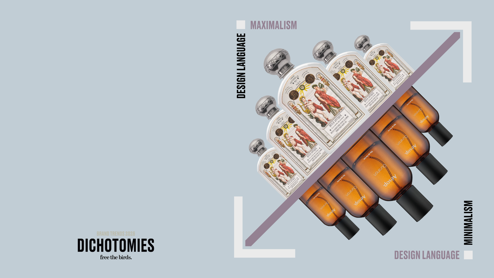
This tension does not play out evenly across categories. Certain sectors naturally gravitate toward one end of the spectrum – and for good reason.
In skincare, pharmaceuticals and derm-led wellness, minimalism continues to earn its place. These are categories built on trust, safety and efficacy, where clarity reduces perceived risk and restraint reinforces authority. Here, pared-back design isn’t an aesthetic preference – it’s a reassurance mechanism.
Beauty, particularly colour cosmetics and fragrance, operates by different rules. These are expressive categories, tied to identity, experimentation and emotion. Maximalism feels at home here. Bold colour, layered visuals and personality-led design give consumers permission to play and to signal who they are – or who they want to become.
Wellness is where the spectrum becomes most interesting. Functional supplements and clinical health tools lean minimalist, while mood-led, ritual-based and lifestyle wellness increasingly embraces maximalist cues – richer storytelling, expressive packaging and stronger personality. The split isn’t contradictory, it simply reflects the multiple roles wellness now plays in people’s lives.
Consumers move between aesthetics not just by mood, but by category.
Pantone’s announcement of Cloud Dancer as its Colour of the Year for 2026 quietly reinforces this shift. A soft, airy white, Cloud Dancer is less a statement shade and more a structural one – a base that brings lightness, calm and clarity without demanding attention.
In beauty and wellness, white already carries cultural weight. It signals clinical expertise, safety and efficacy. But Cloud Dancer’s success will depend on how brands use it. Without texture, warmth or material nuance, it risks tipping into sterility. With the right finishes – chalk-matte, porcelain, milky translucence, soft-focus shine – it becomes human again.
Its power lies in flexibility. Cloud Dancer can stand alone as quiet minimalism, or act as a canvas for expressive contrast. In that sense, it captures the very tension shaping design in 2026 – restraint versus expression, calm versus character – and asks brands to choose how intentionally they balance the two.
What unites both ends of this spectrum is a move away from absolutism. Consumers no longer want to live inside a design ideology. They want brands that feel human.
Human experiences are not consistently minimal or maximal. They shift depending on mood, context and need. Sometimes we seek calm. Sometimes we crave stimulation. Sometimes we want clarity. Sometimes we want expression.
This is particularly true in beauty and wellness, where aesthetics are inseparable from emotion. A wellness brand that feels too clinical can alienate, whilst a beauty brand that feels too chaotic can overwhelm.
The most compelling brands are designing systems that flex – minimalist structures that provide ease and navigation, paired with expressive moments that bring warmth, personality and cultural relevance.
This is not compromise, it’s emotional fluency.
Packaging is where this tension becomes most tangible.
As sustainability pressures push brands toward streamlined materials and simplified formats, packaging design is becoming more restrained by necessity. Mono-material solutions, reduced components and recyclable substrates are shaping what is possible. But limitation is not killing creativity, it’s refining it.
Rather than relying on excess materials or complex finishes, brands are turning to texture, form and finish to communicate value. We’re seeing key details shifting, as subtle embossing replaces foils, and natural pigments replace synthetic brights. Leaning into sustainability, moulded forms create depth without waste.
This allows minimalist packaging to feel warm and tactile, while giving maximalist elements – bold typography and graphics, combined with colour accents – a calm base from which to stand out. The result is packaging that feels considered rather than decorative. Calm, but not cold. Expressive, but not chaotic.
The future does not belong exclusively to minimalism or maximalism. It belongs to brands that understand why they are using each. Minimalism brings clarity, trust and ease. Maximalism brings emotion, culture and personality.
Together, they create brand worlds that feel navigable and distinctive – systems that allow consumers to project themselves into the experience rather than being dictated to. This is not about sitting safely in the middle, it’s about designing with intent.
1. Design for feeling before form
Start with emotional intent. Decide what you want people to feel, then choose how much to reveal or restrain.
2. Soften minimalism with humanity
If your brand leans pared-back, introduce warmth through texture, tone and language. Efficiency alone won’t build connection.
3. Edit maximalism with purpose
Expression works best when it has hierarchy. Boldness without structure risks becoming noise.
4. Use packaging as emotional proof
Let materials, finishes and form communicate values. Sustainability and care should be felt, not explained.
5. Build flexible systems, not fixed aesthetics
Design brand worlds that adapt across categories, channels and moods without losing coherence.
6. Remember the human at the centre
In 2026, the most compelling brands won’t shout louder or disappear quieter – they’ll connect more intelligently.