Understand First
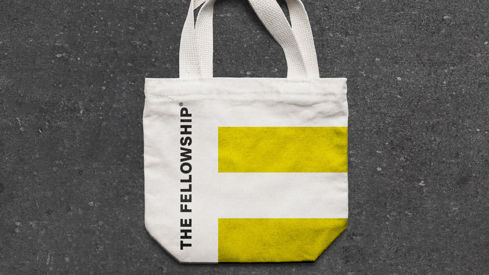
The notions of masculinity are changing, and with that, our gendered preconceptions of colour. The tradition with men’s grooming products is to opt for greys, blacks and browns. The Fellowship needed to break the mould.


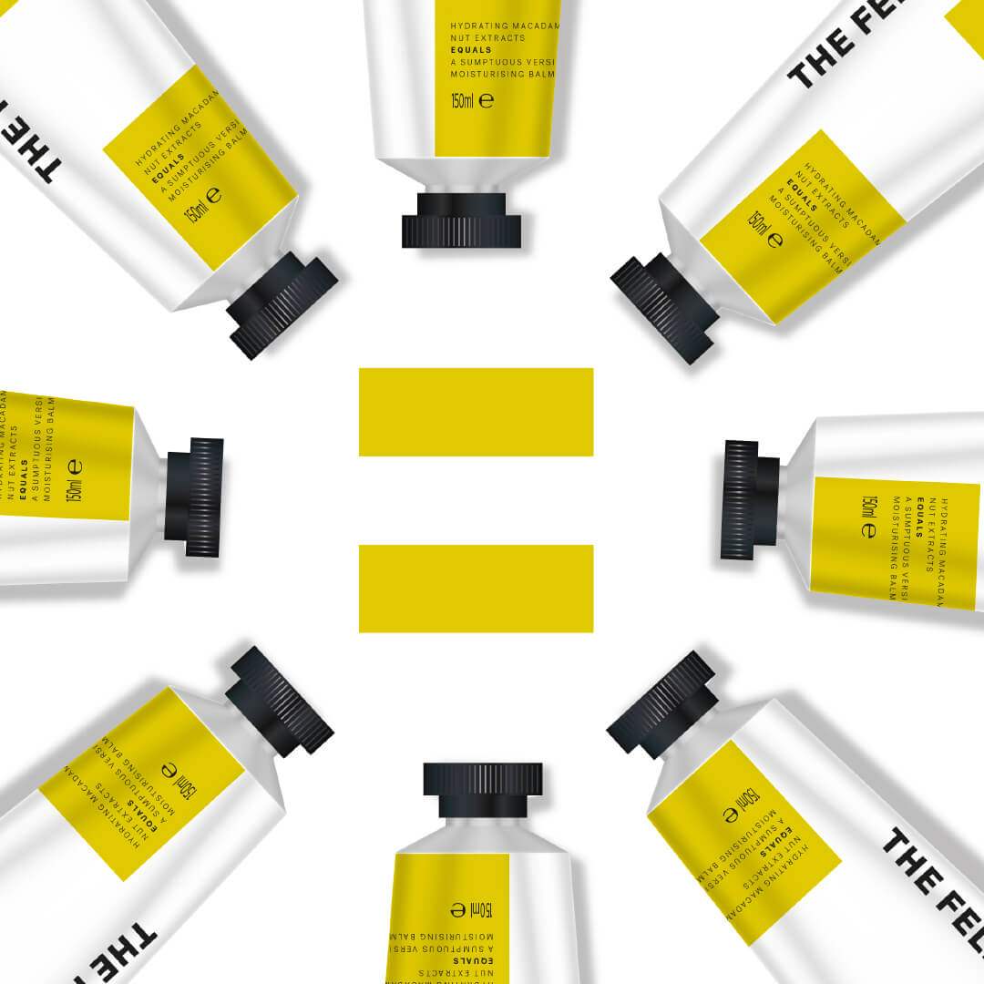

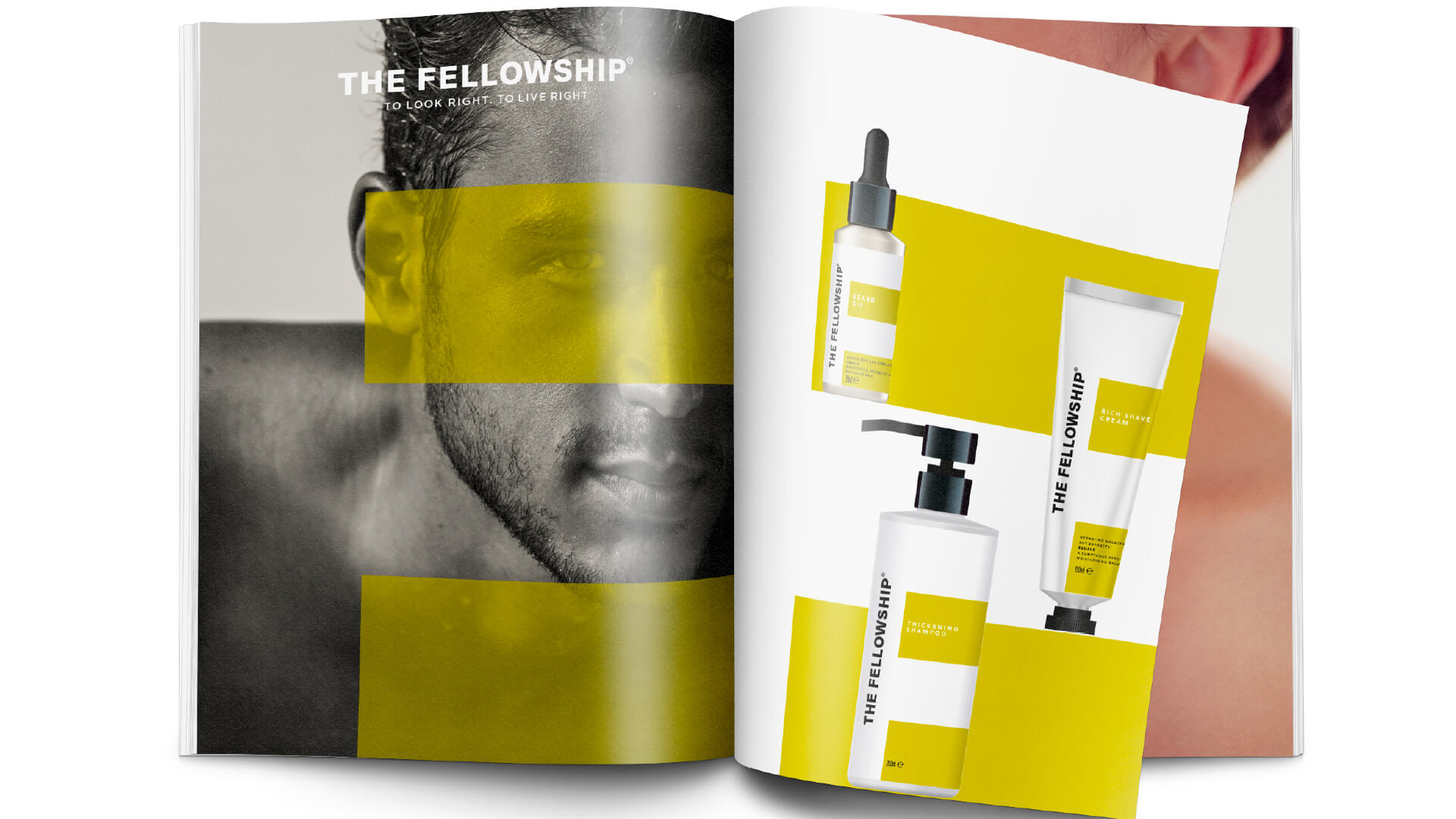

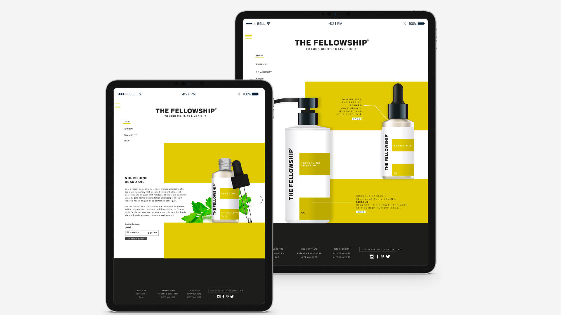
On each product, the bold information labels are arranged over a plain white background in the shape of an equals (=) sign, a striking motif that artistically encapsulates and communicates The Fellowship’s core values. The bright, accented colour palette conveys the sense of modernism that The Fellowship and its target customers embody, and also ensures the products catch the eye of the customer straight away, which is particularly important for new brands entering this competitive category.
