Understand First
FFS is the UK’s first and biggest direct-to-consumer women’s shaving brand. However, in 2019, subscribers had stalled, the designs were looking dated and the brand wasn’t sure who it was anymore.

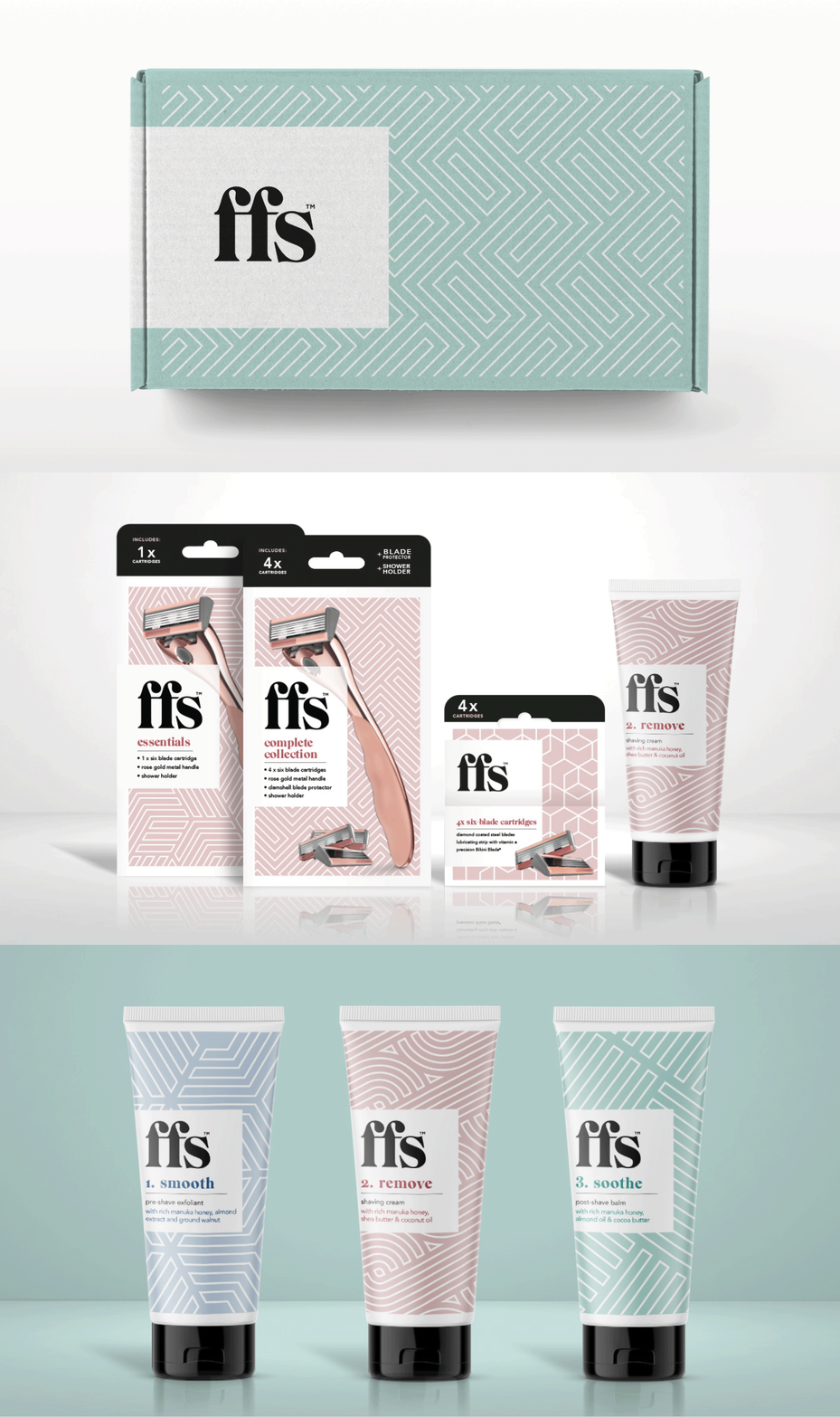

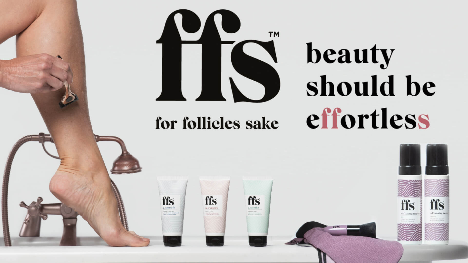
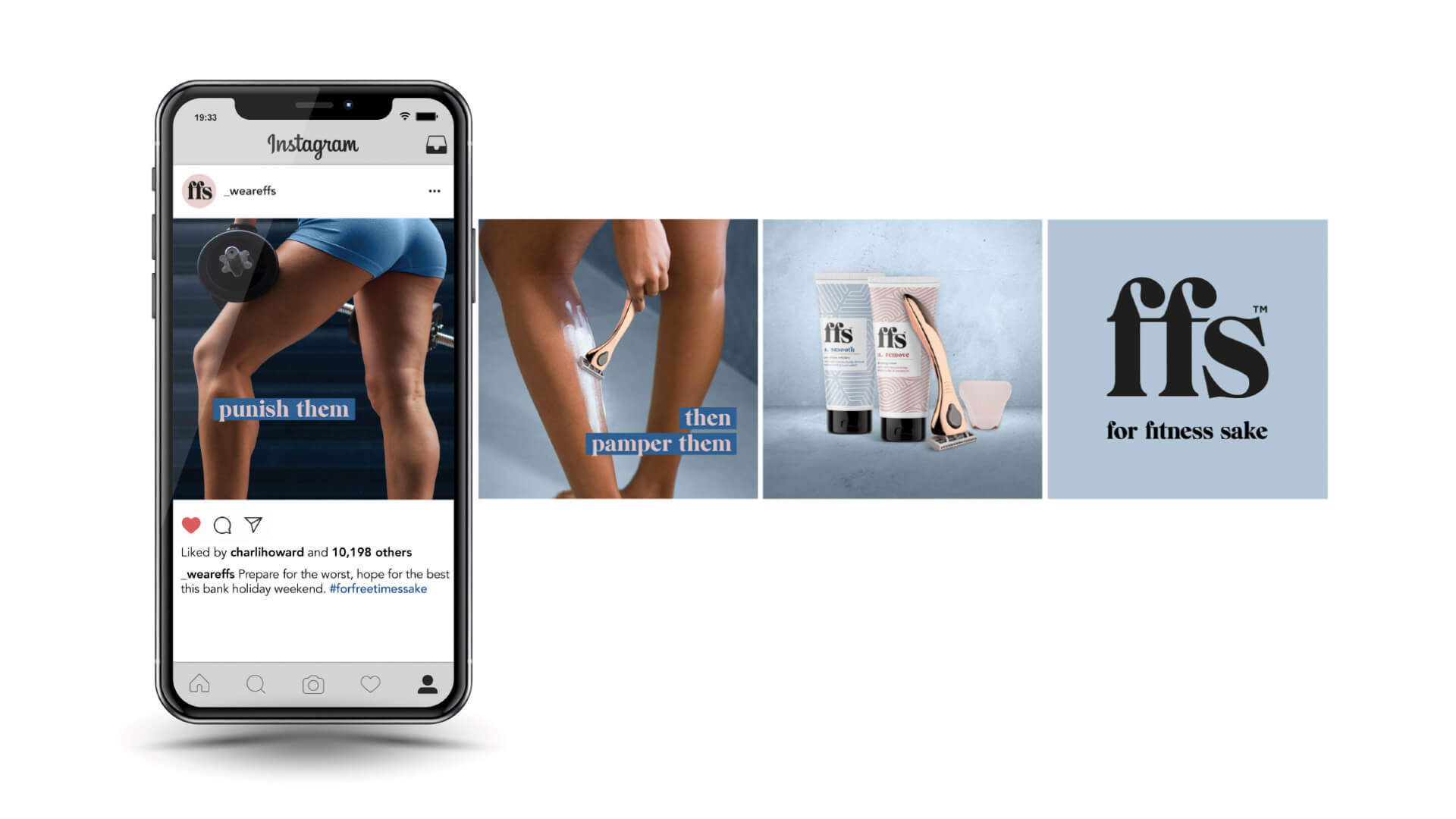
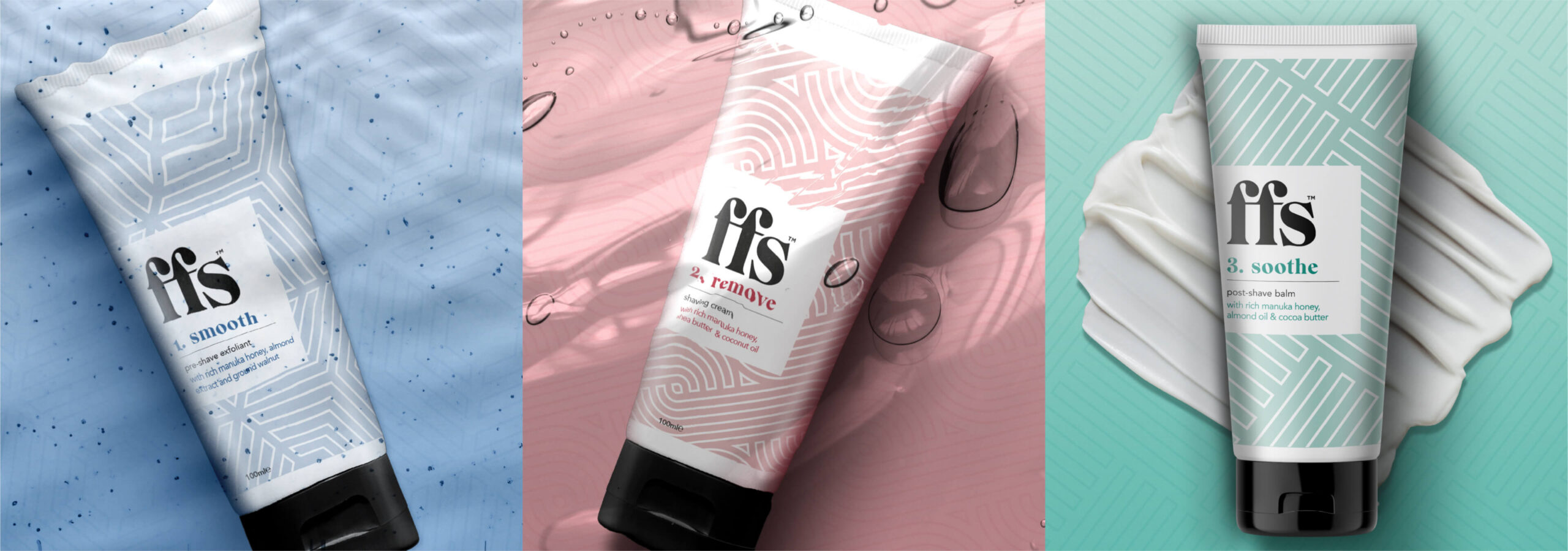
The FFS brand name, which originally stood for “Friction Free Shaving,” was evolved to unlock visual and verbal twists on the acronym, recapturing the brand’s irreverent roots. Modern-day alternative meanings were designed to resonate – from “For fun’s sake” and “For fabulousness’s sake”, to “For fairness sake” and “For future’s sake.” Distinctive linear graphics symbolise the precision of the shaving experience. A new tagline reflects the brand idea and ethos; Beauty should be effortless. The sleeker and more stylish designs appeal to a refreshed target demographic and underpin the premium quality of the products.
“When we launched the brand back in 2015, it was about rebellion and shaking up the tired and often overlooked women’s shaving category with an irreverent, raised eyebrow. Five years on, and proud of all that we have achieved, it felt like the right time to refresh and showcase how we’ve evolved. The new FFS Beauty name, look and feel reflects our growth into a more sophisticated, conscious and contemporary brand, but one that remains committed to disrupting the wider beauty industry without taking itself too seriously.”
Des McManus, managing director at FFS Beauty
