Understand First
Bayer’s Supradyn, Europe’s no.1 VMS (vitamins, minerals and supplements) brand, had become dated over time and no longer communicated the level of efficacy consumers demand. The range was fragmented across markets.

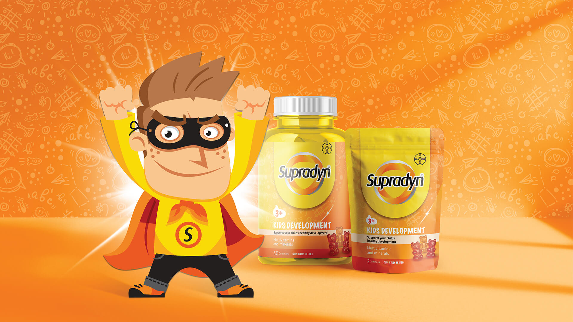
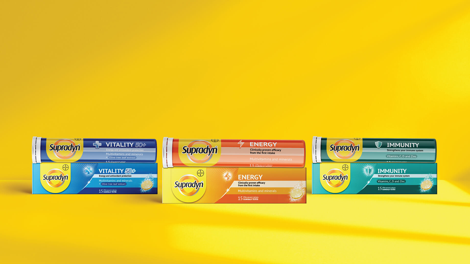
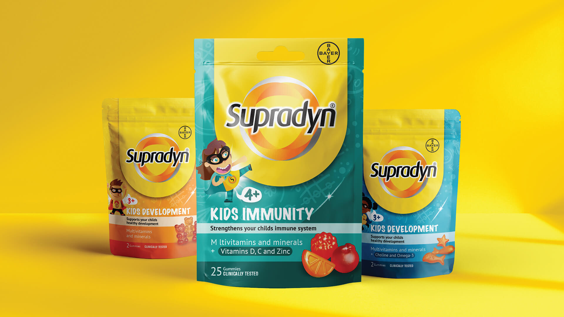
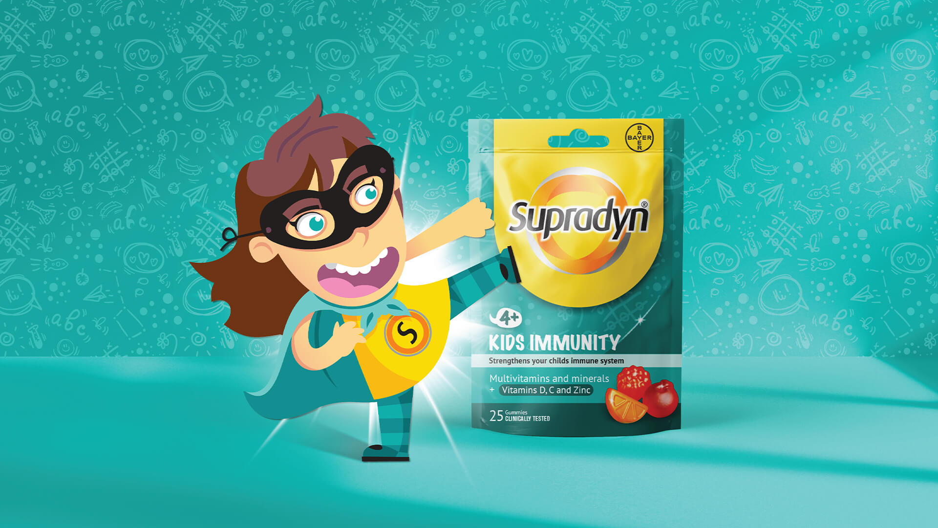
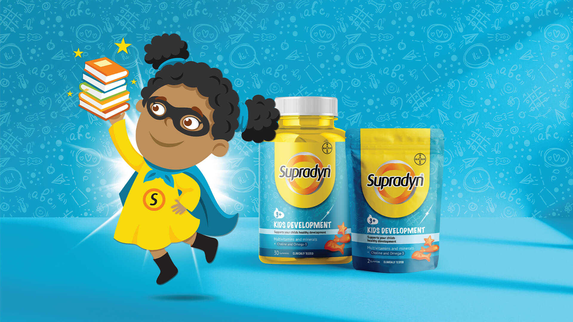
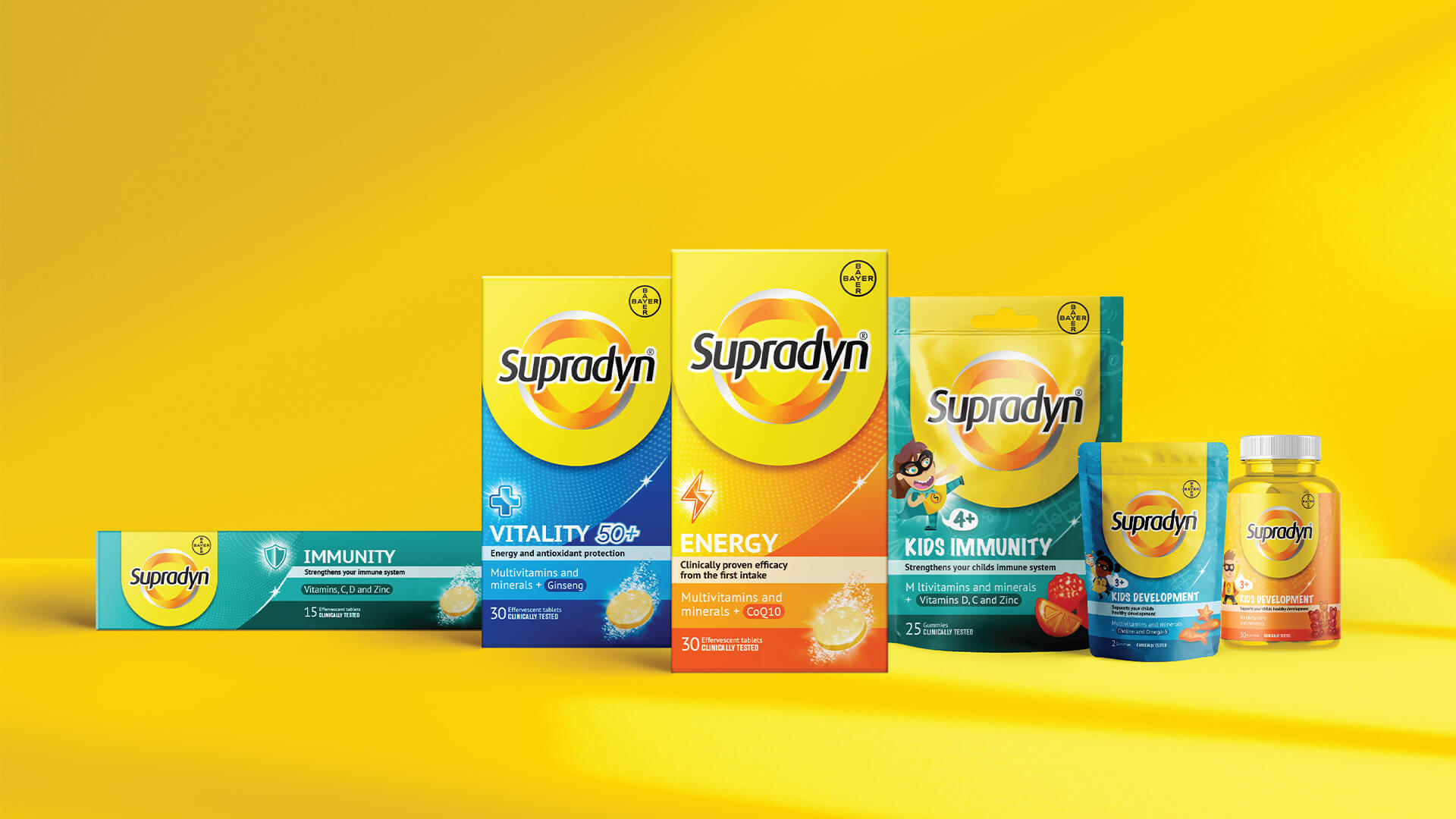
Tasked with aligning the portfolio across all markets, we communicated the new positioning, ‘Recharge your Strength’, through revitalised branding, packaging design, typography, illustration, and improved colour palette.
The brand was brought to life through a new iconic brand logo and engaging assets that also come to life off pack. A simplified architecture and navigable creative system united the markets.
A dynamic, vibrant colour palette across the portfolio allowed for ease of navigation, with bespoke icons on packs clearly communicating product benefit of each product whilst further aiding navigation.
“The new packaging design not only reinvigorates our brand messaging but strengthens our position as Europe’s number one vitamin brand. Free The Birds has been an excellent partner to work with throughout the process and we are delighted with the evolution of our brand identity which remains consistent with our heritage and product benefits that we are so proud of.”
Midori Morgan, Global Brand Director at Supradyn/Berocca
