Understand First
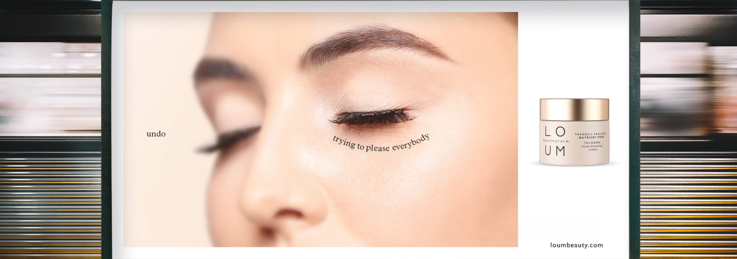
Following a successful US launch, this new premium clean skincare brand sought to establish itself in the nascent CBD-based product market here in the UK. Its unique three-way formula was Loum’s secret to unlock stress.
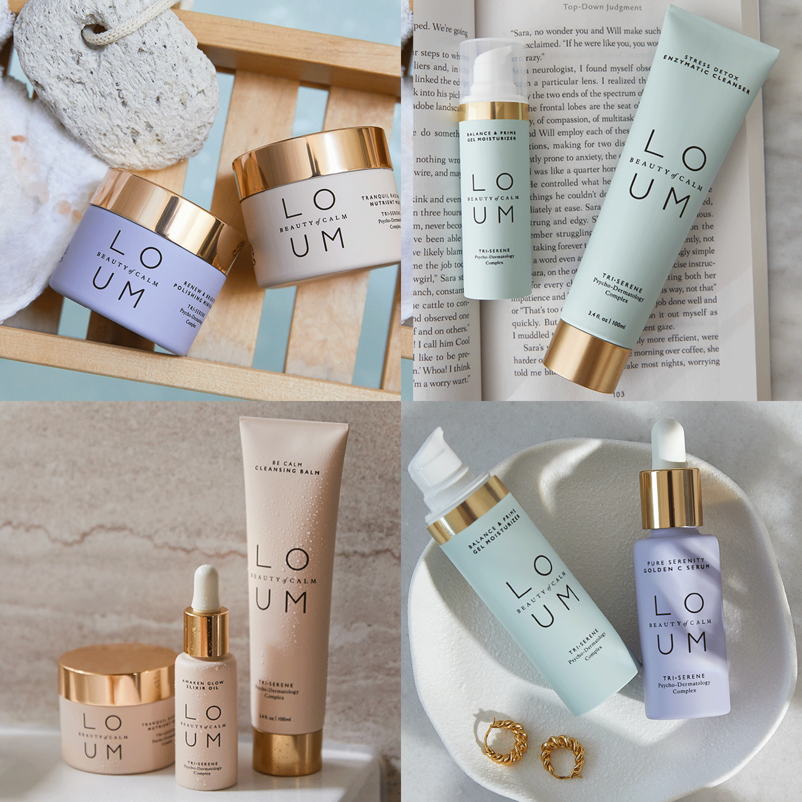
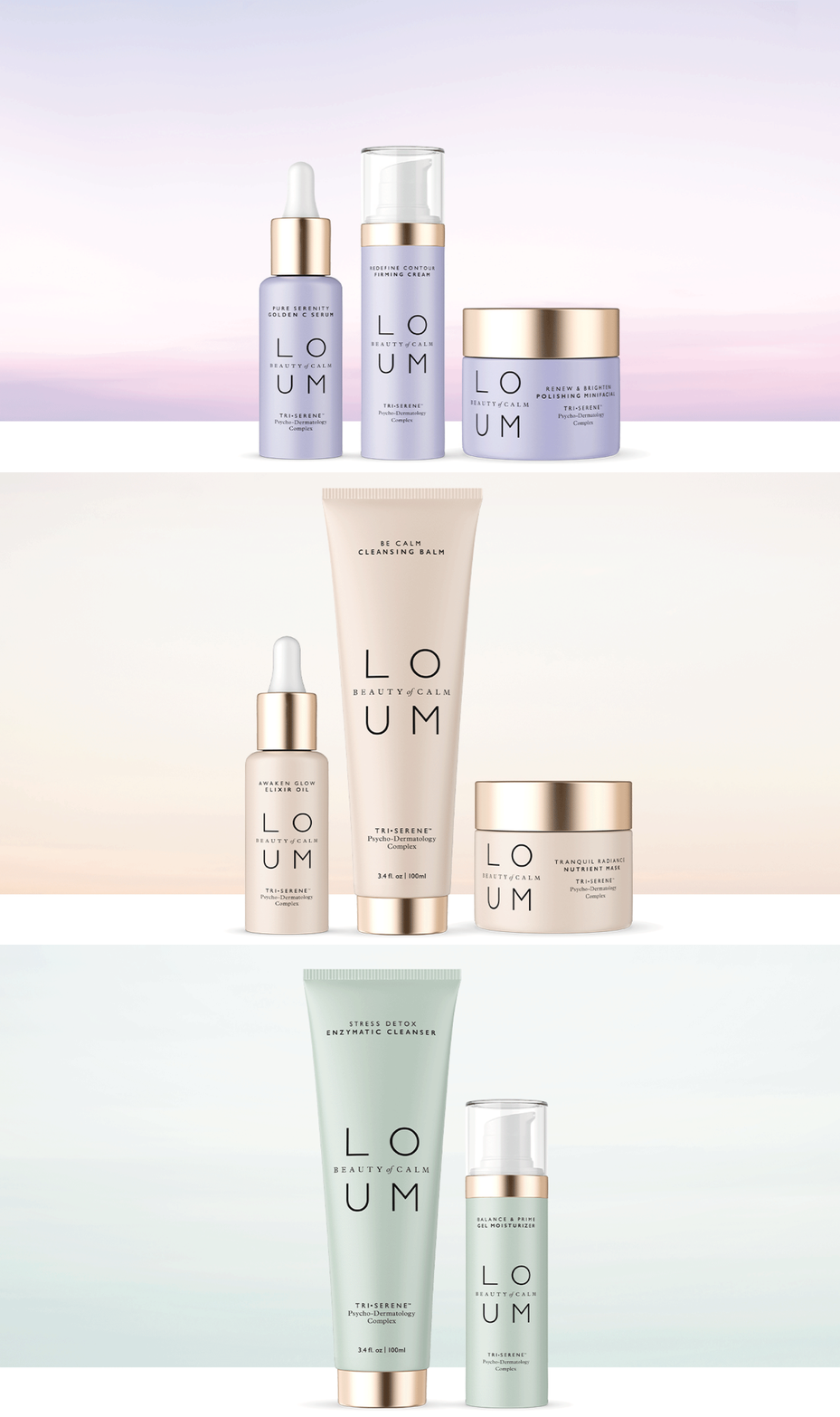
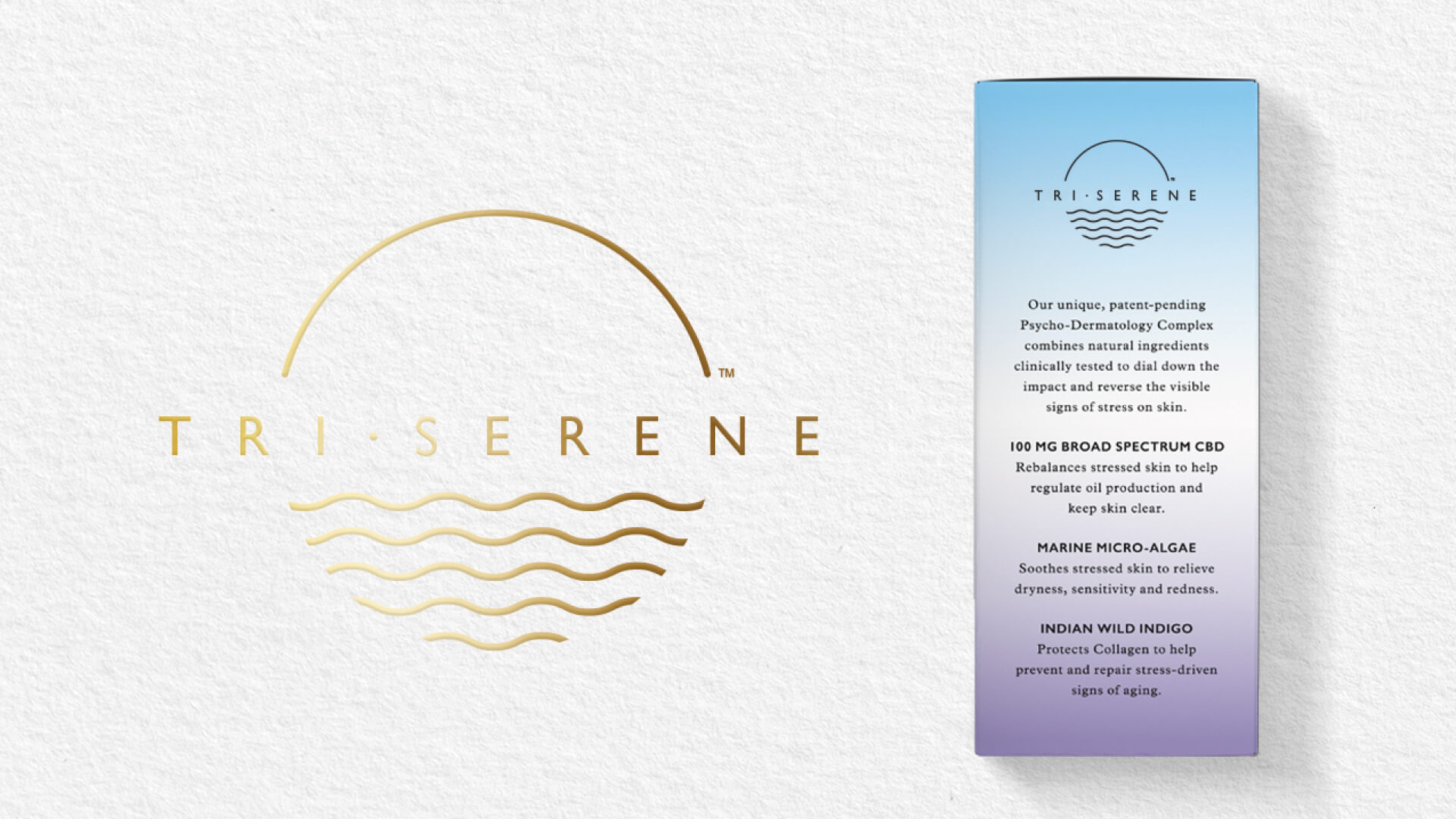
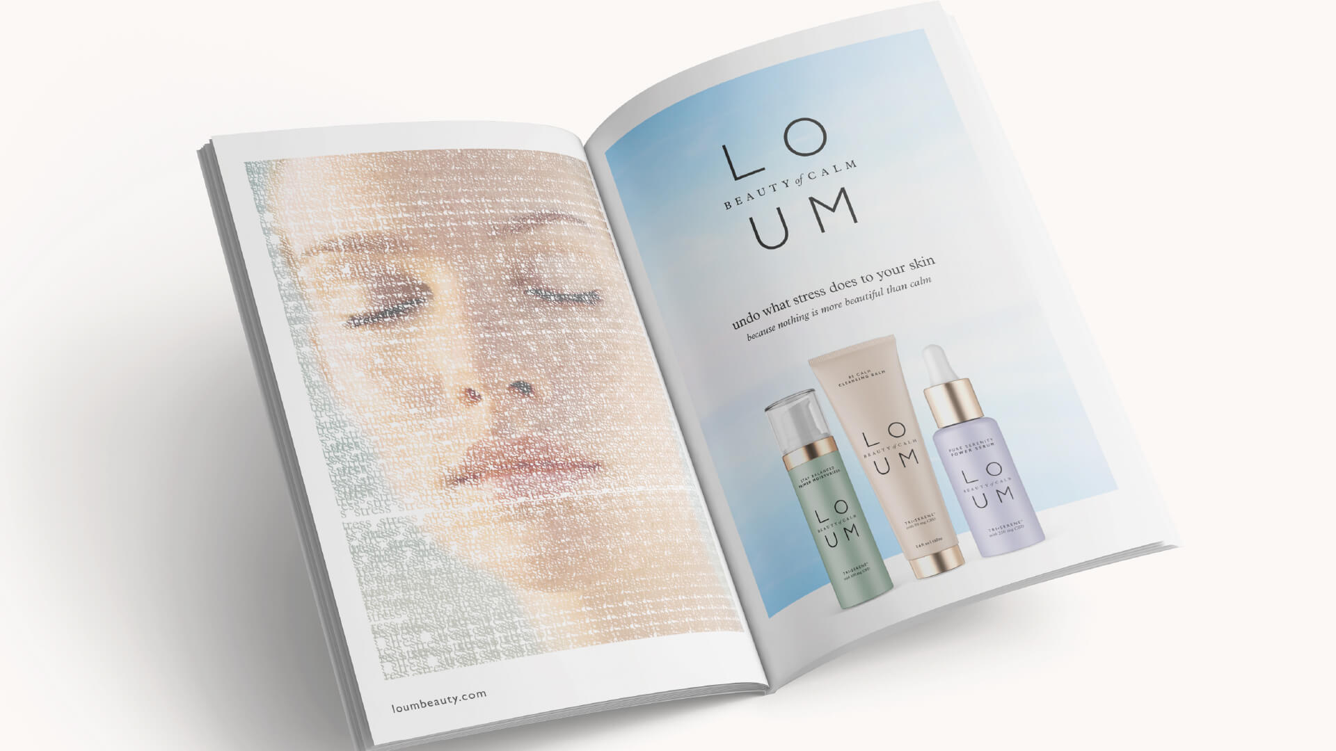
We sought to make the brand and all its assets the very essence of calm, harnessing stillness and serenity in open composition and colourways, bringing Loum’s science-based proposition to life by creating an enticing full suite brand identity and brand world. We worked with a semiotician to develop the brand’s peaceful colourways and calming gradients – visual cues that are proven to promote serenity. Equal, balanced airy spaces are incorporated into Loum’s font and logo design.

“Free the Birds took on a unique and challenging brief – how could we create a brand organically rooted in the science of calm, from its ethos to its brand identity and execution. Their strategic and thoughtful approach helped us not only define the brand’s visual identity but create a world of calm that is not only beautiful but feels much needed in these uncertain times.”
